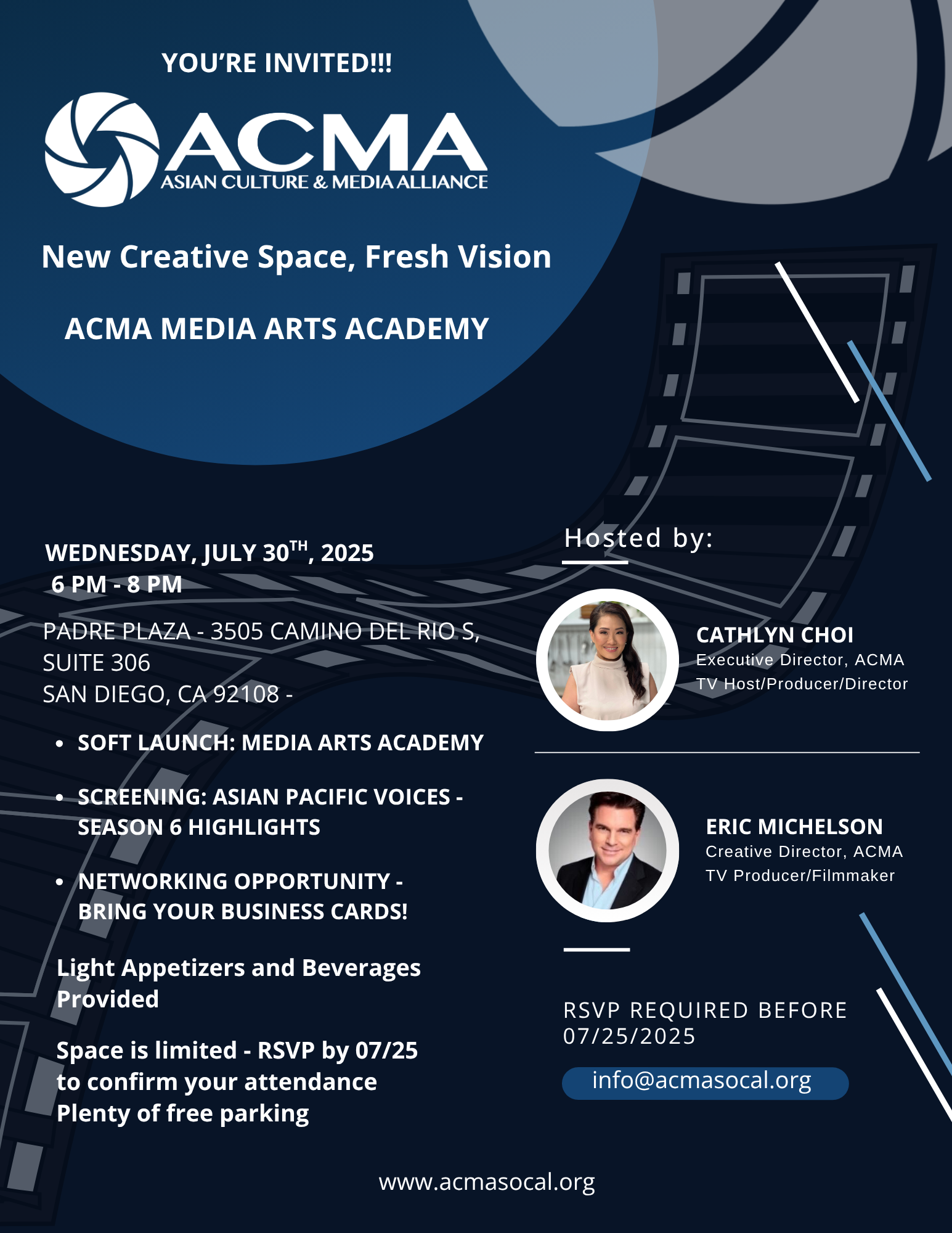
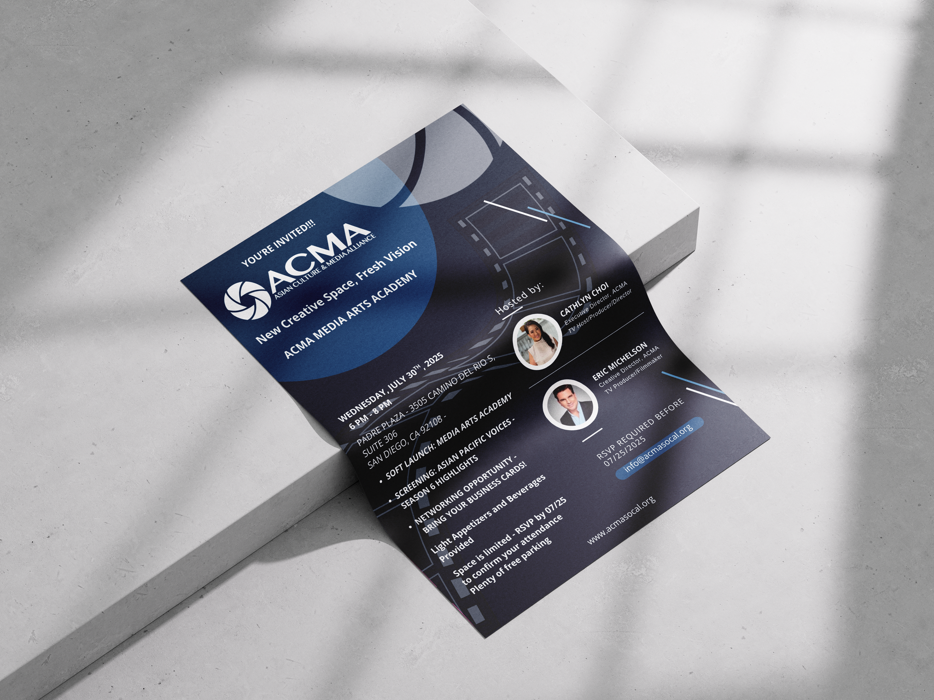
I designed this invitation flyer using the blue color palette and clean layout to match ACMA's creative identity. I organized the content with a clear visual hierarchy, using bold headings and geometric shapes to guide viewers' eyes. I used white text against the dark background to make everything easy to read, while keeping the spacing and alignment clean for a polished and professional look.
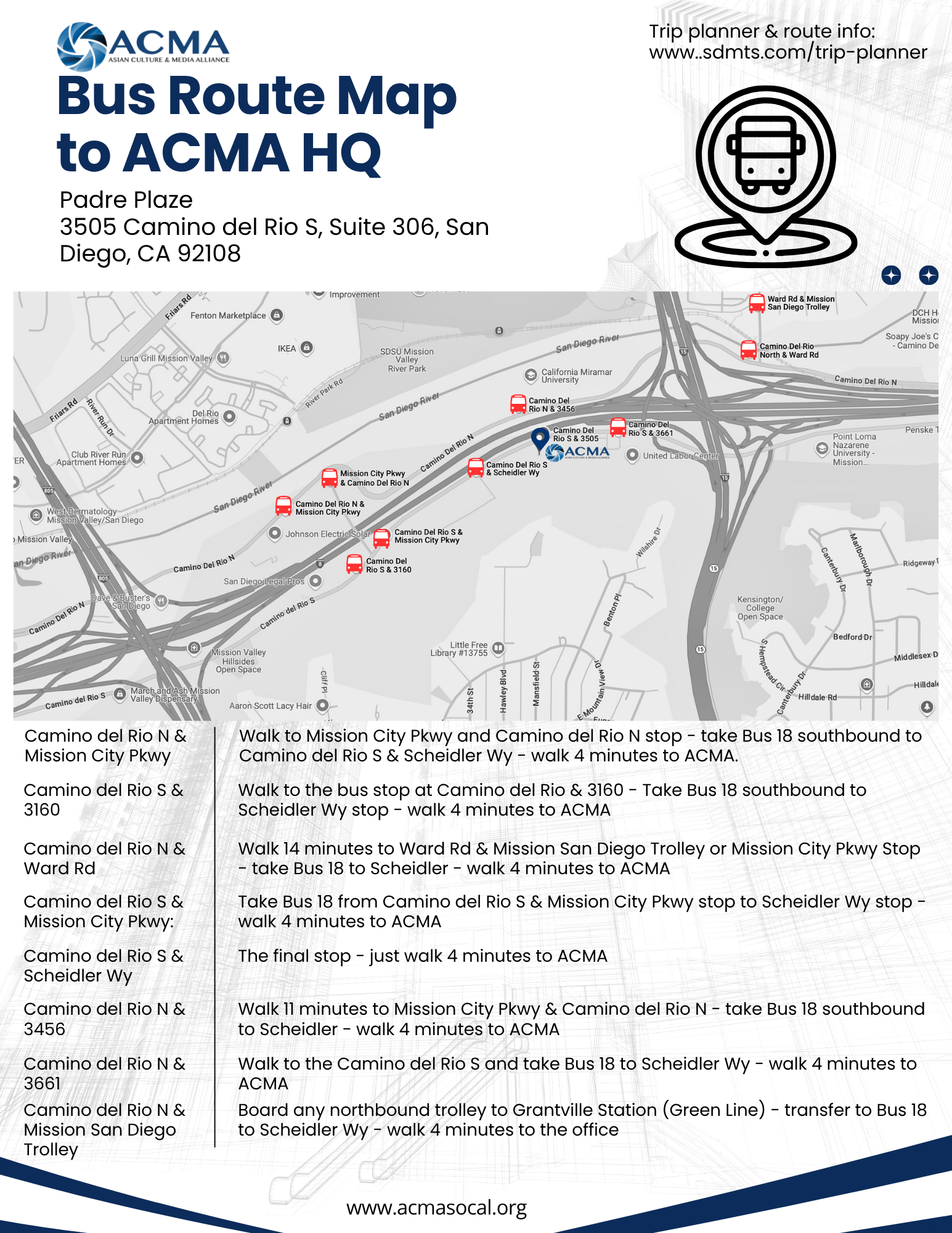
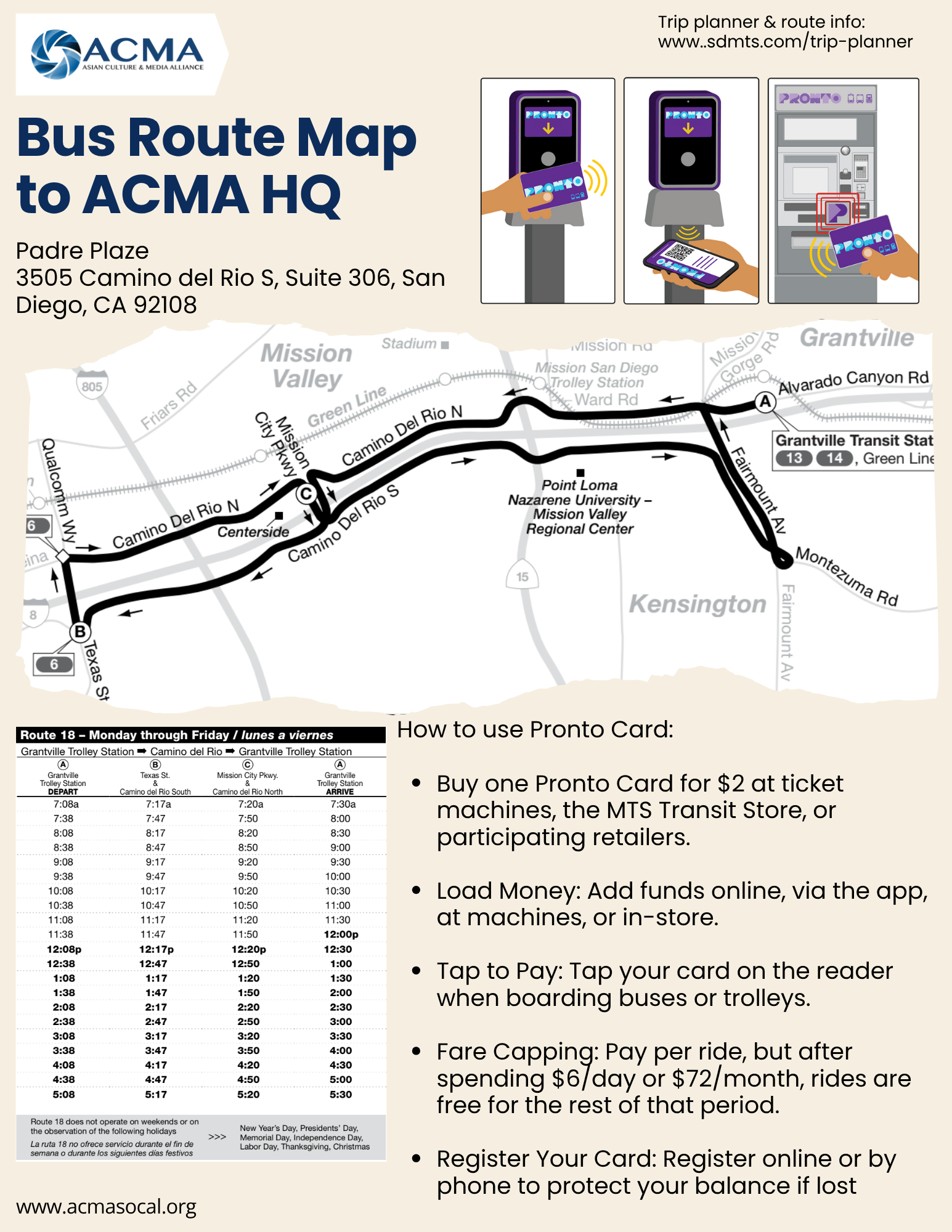
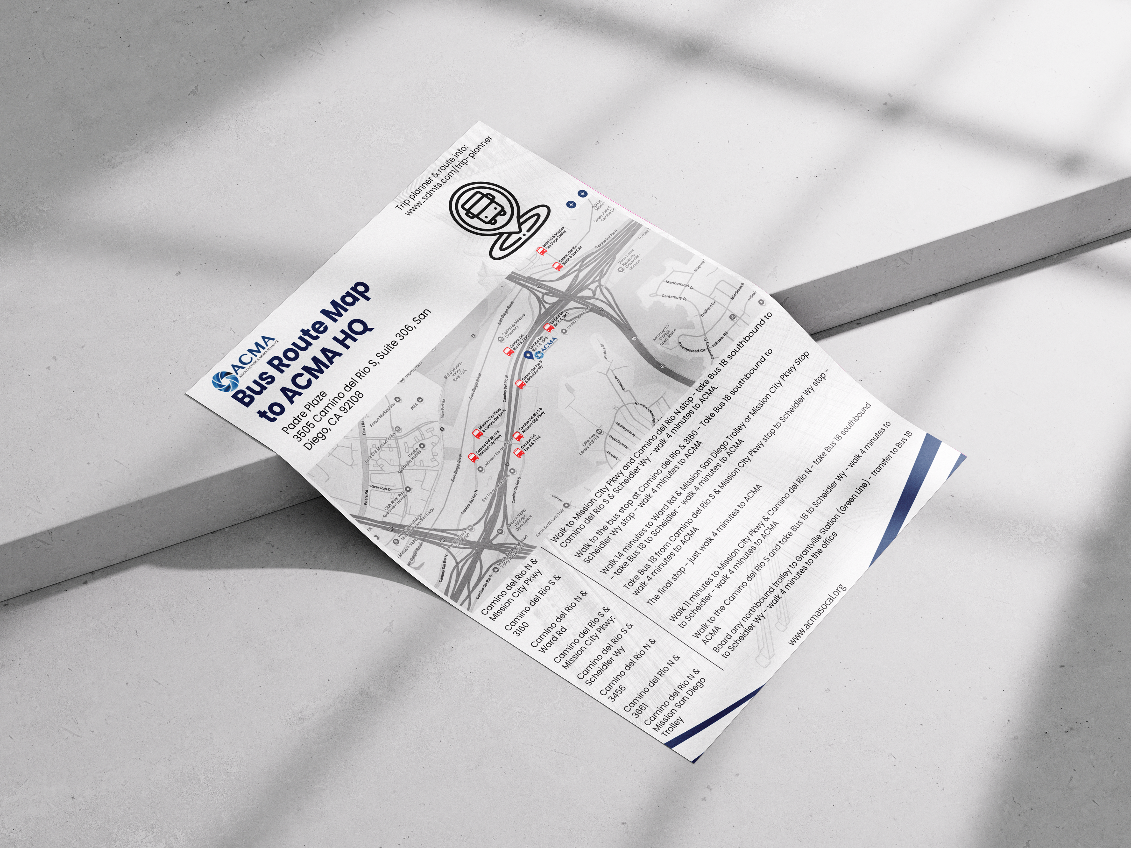
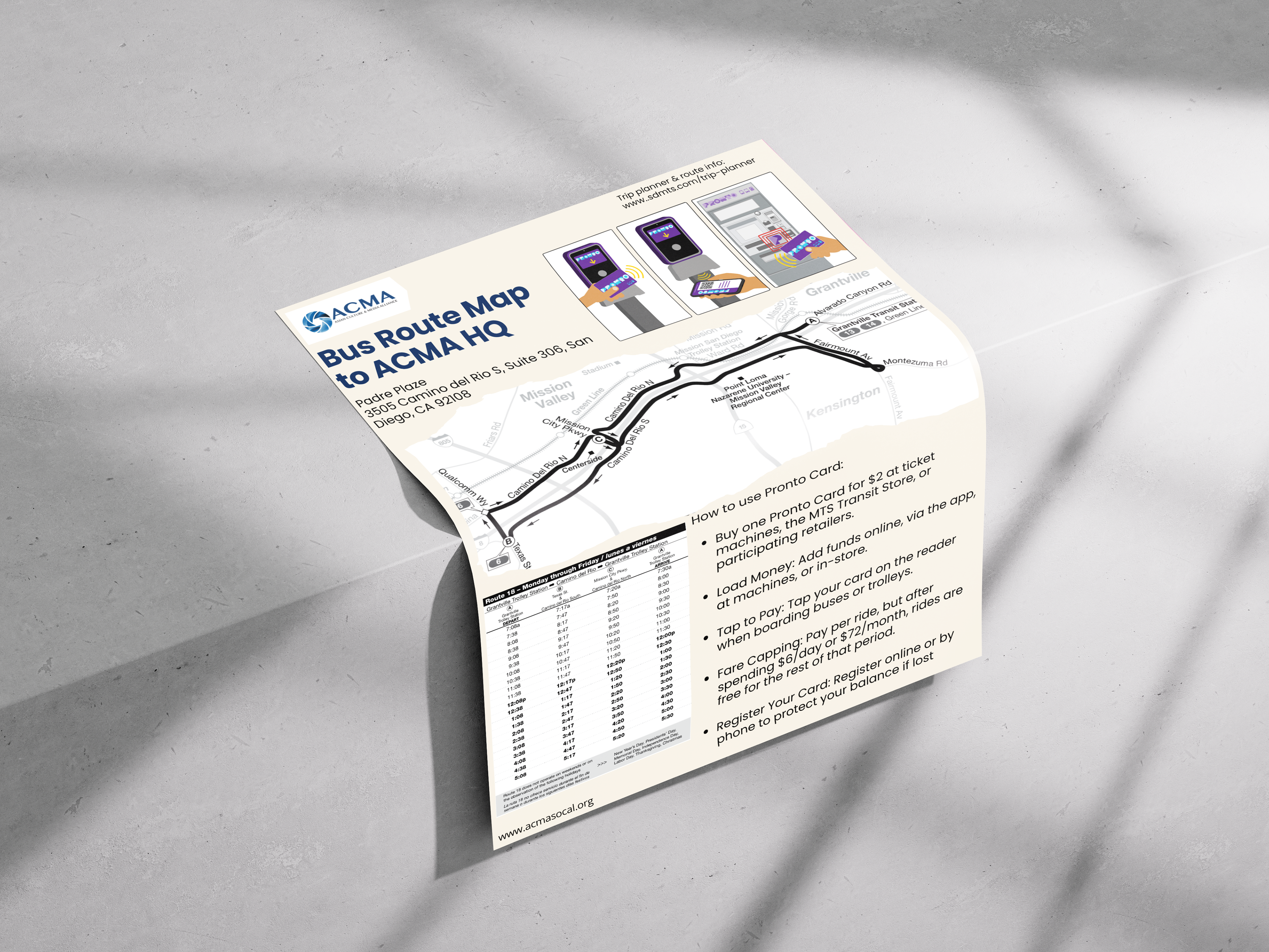
I designed the bus route maps using a clean and simple layout to make it easy to navigate for teens. I used ACMA's blue color along with clear headings, icons, and a map photo to keep the focus on the bus stop and directions. Also, the spacing and layout help users quickly find the information they need while keeping the design clean.
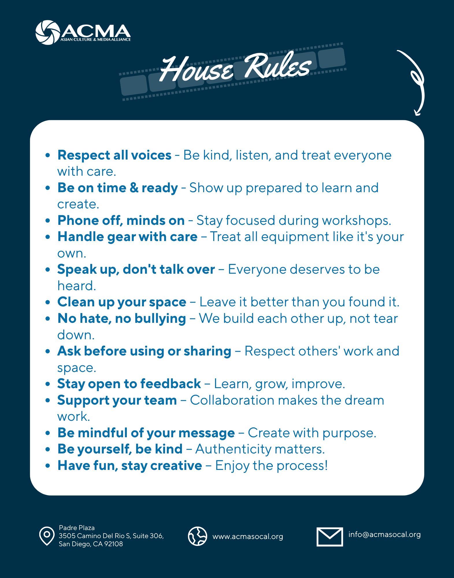
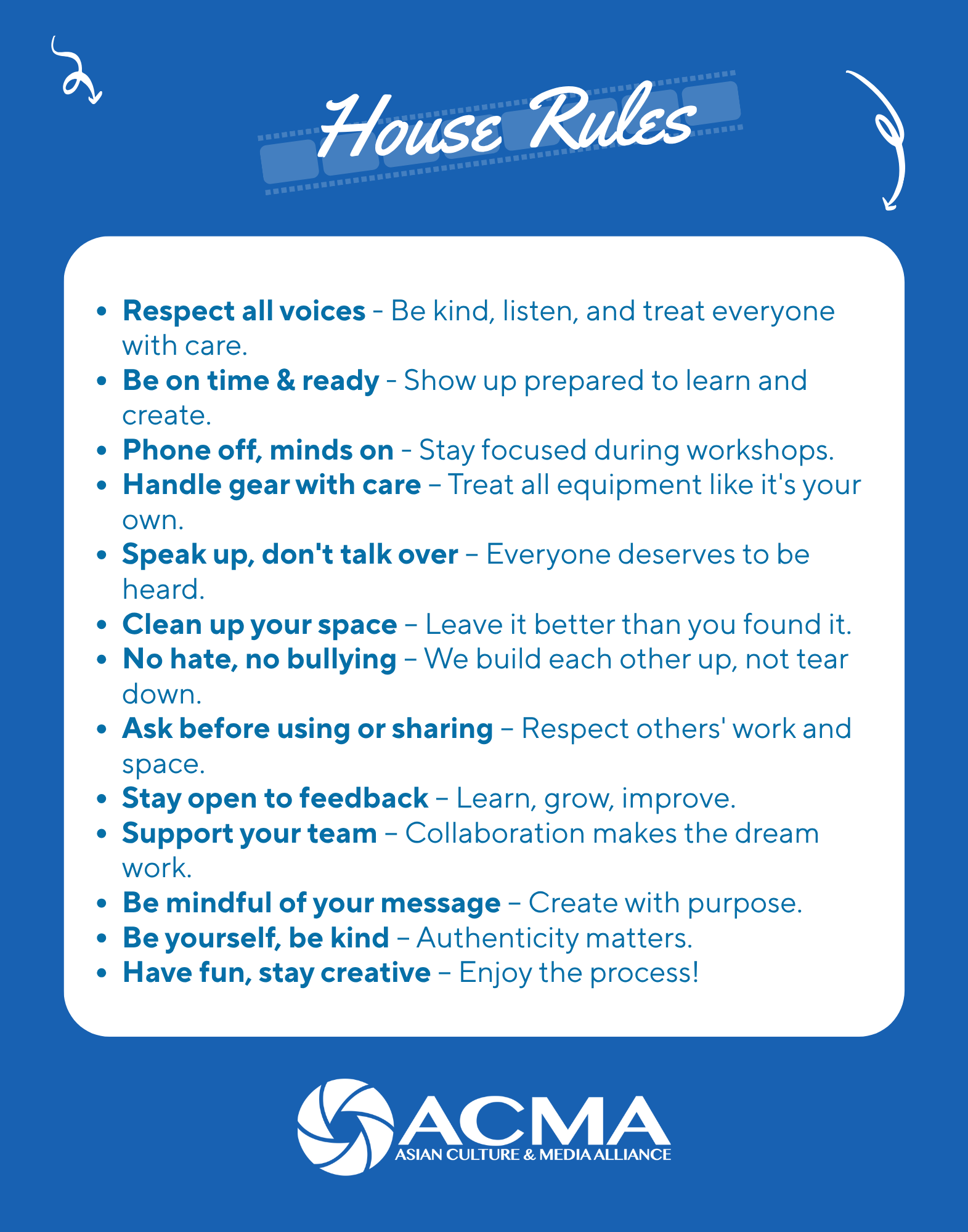
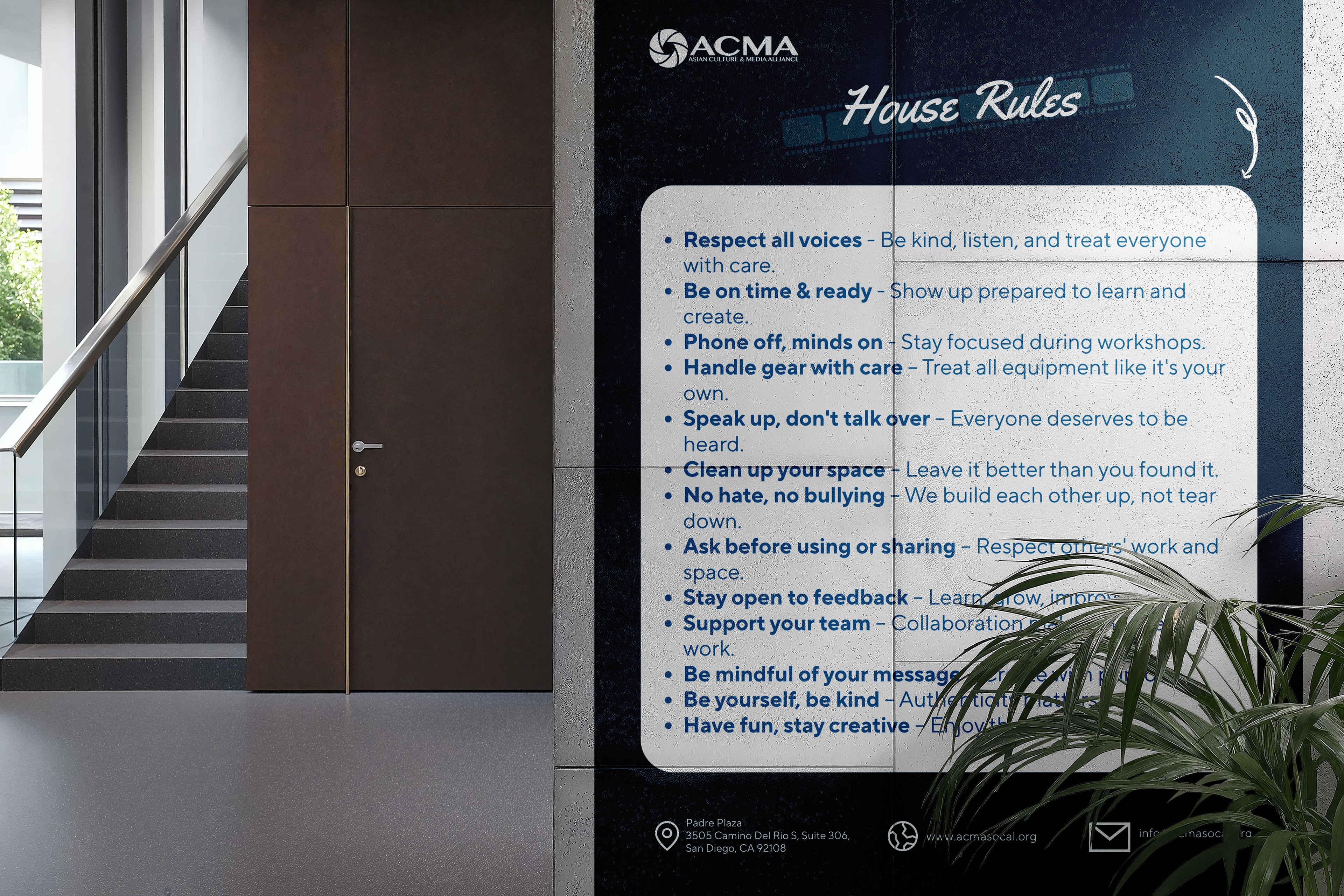
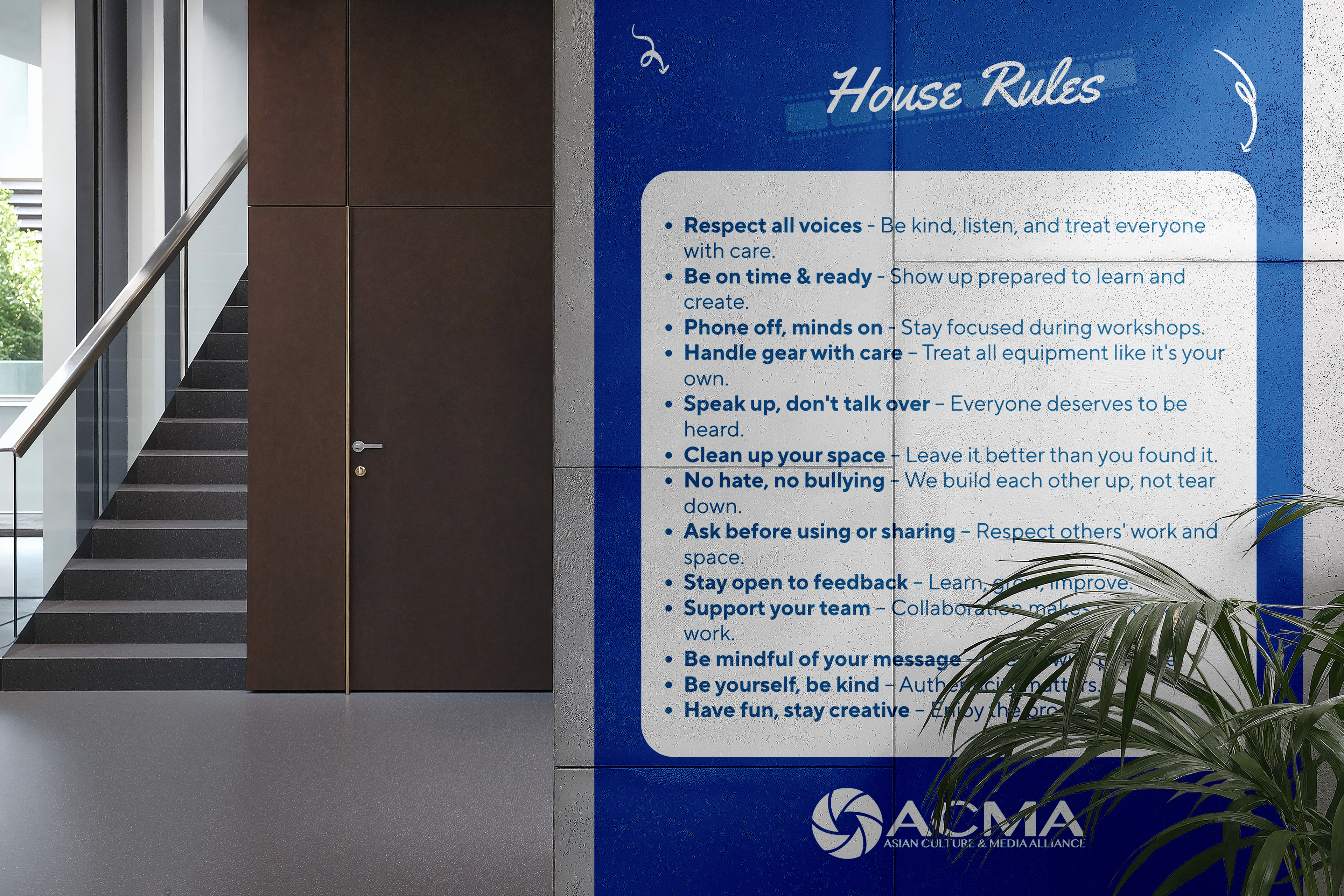
I created these house rules using ACMA's blue branding and a clean, organized layout without any additional images. The clear, straightforward language and bold headings help visitors quickly understand the rules without spending too much time reading. The simple design keeps the information easy to scan while maintaining a professional and welcoming look.
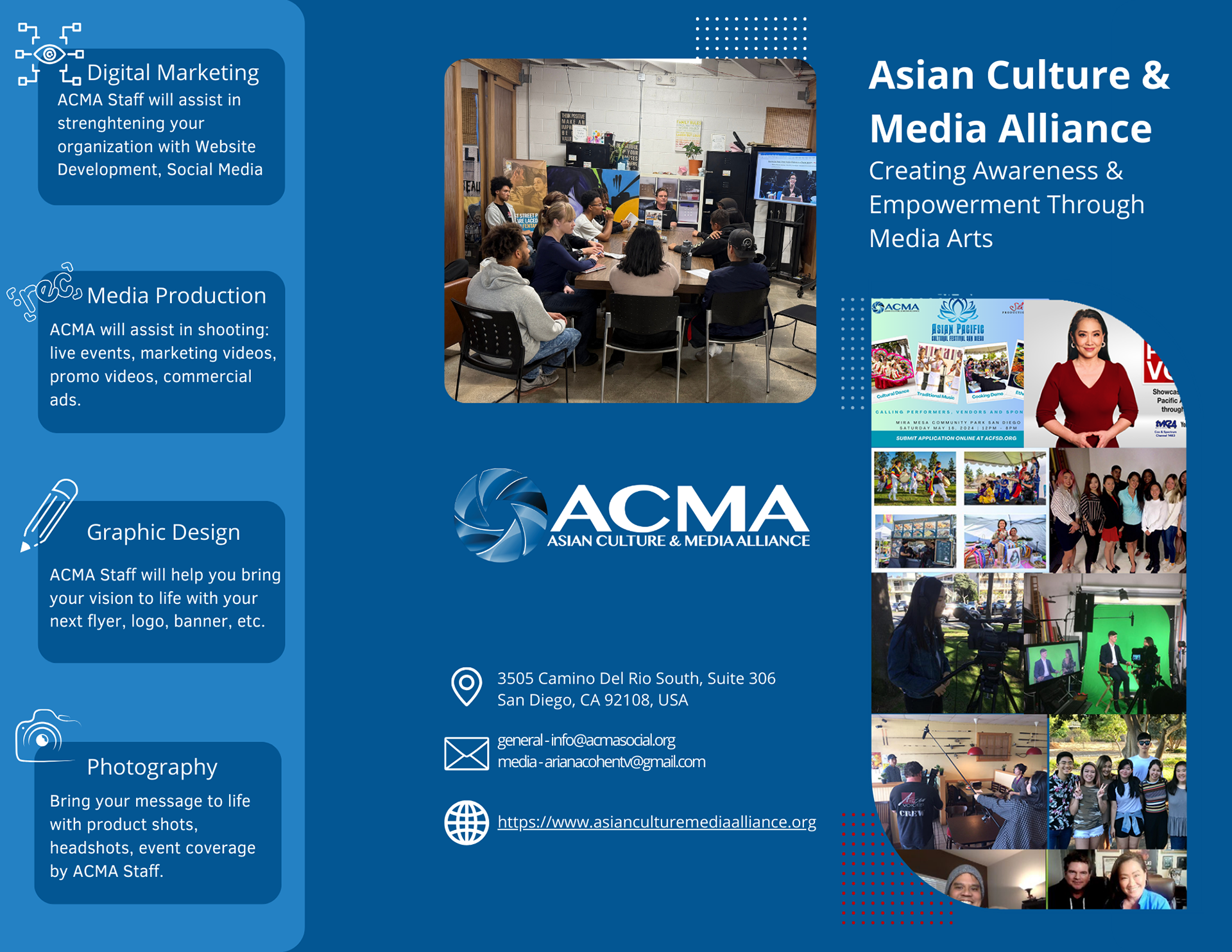
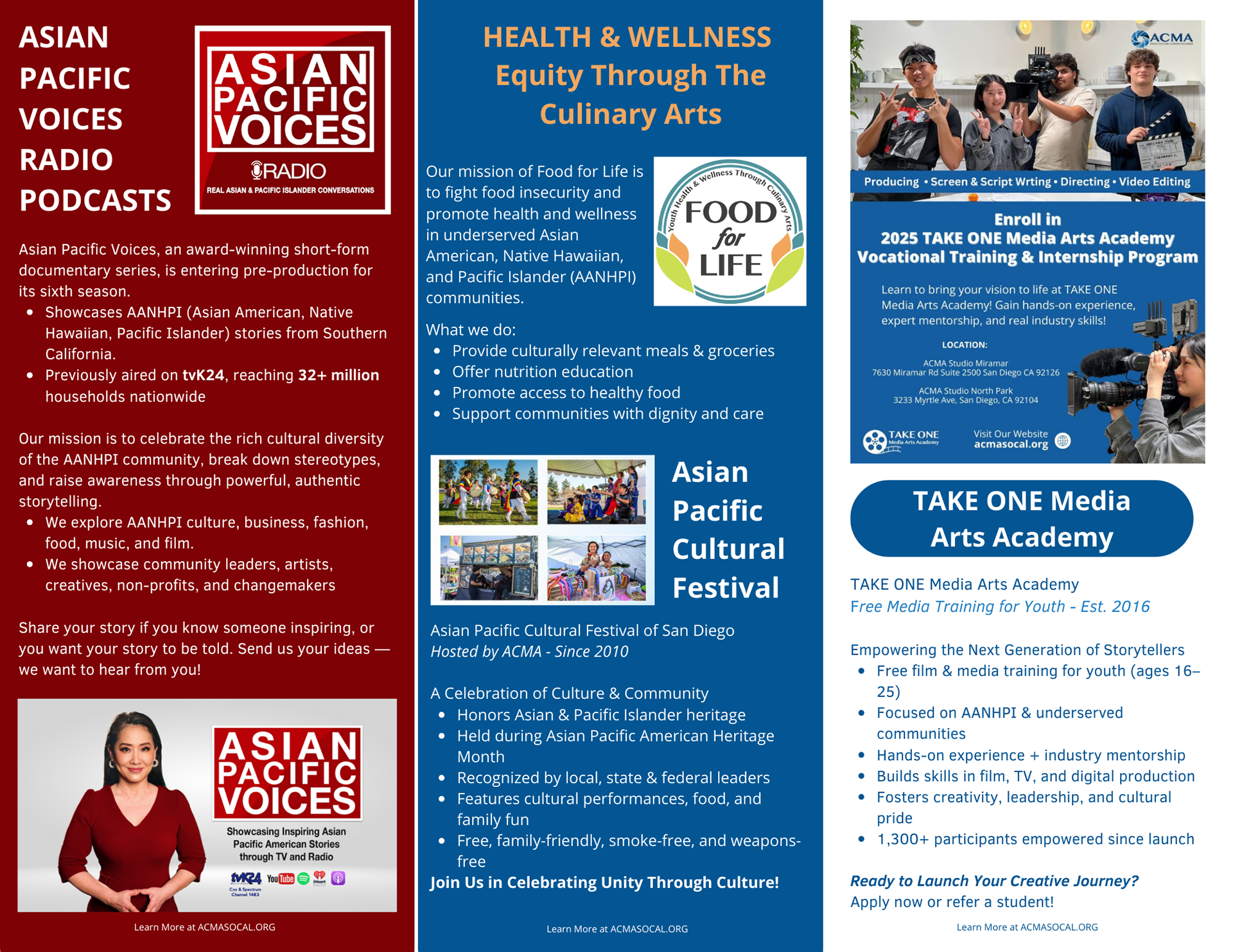
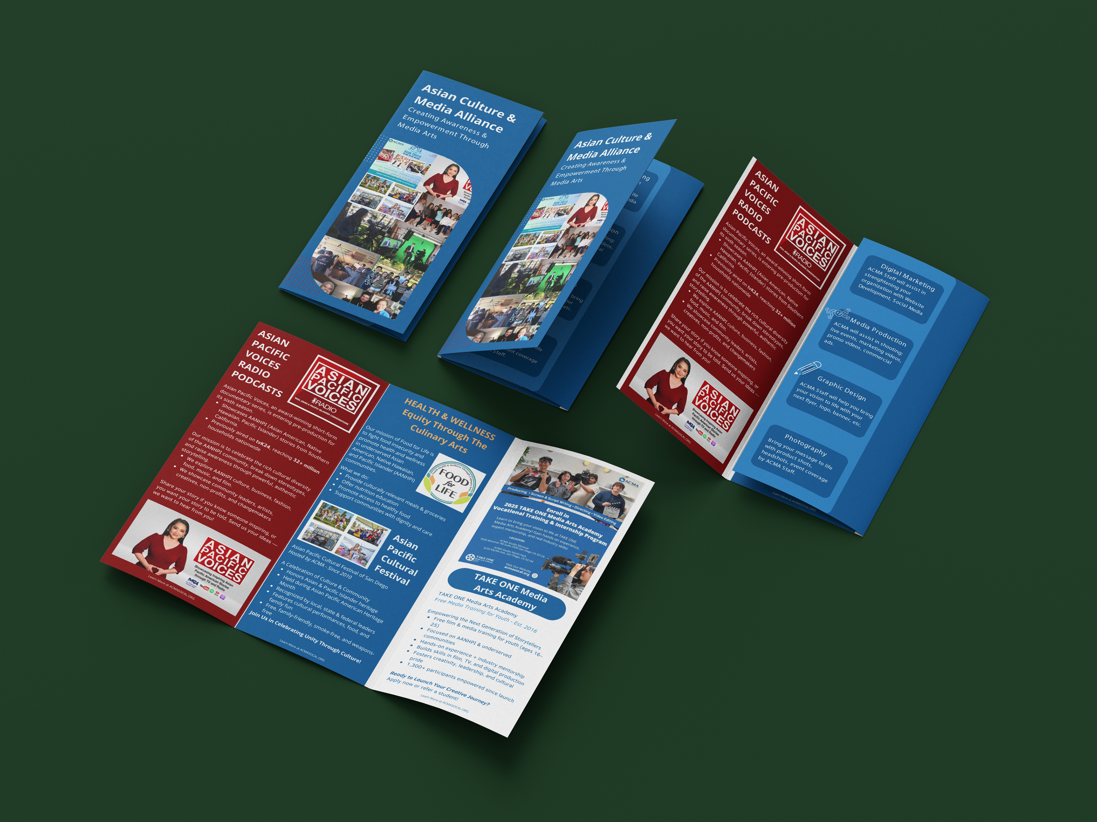
For this tri-fold brochure, I used ACMA's blue branding to create a clean and consistent look, while incorporating red to represent the Asian Pacific Voices Radio & Podcast brand. I organized the content into clear sections, using photos, the logo, and icons to make everything easy to scan. The layout balances text and visuals, helping the audience quickly learn about ACMA's programs and services in an engaging and easy-to-follow way.
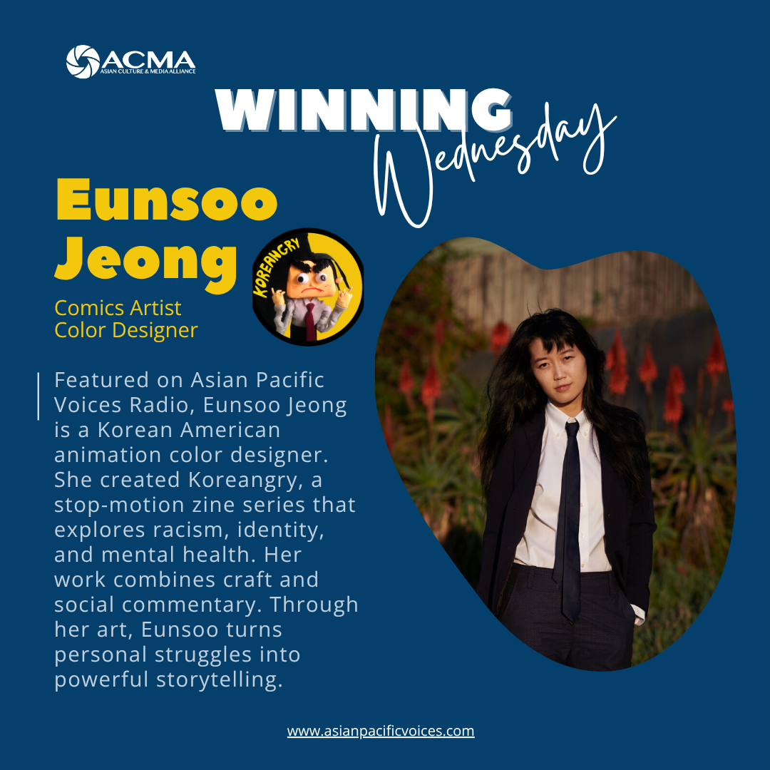
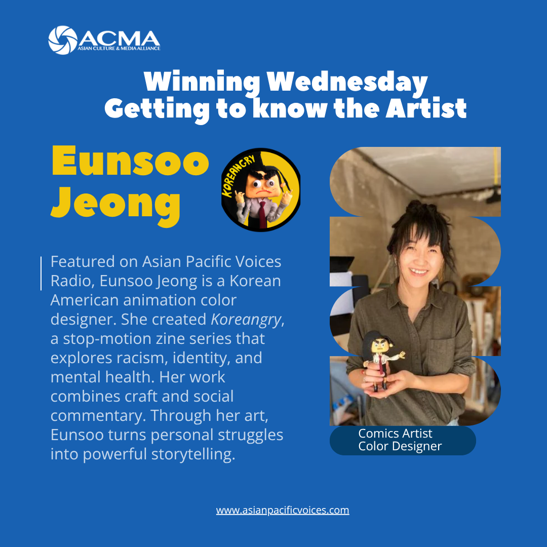
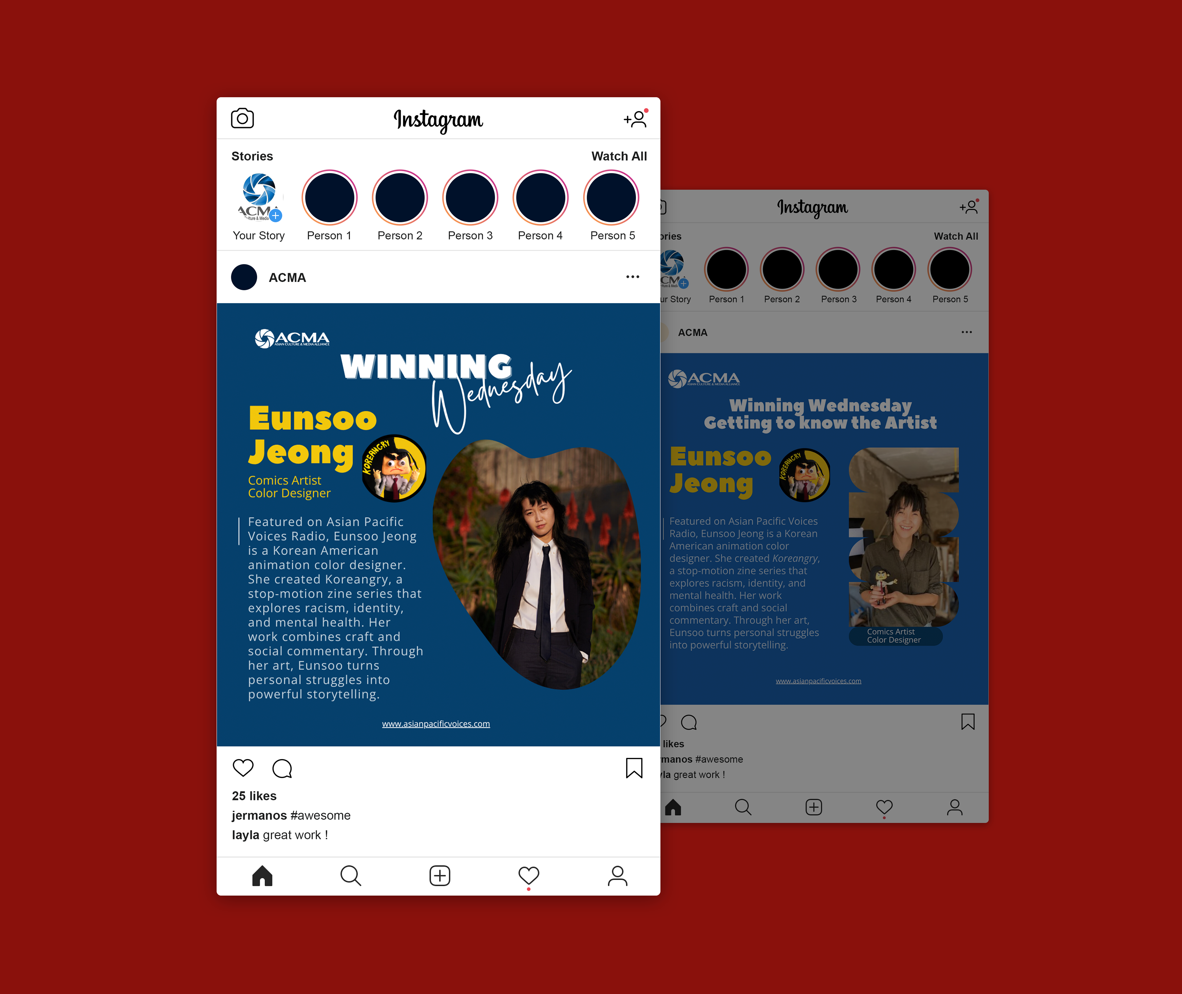
For my fourth task of the week, I created two digital prints from scratch using the company's branding colors and font to maintain a cohesive visual identity. I used the artist's signature color, which is yellow, in the typography to highlight her name and strengthen the connection to her personal brand. The curved picture frames were inspired by the playful and organic style I found in her comics, adding personality and reinforcing the artist's unique visual language.
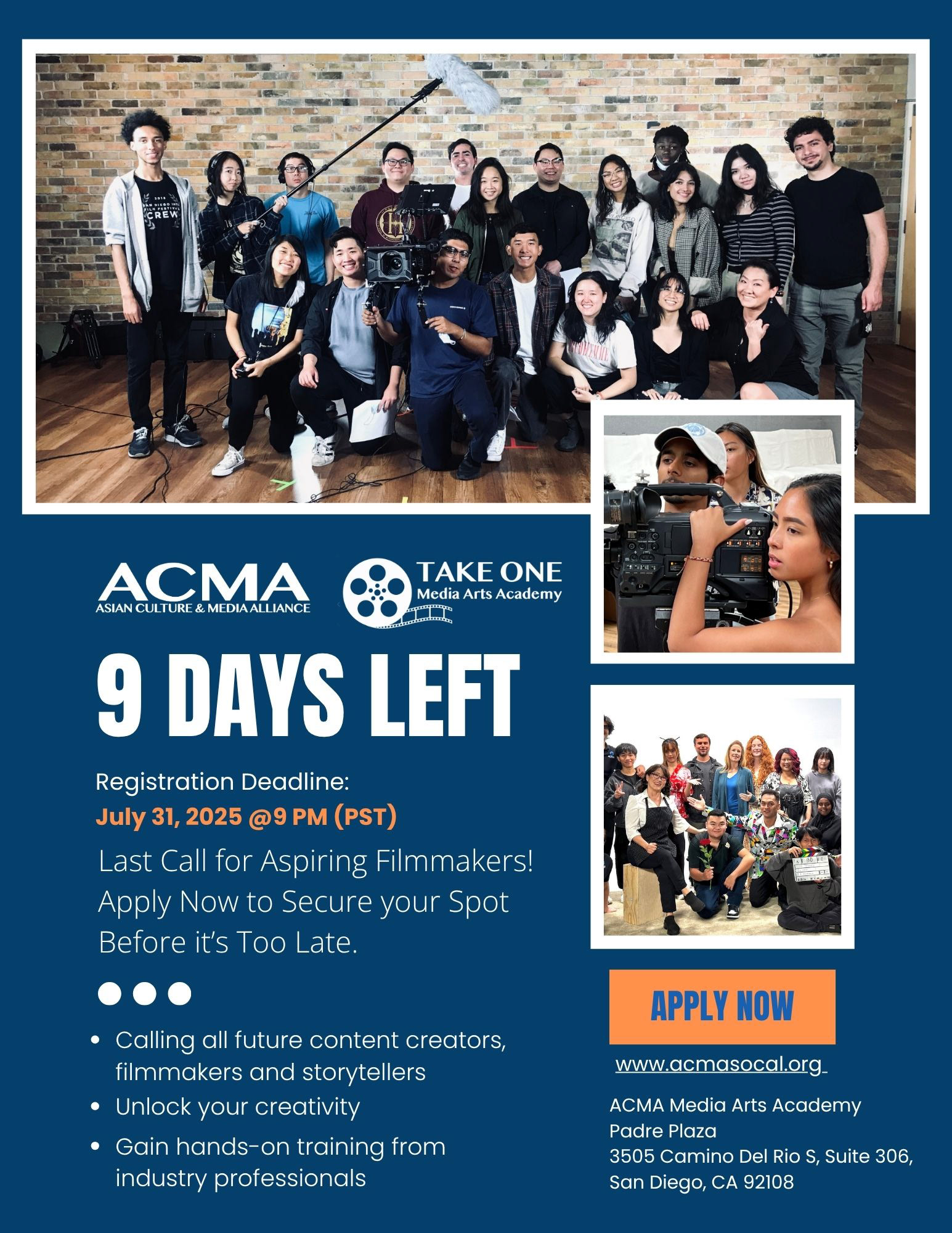
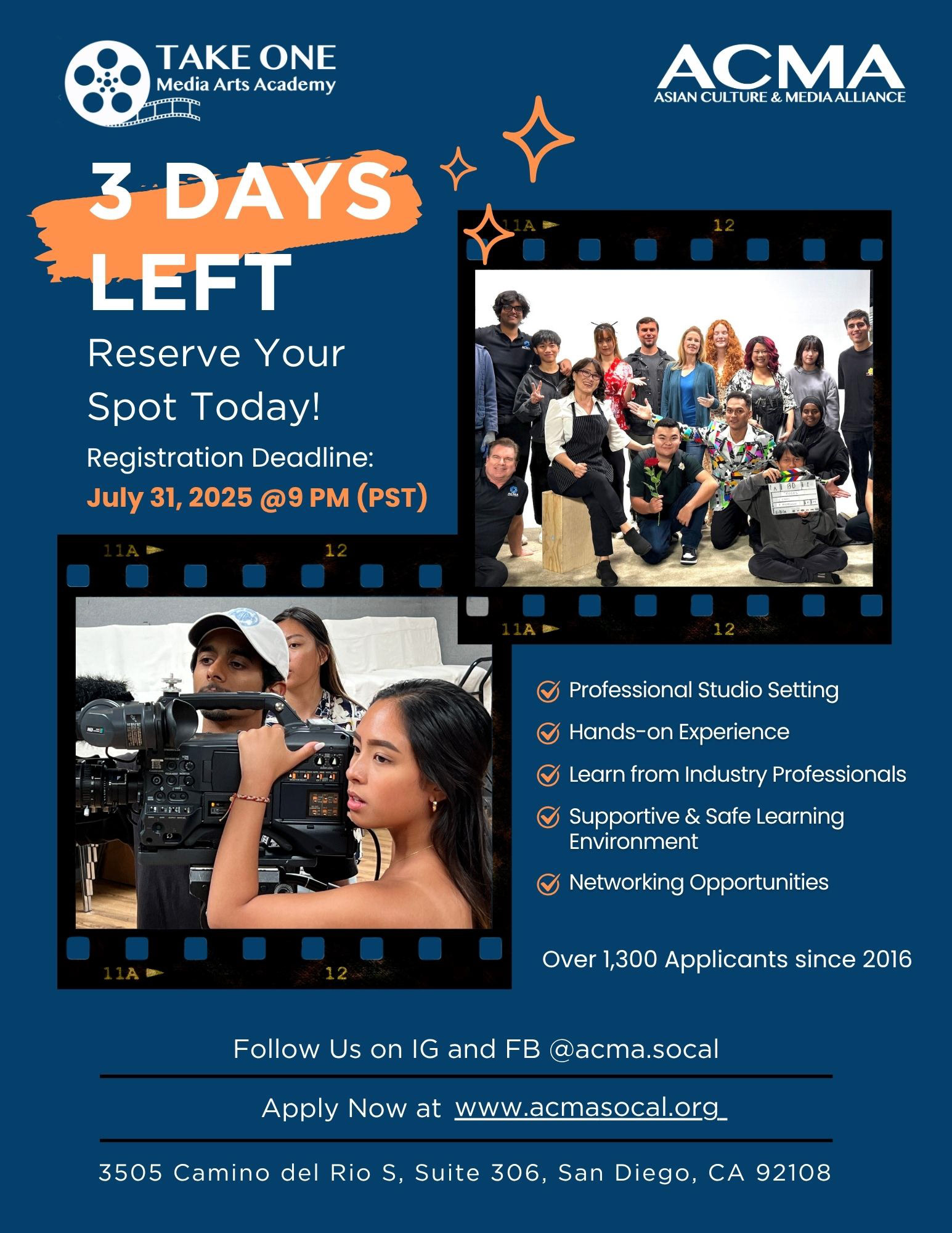
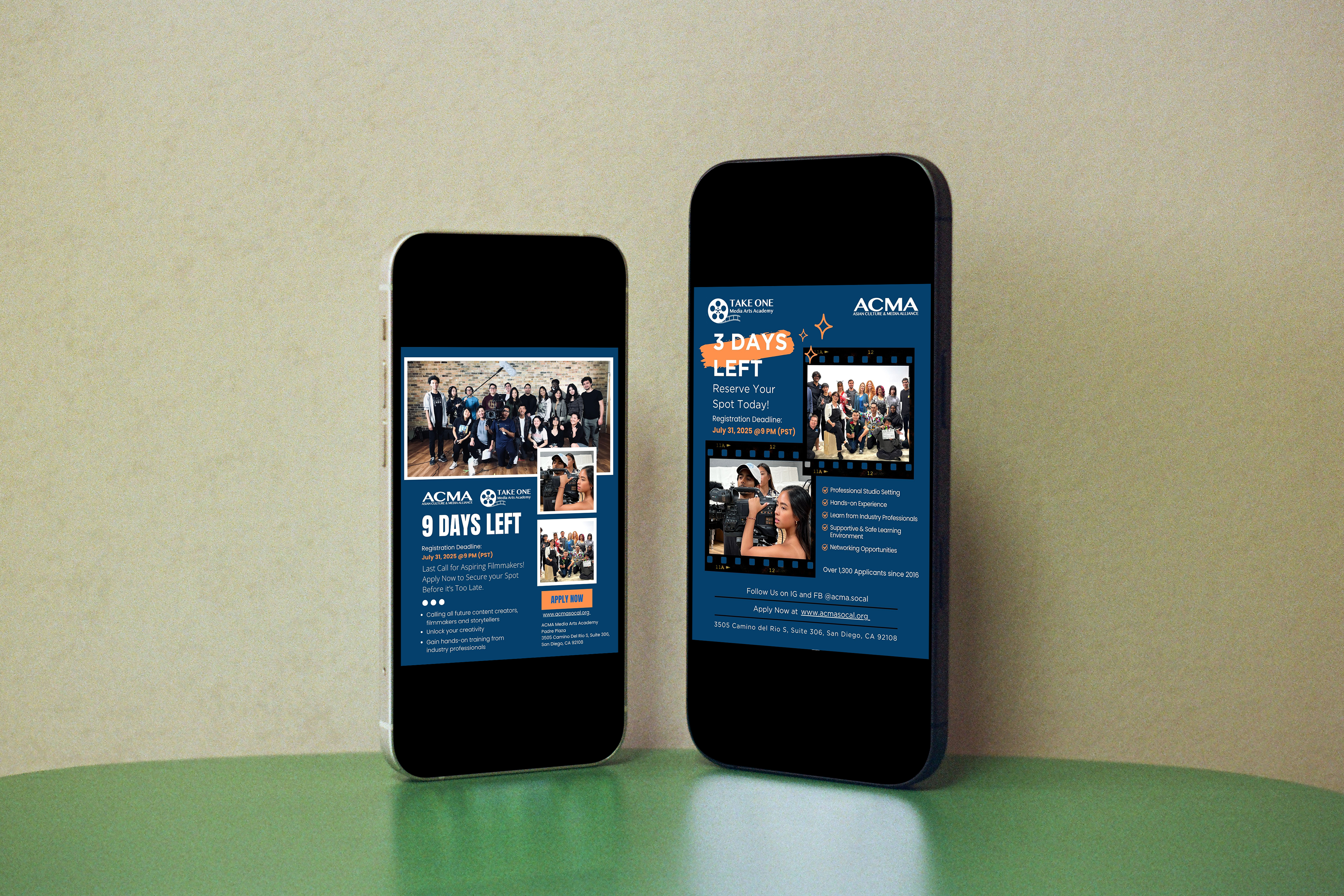
For this project, I designed two digital print advertisements to encourage audiences to register, mainly focusing on teenagers for the Take One Program before the application deadline.
The first design featured a "9 Days Left" message, using white typography against a bold blue background to maximize readability. Orange was used to highlight the application deadline and the "Apply Now" call-to-action button, while supporting information was placed beneath the button to create a clear visual flow that guides the reader's attention.
For the second design, I created a "3 Days Left" version to convey a sense of urgency. I highlighted the "3 Days Left" message with an orange marker-style underline and used orange again to highlight the deadline. I also organized the layout and used white text on the blue background, and simple information allowed audiences to understand the message and focus on the call-to-action.
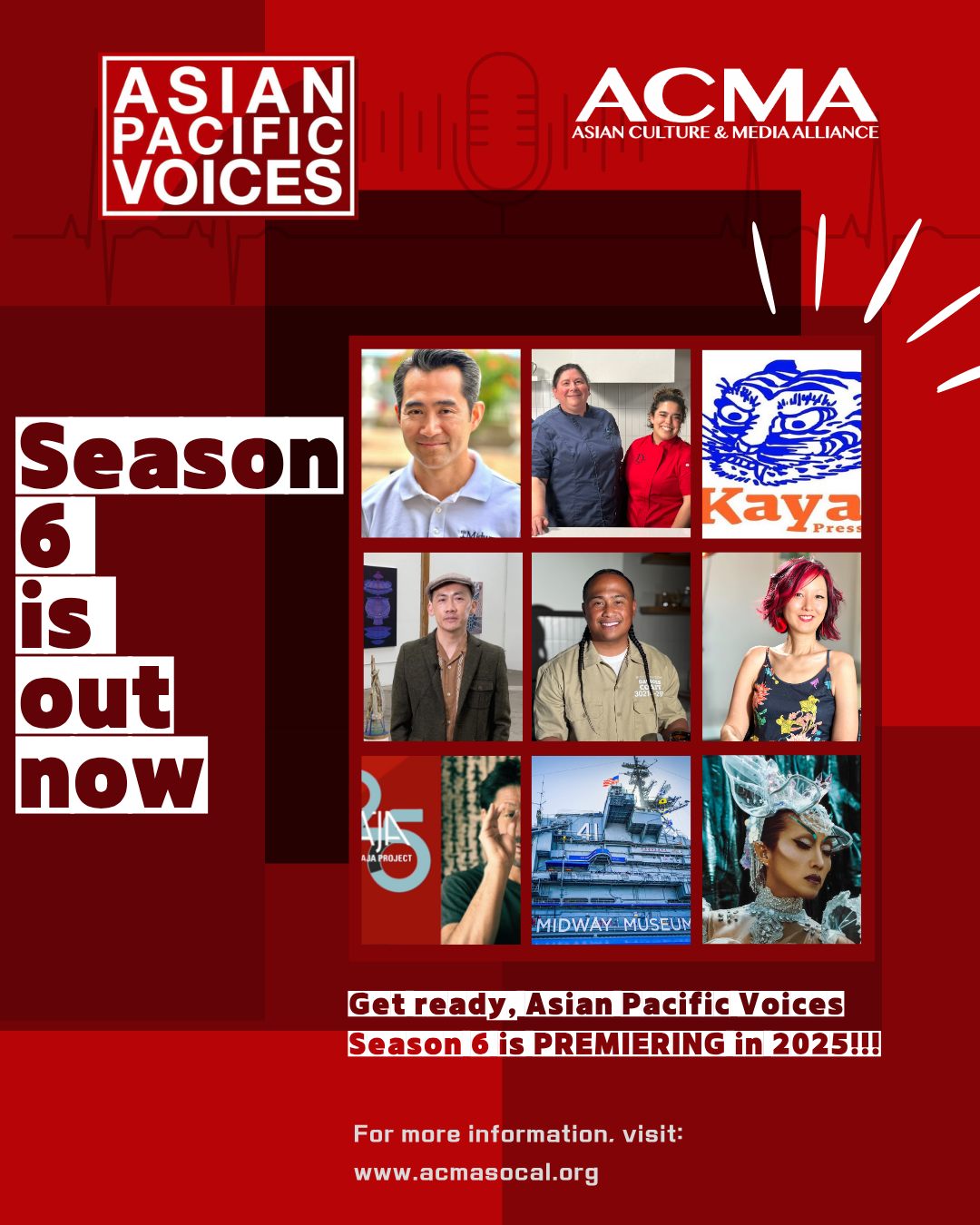
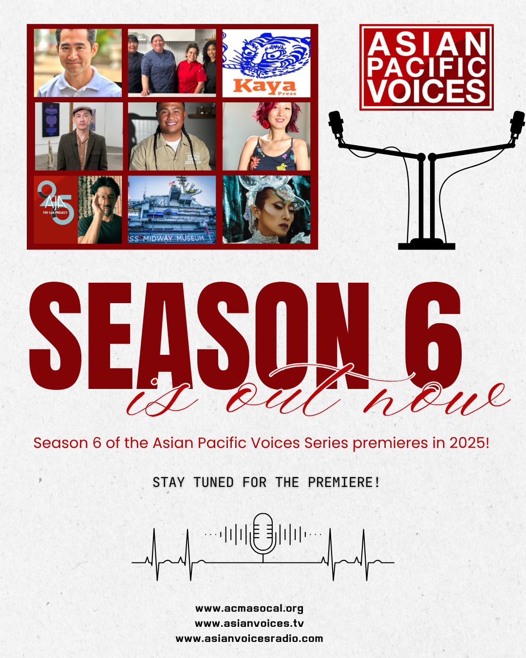
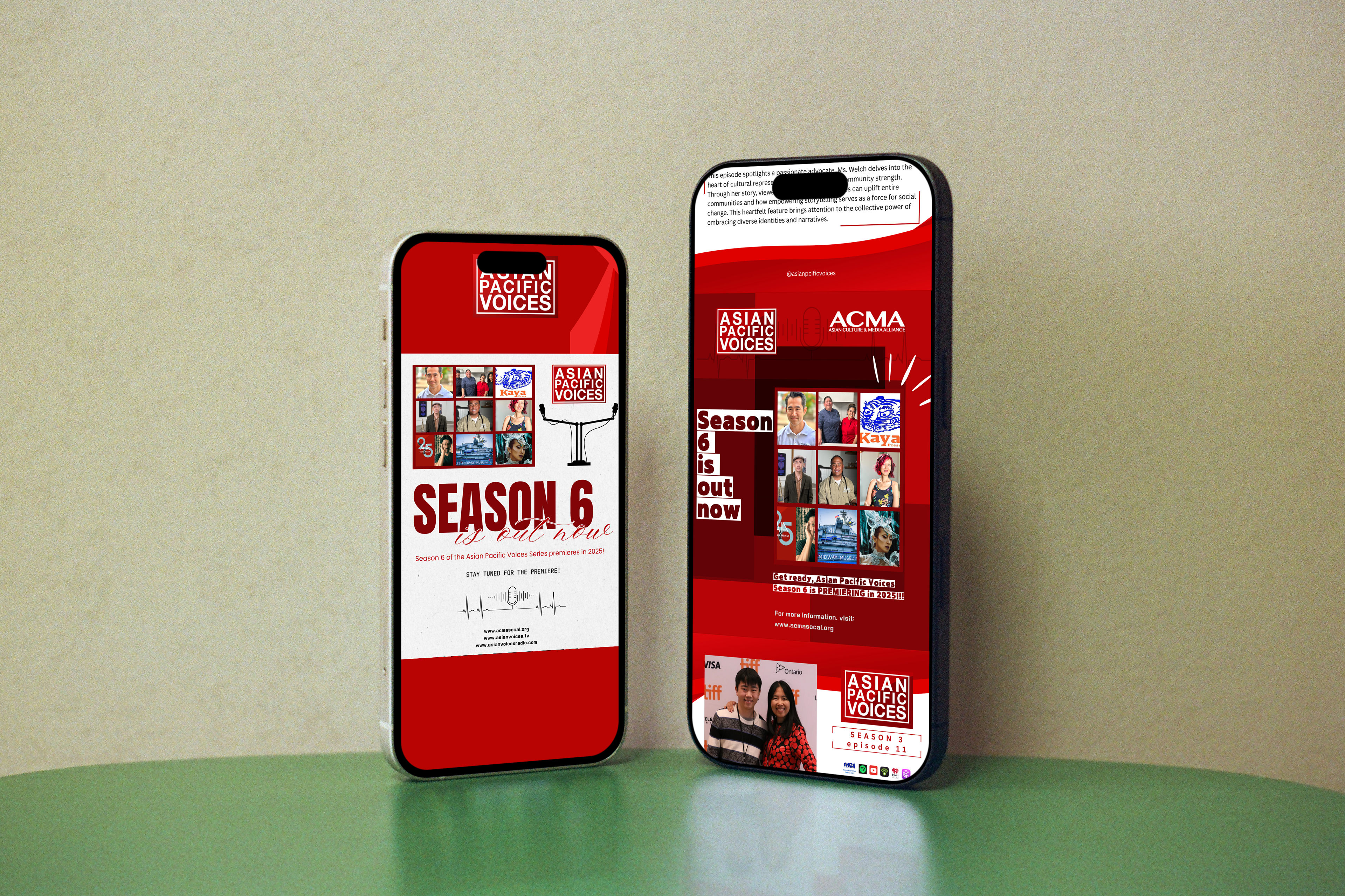
During my internship, Season 6 of Asian Pacific Voices was being released. The program highlights the stories, culture, and achievements of AANHPI communities through television and digital media. For the posters, I featured all of the Season 6 guests so the audience could see who would be shown. To keep the design clean and easy to read, I used two typefaces for each poster and a limited color palette, allowing the guests' photos and information to stand out.
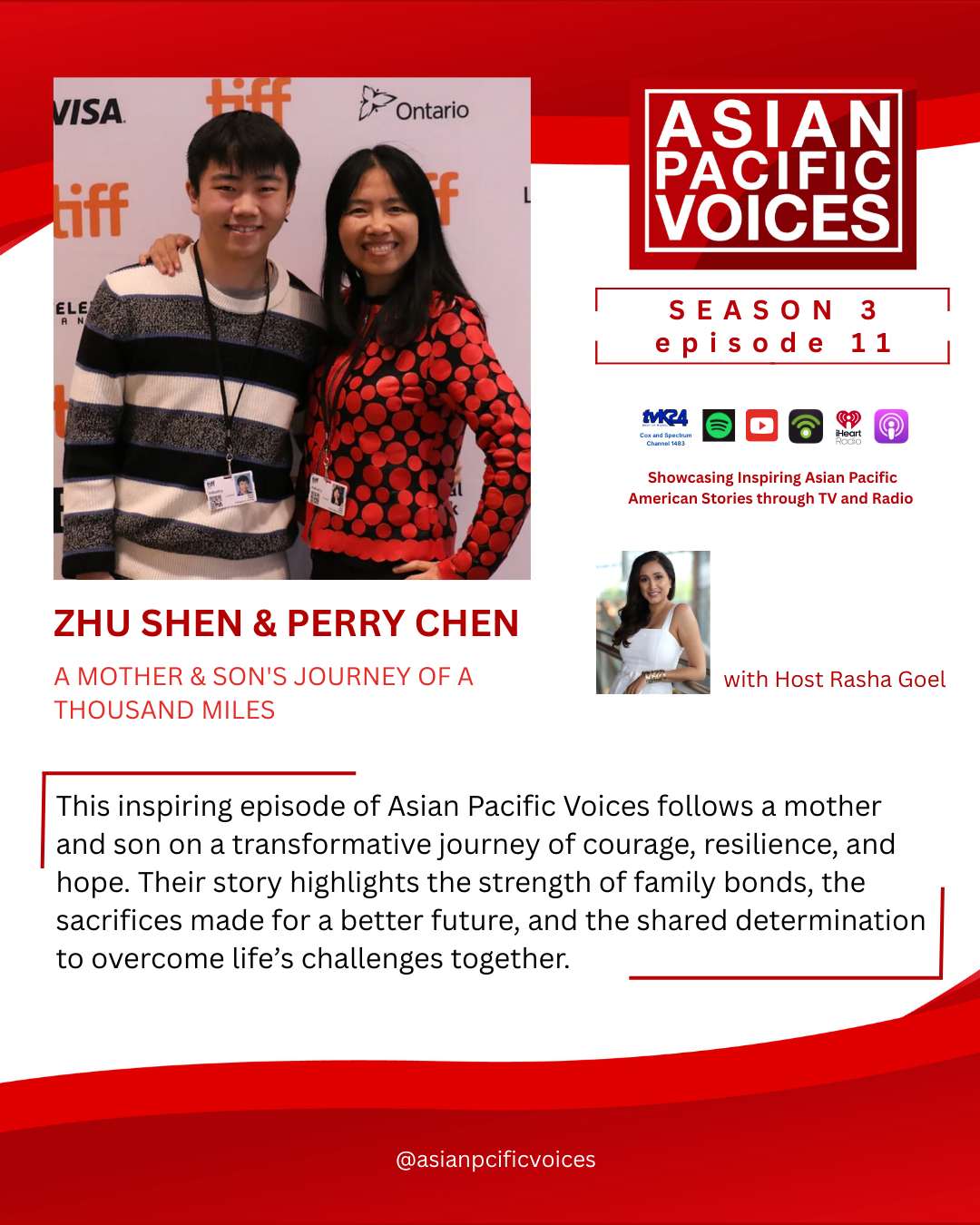
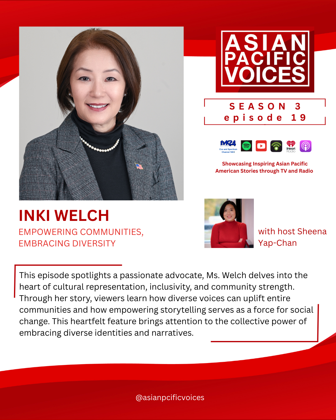
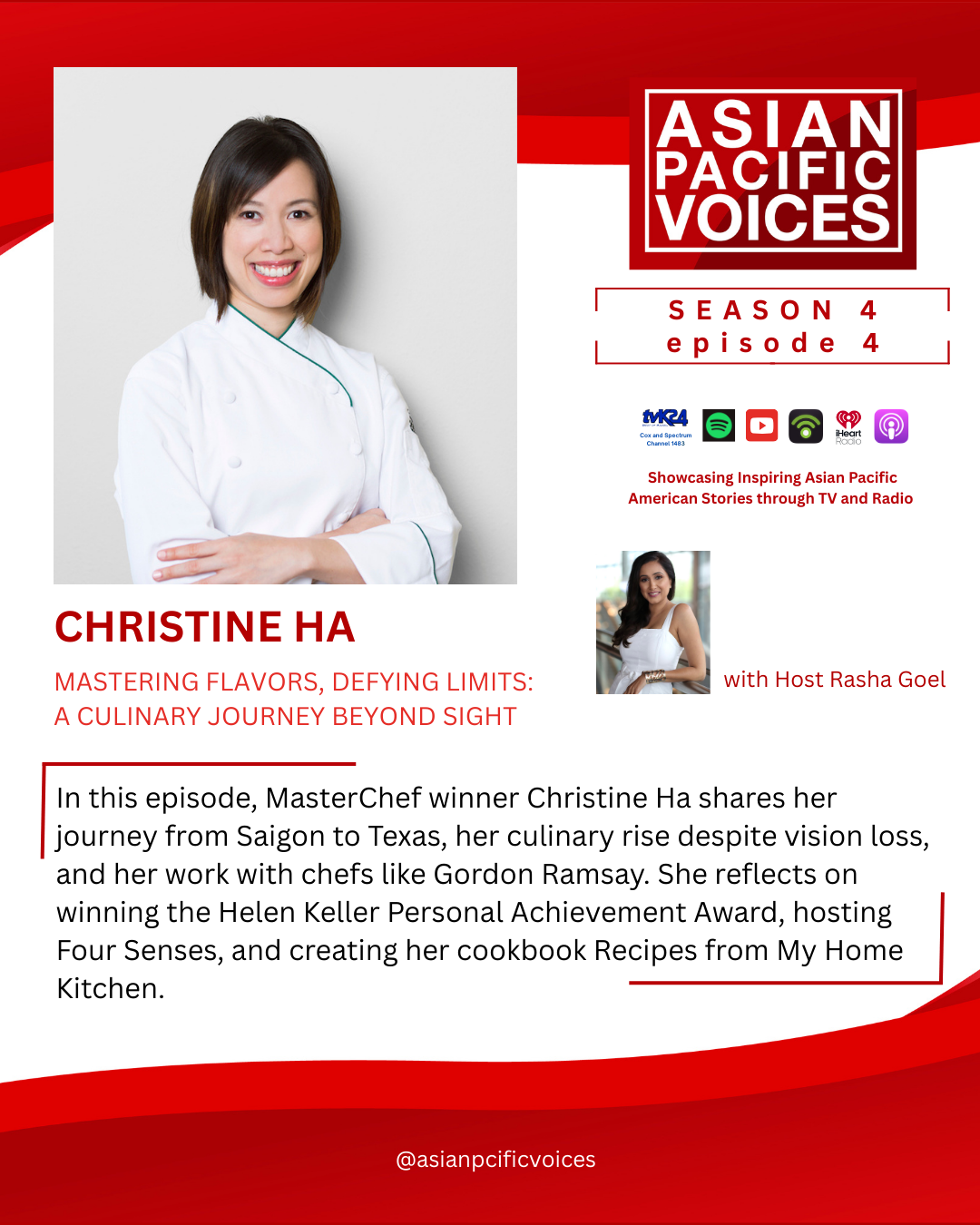
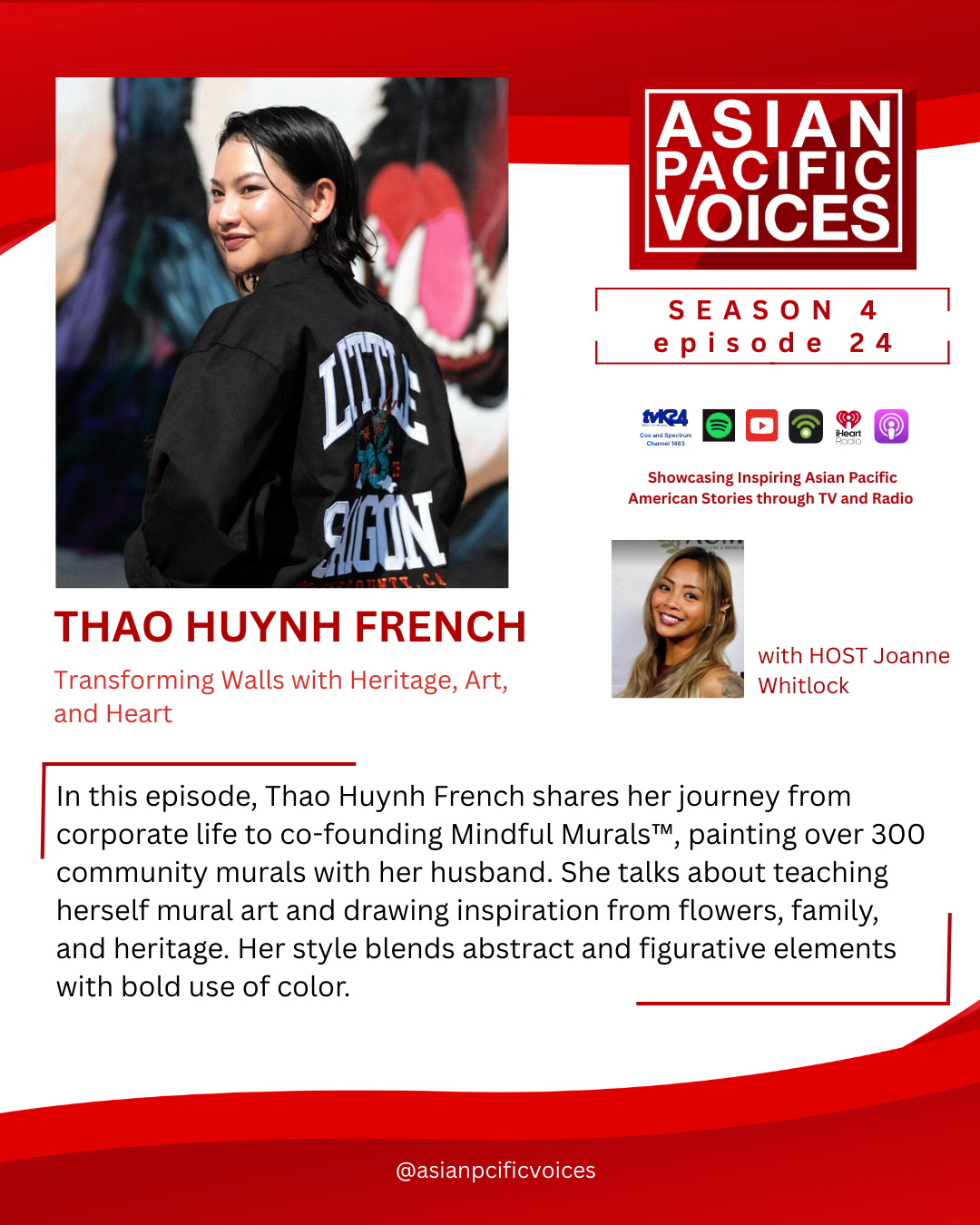
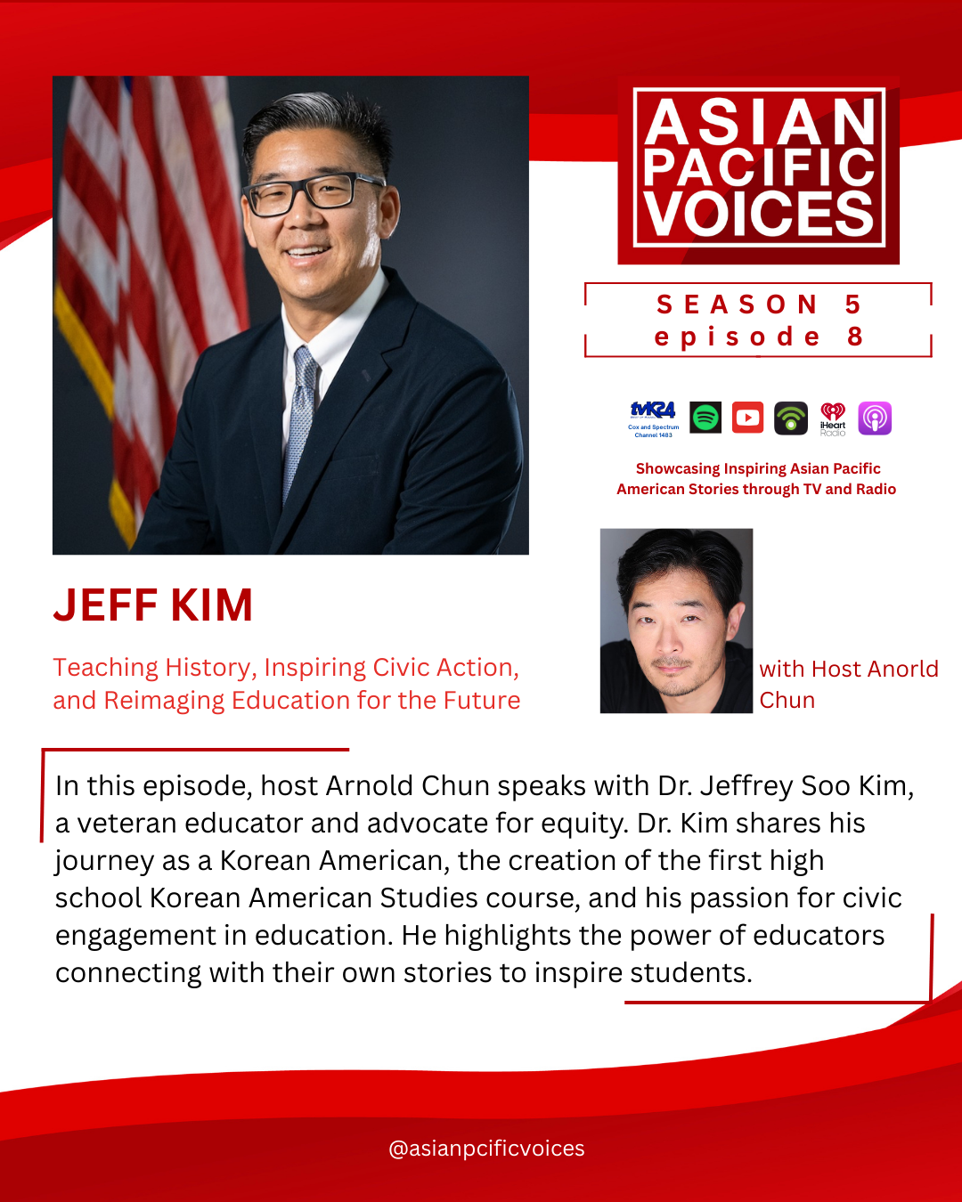
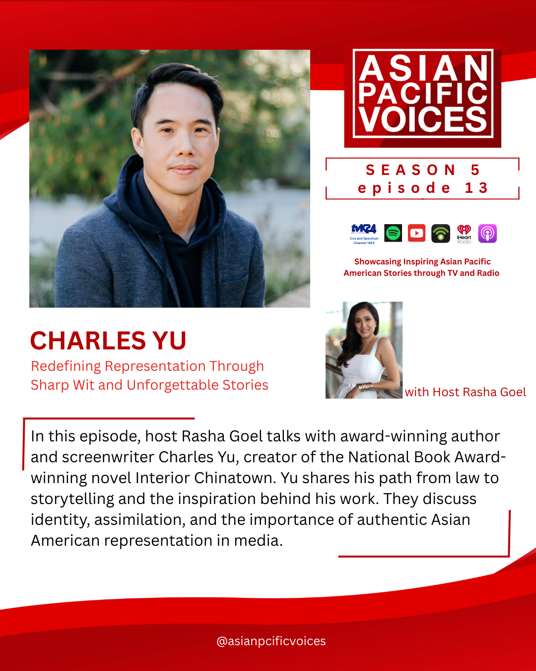
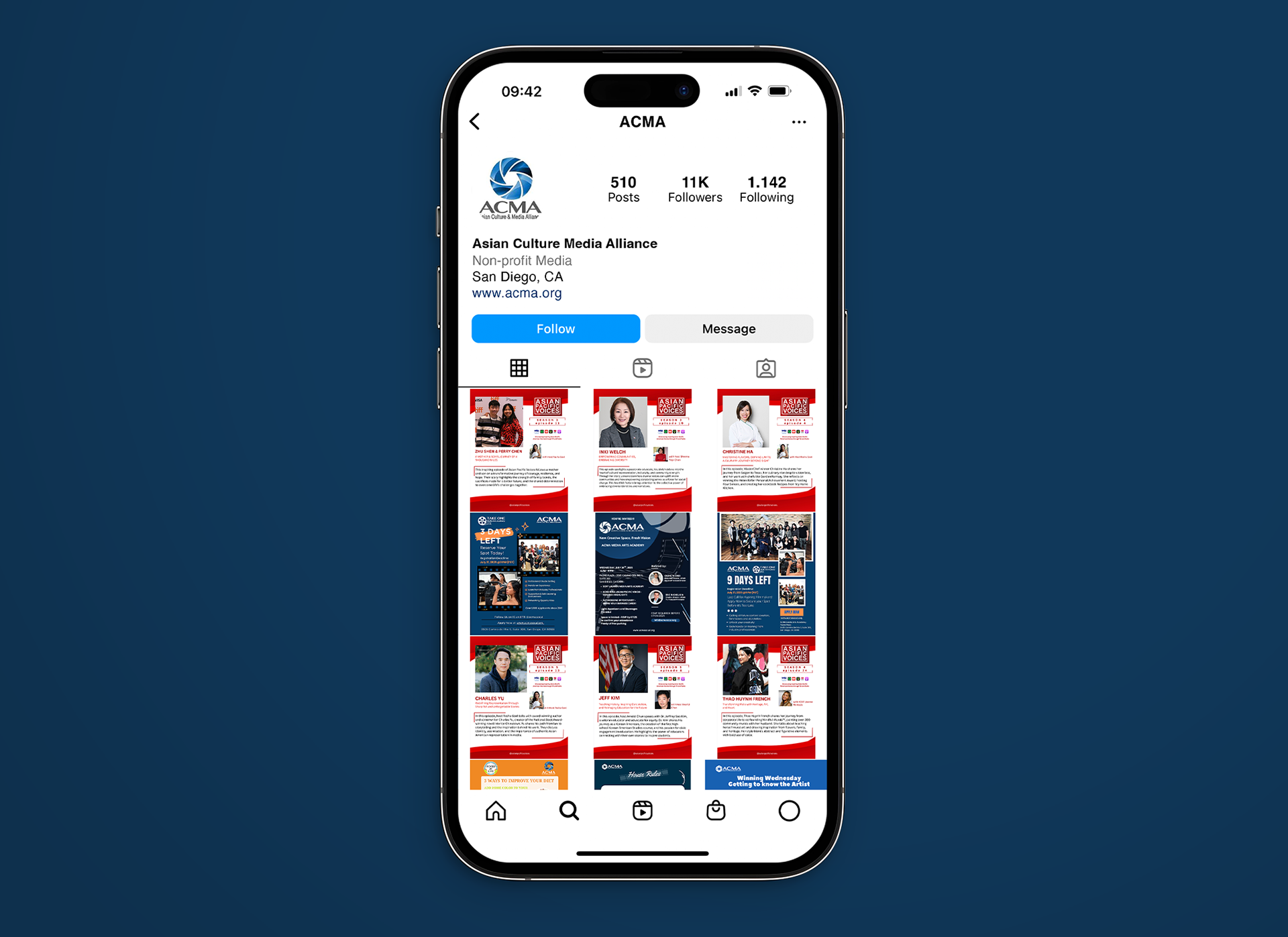
For this task, I assist the marketing team by creating promotional graphics featuring guests who appeared on Asian Pacific Voices. Using the company design template, I researched each guest's background and selected photos to create engaging and informative social media graphics. I applied the brand's red and white color palette to maintain visual consistency across the campaign while making sure each design highlighted the featured guests.
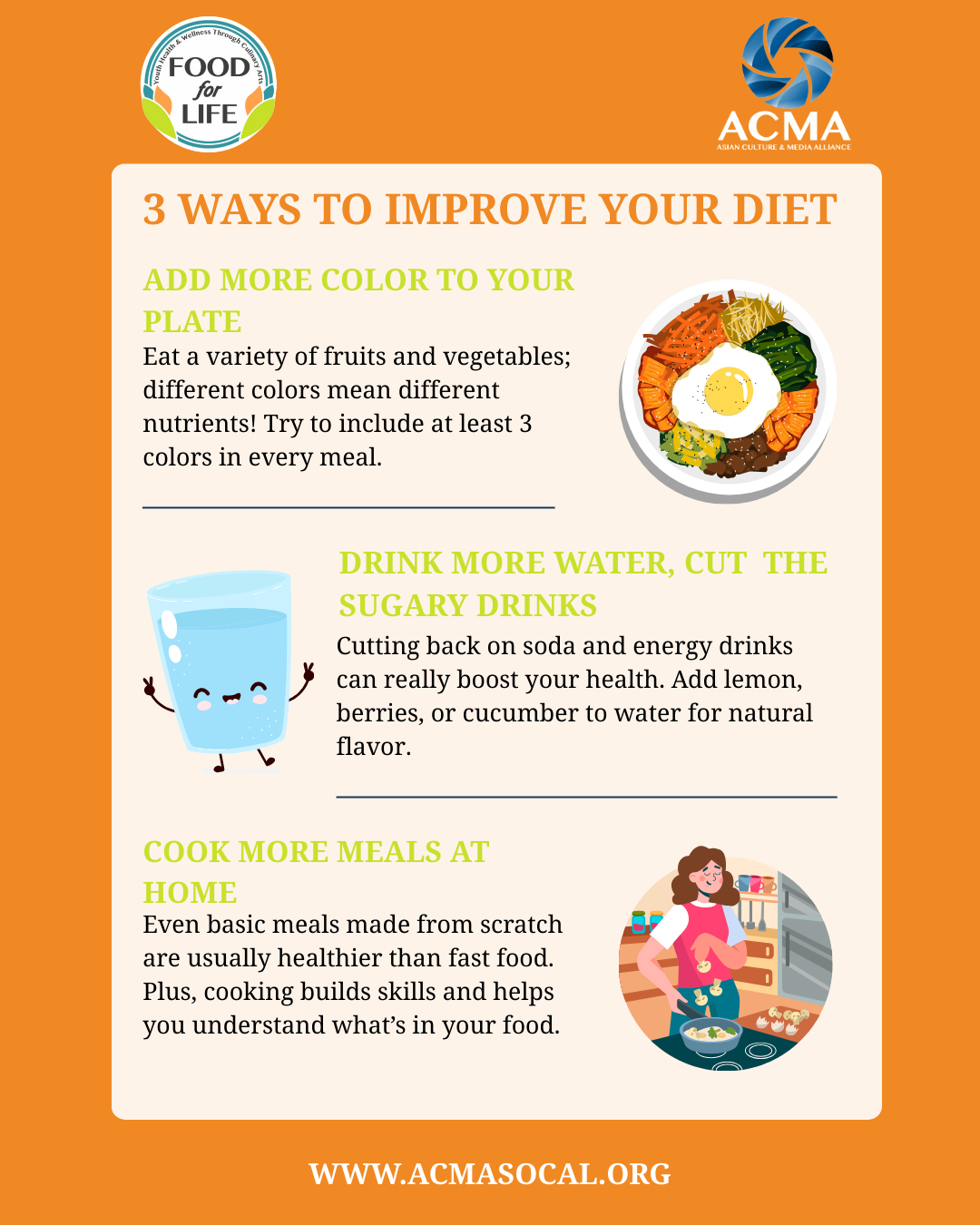
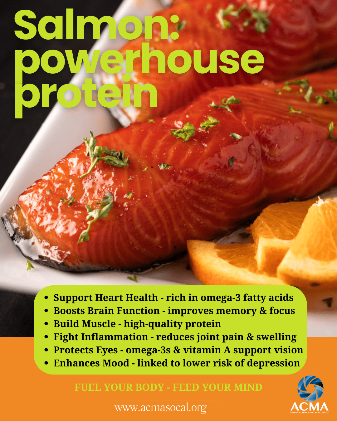
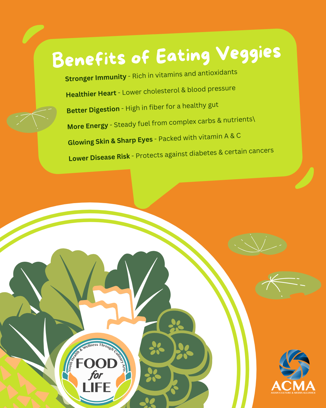
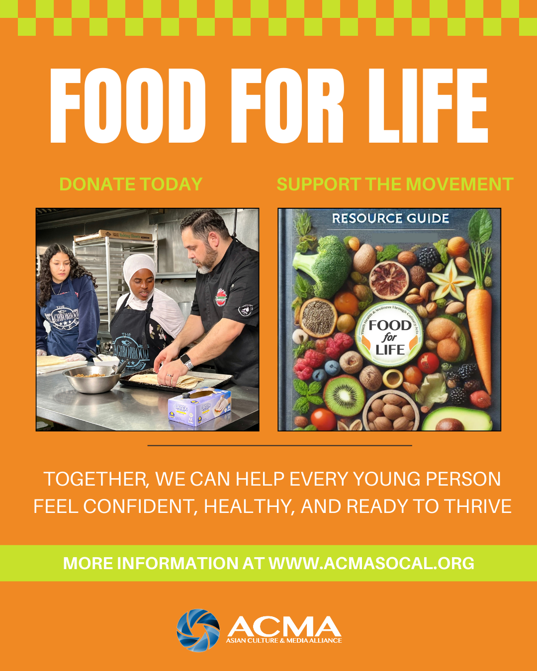
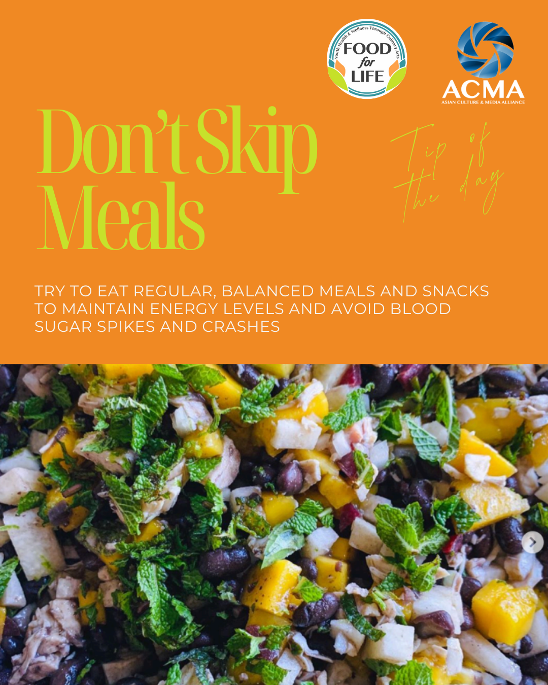
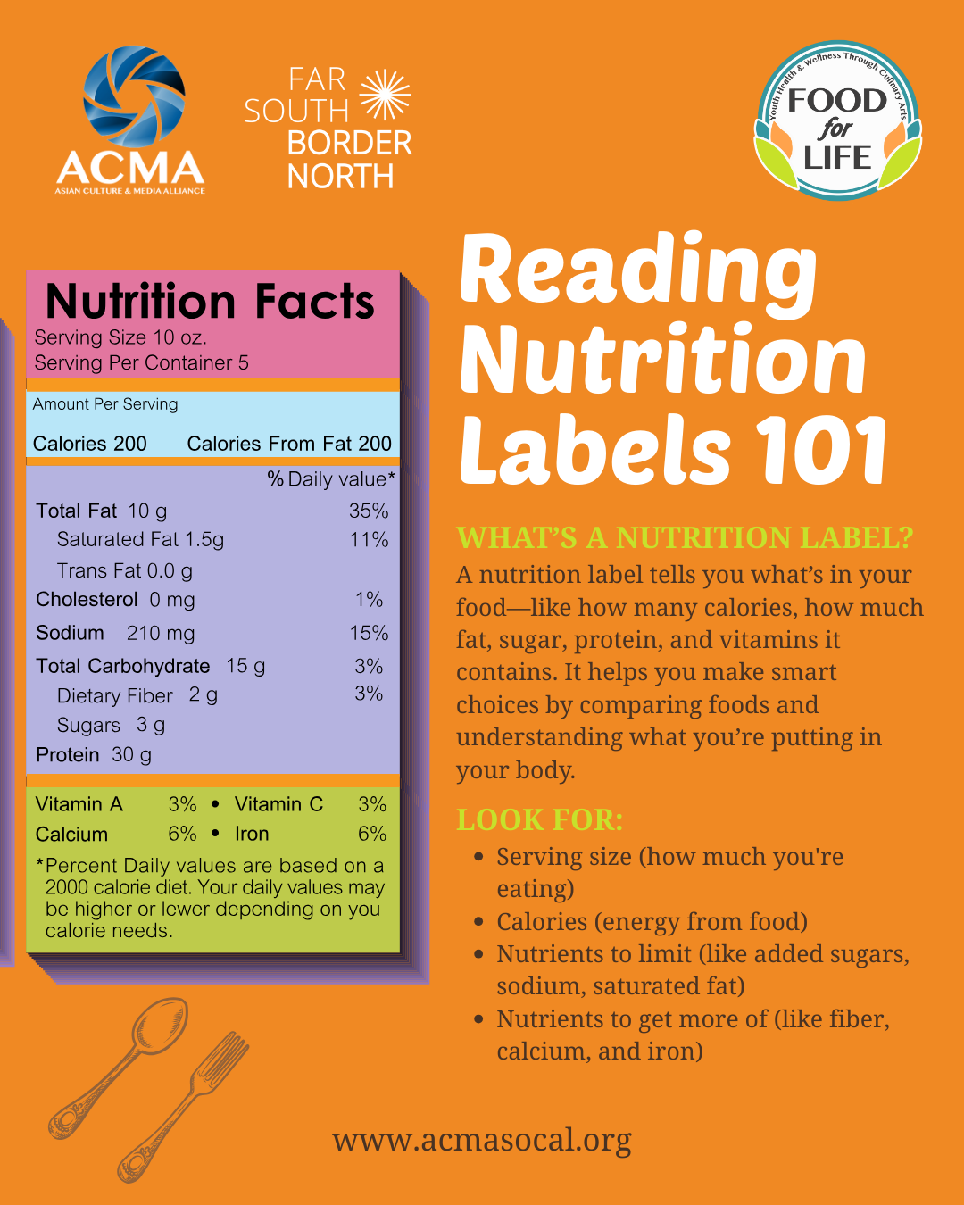
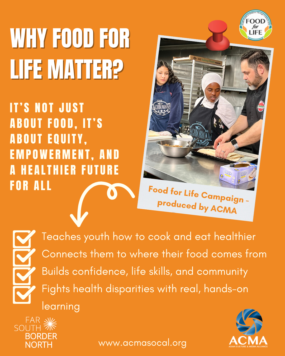
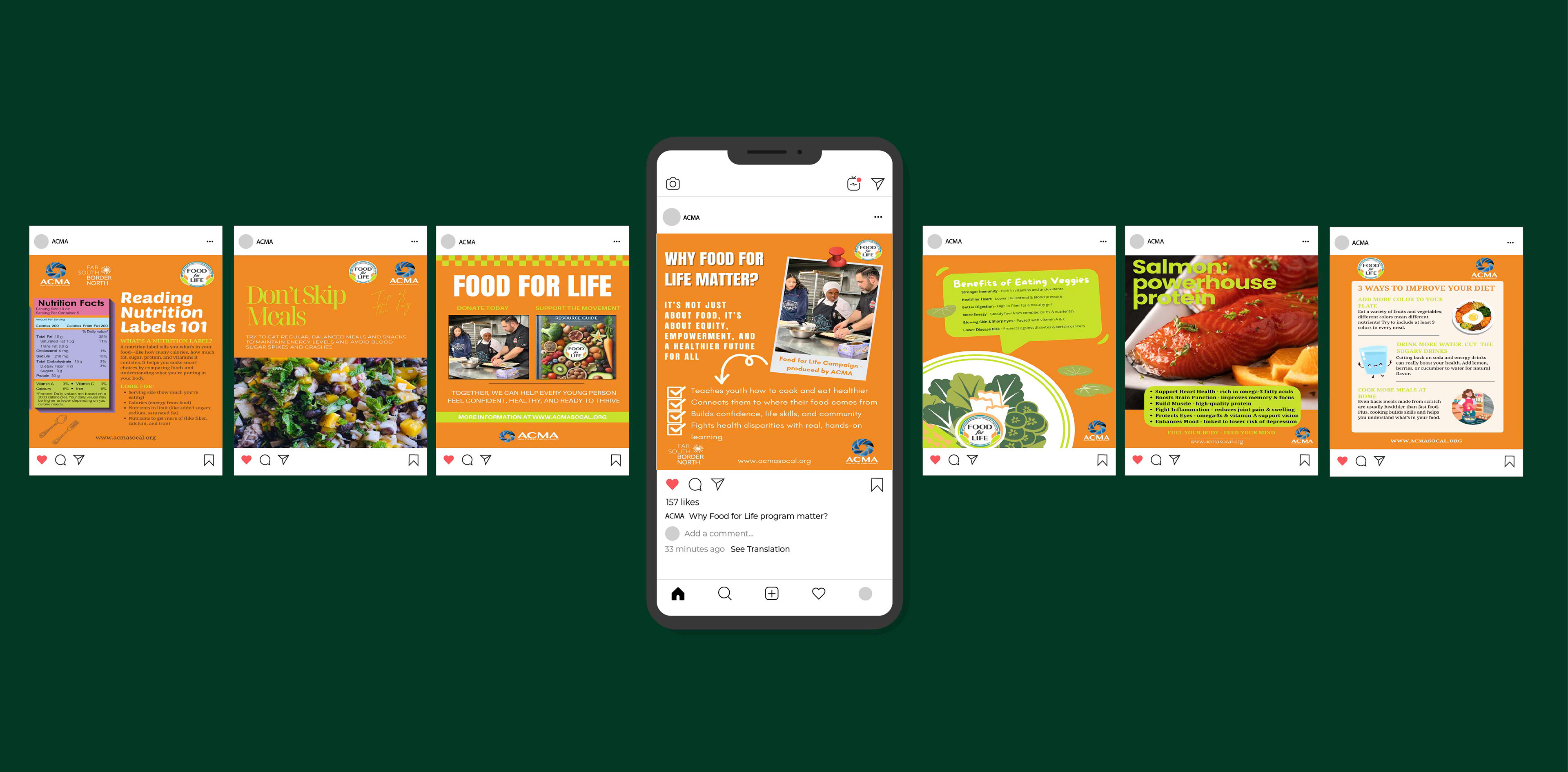
For the Food For Life project, I designed a series of educational posters promoting healthy eating and nutrition awareness. The campaign covered topics such as the importance of real foods, how to read nutrition labels, healthy food facts, and the ways food affects the human body.
To create the cohesive visual identity, I used the program's brand colors, which are orange and green, with white typography to ensure strong contrast and readability. Each poster was designed with a clear information hierarchy, making complex health topics easy to understand while maintaining a consistent and engaging visual style throughout the series.
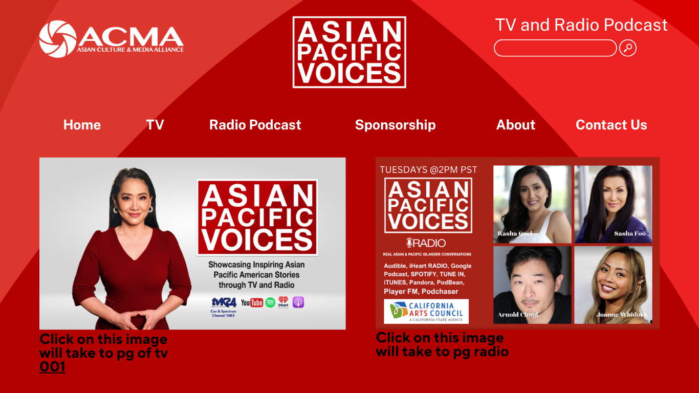
Home Page - Page 1
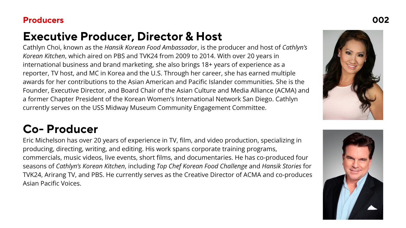
Introduce the Producers - Page 2
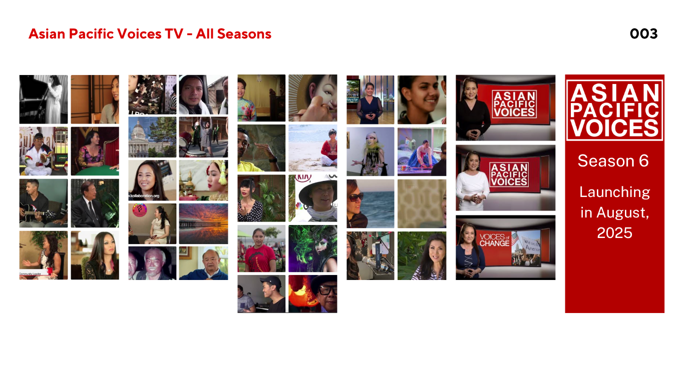
Asian Pacific Voices TV All Seasons 1/2 - Page 3
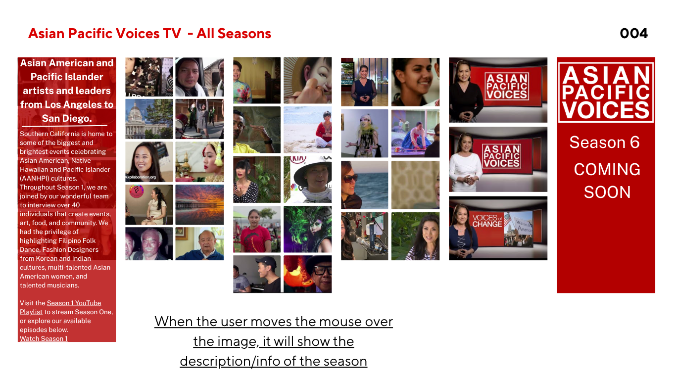
Asian Pacific Voices TV All Seasons 2/2 - Page 4
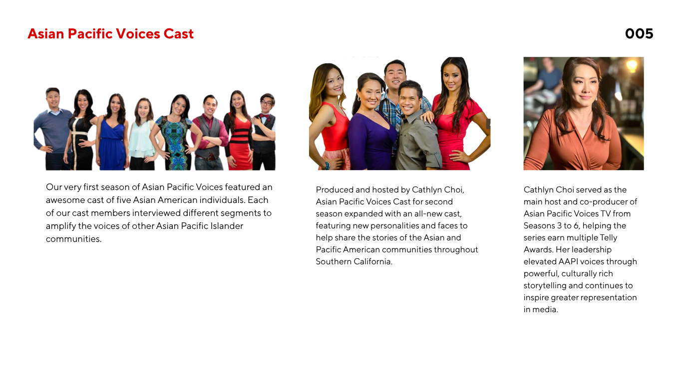
Asian Pacific Voices TV Cast - Page 5
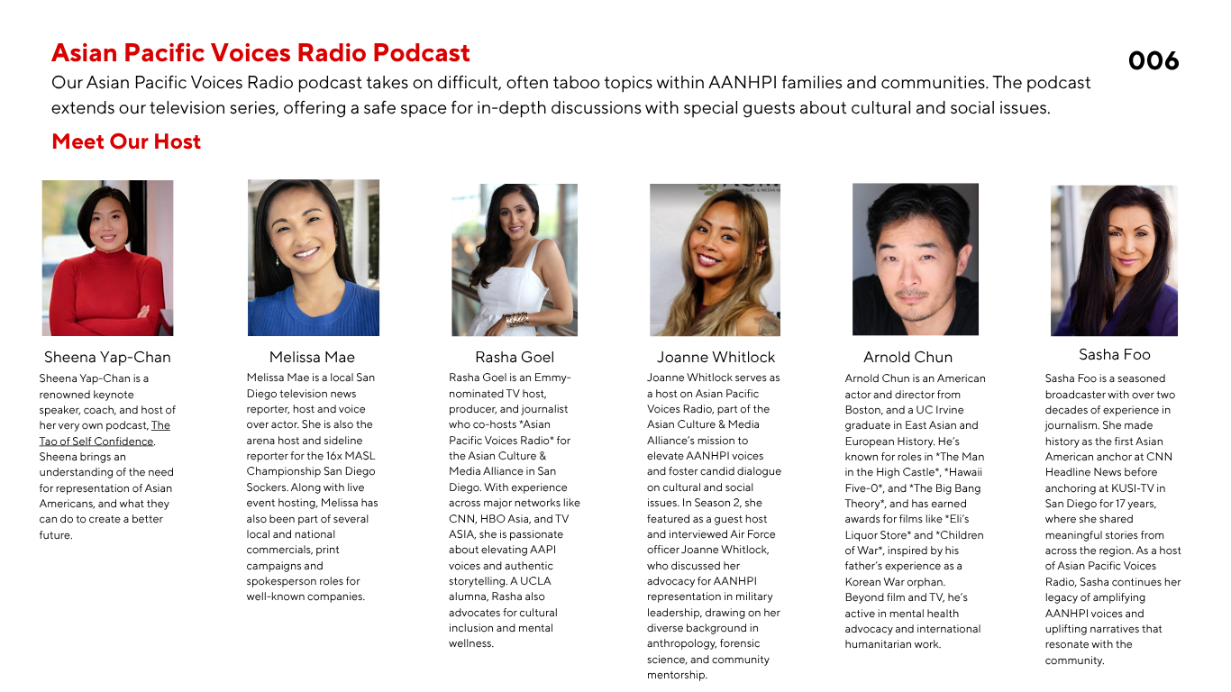
Asian Pacific Voices Radio Podcast - Page 6
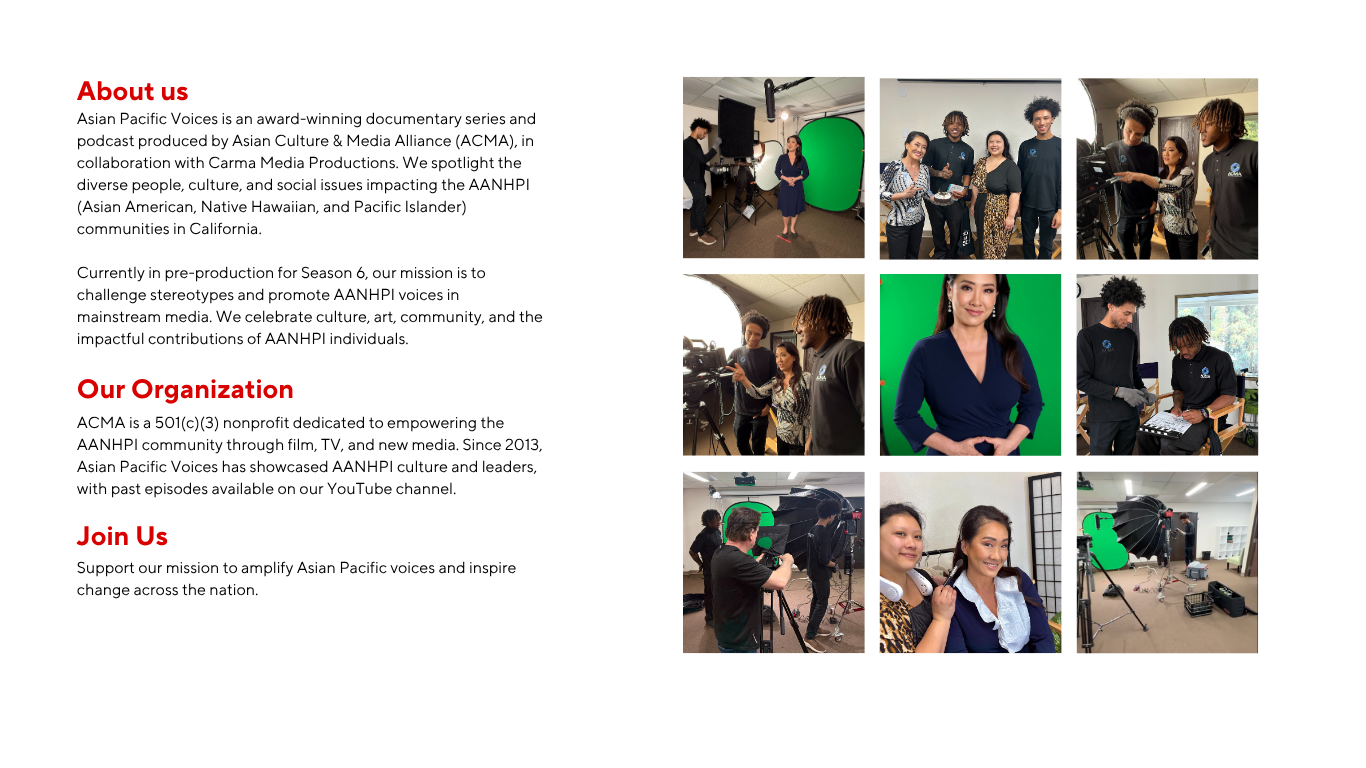
Other Infos - Page 7
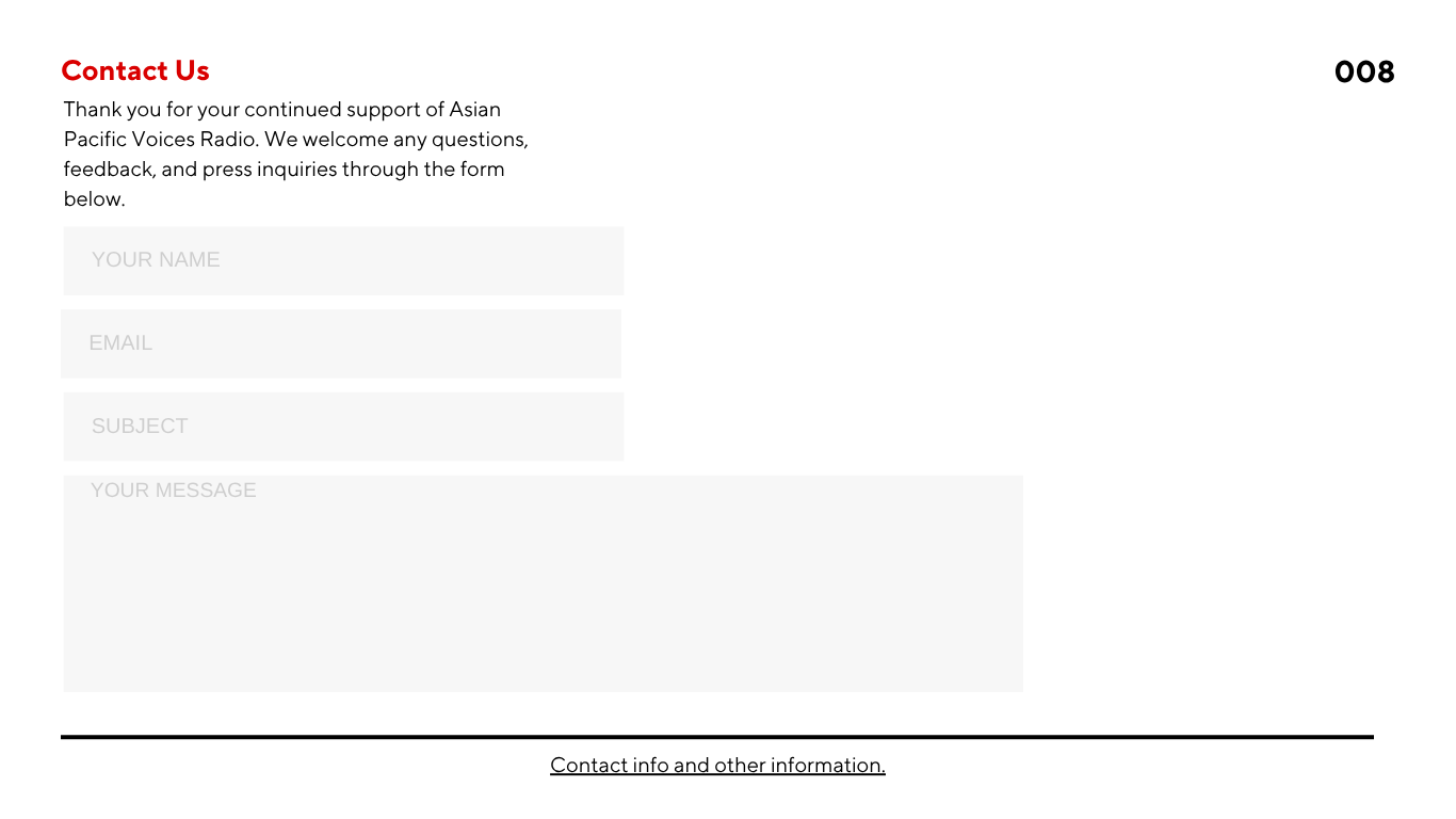
Contact Us - Page 8
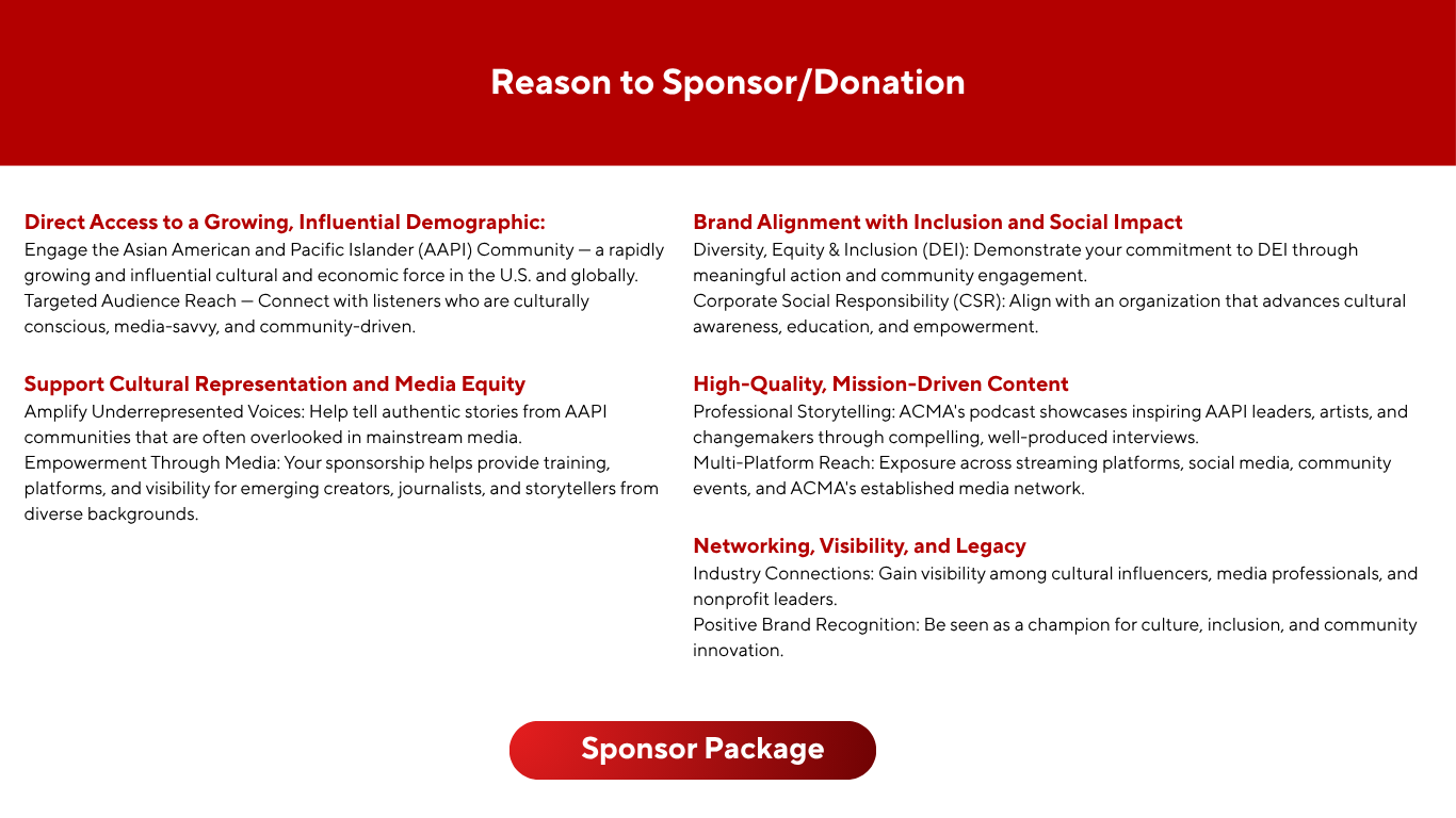
Donation Call - Page 9
Footer/ Last Page
Since I studied multimedia design, I really wanted the opportunity to design a website from scratch. I asked my manager for permission to redesign the Asian Pacific Voices and the Asian Pacific TV and Radio into one website, and she asked me to send her the draft once I finished. She approved the design, but I was not able to continue developing it because my internship had ended. If I have the opportunity in the future, I'd like to build it as a temporary website to bring the design to life.