About the font:
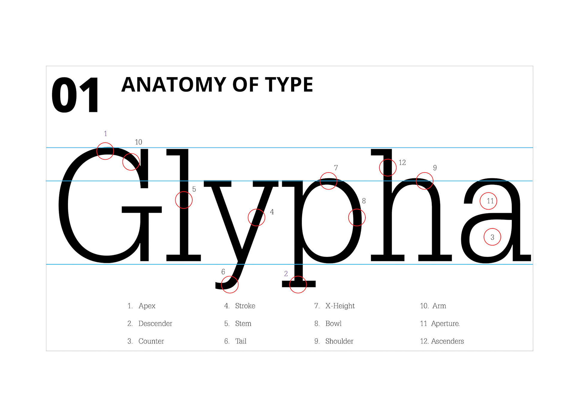
- Glypha was created by Adrian Johann Frutiget (05/24/1928-09/10/2015), he was a Swiss typeface designer who influenced the direction of type design in the second half of the 20th century. He expanded Univers to more than 40 sets, or styles of font. His career spanned the hot metal, phototypesetting, and digital typesetting eras.
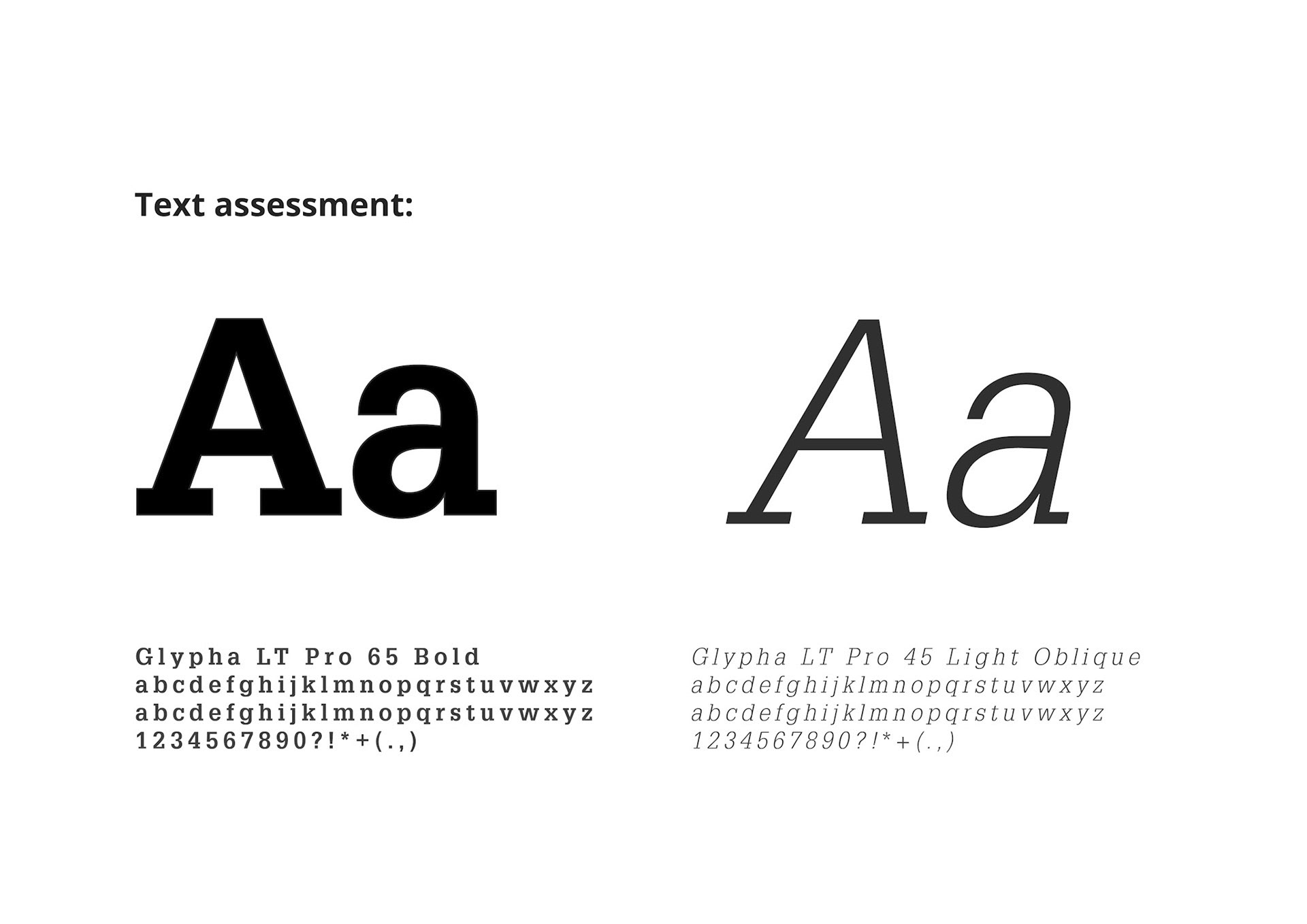
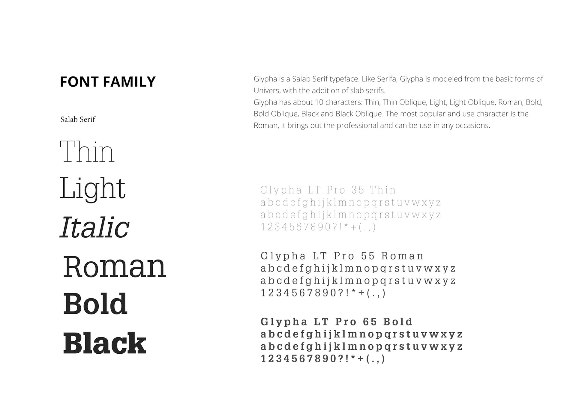
- Glypha is based on Serifa, an earlier slab design from Frutiger. Compared to Serifa, Glypha has a larger X-height and slightly more condensed letterforms. Both Serif and Glypha follow the shapes of Univers, so both typefacts tent to pair well with neo-grotesques. The Glypha family is available in the writings with corresponding obliques.
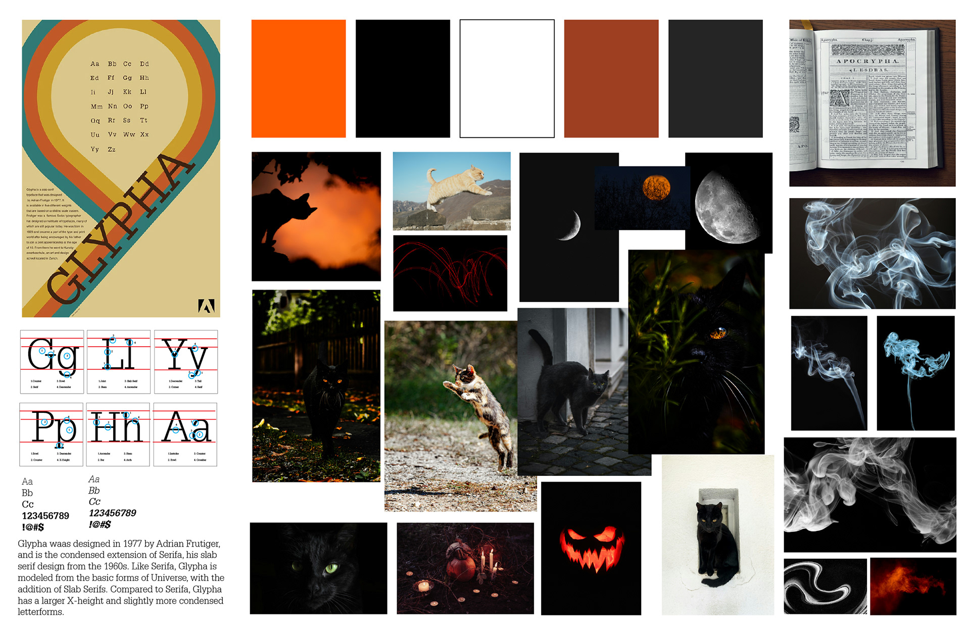
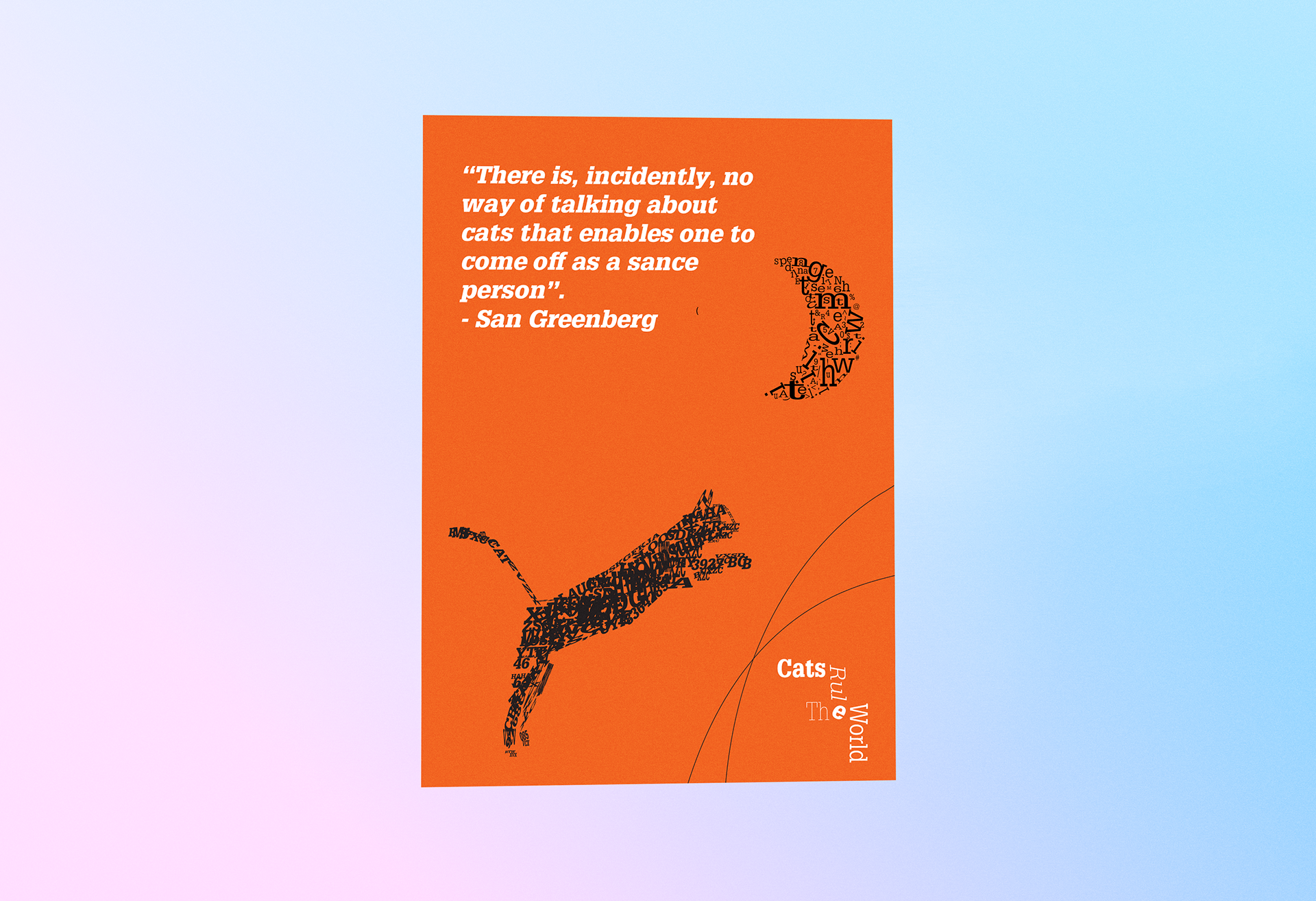
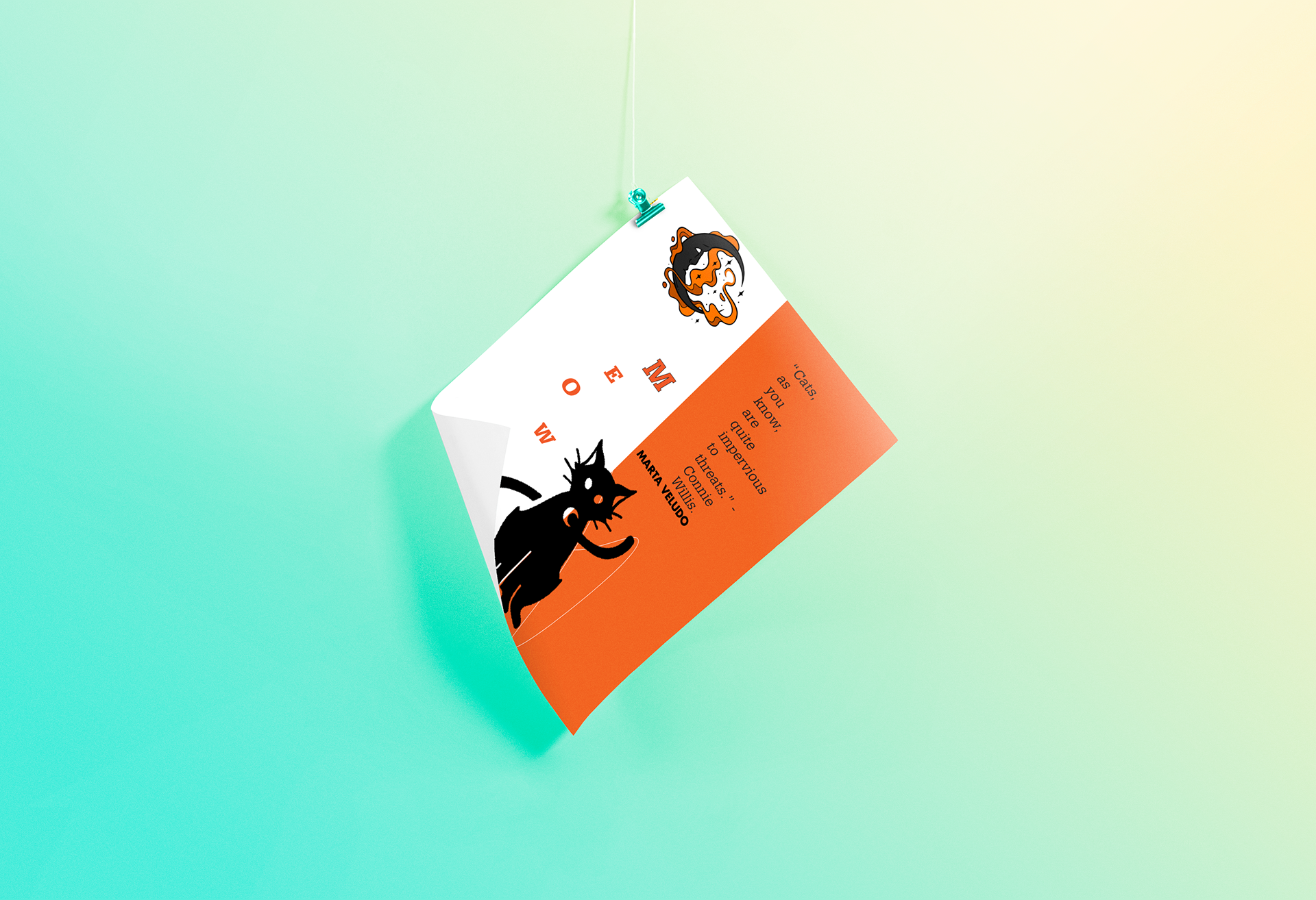
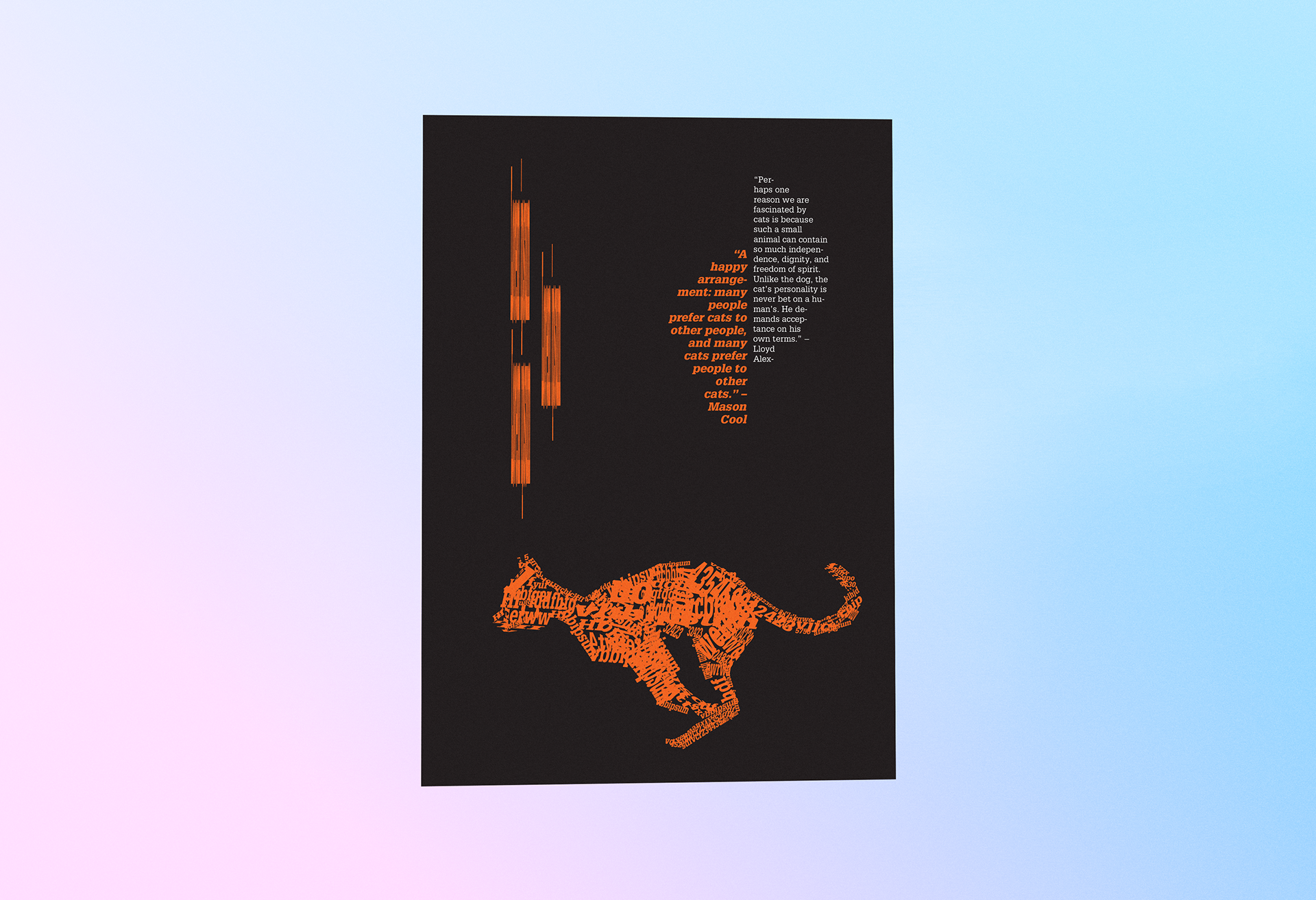
The mood board was inspired by Halloween, combining a black cat, cat posts, moon, and drifting smoke to create a spooky atmosphere. These elements helped build a mysterious, slightly vintage mood that reflects the holiday spirit. I also explored the Glypha typeface, using its bold and dramatic style to enhance the overall composition. The mix of typography and dark imagery effects guided the direction toward a design that feels both mysterious and visually engaging.
Design Process:
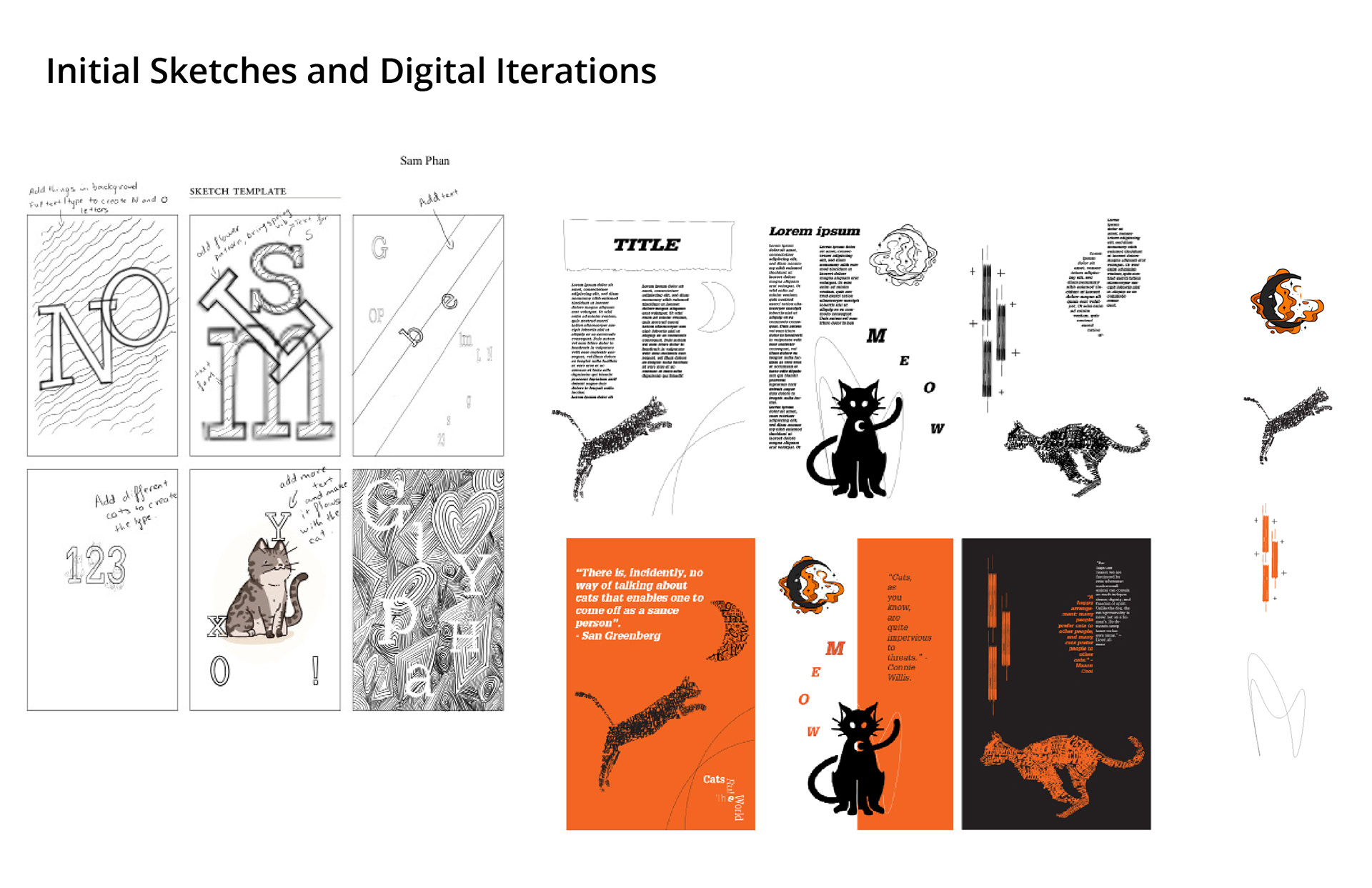
I sketched everything in Procreate as I found it easier for me, before transferring it to Illustrator for refinement. The individual elements were also initially hand-sketched and then polished digitally in Illustrator to improve clarity and structure. I created all three posters, focusing ong first on typography and composition before adding color at the end to ensure a cohesive design. I also adjusted the color palette twice to better match my intended mood and overall visual direction
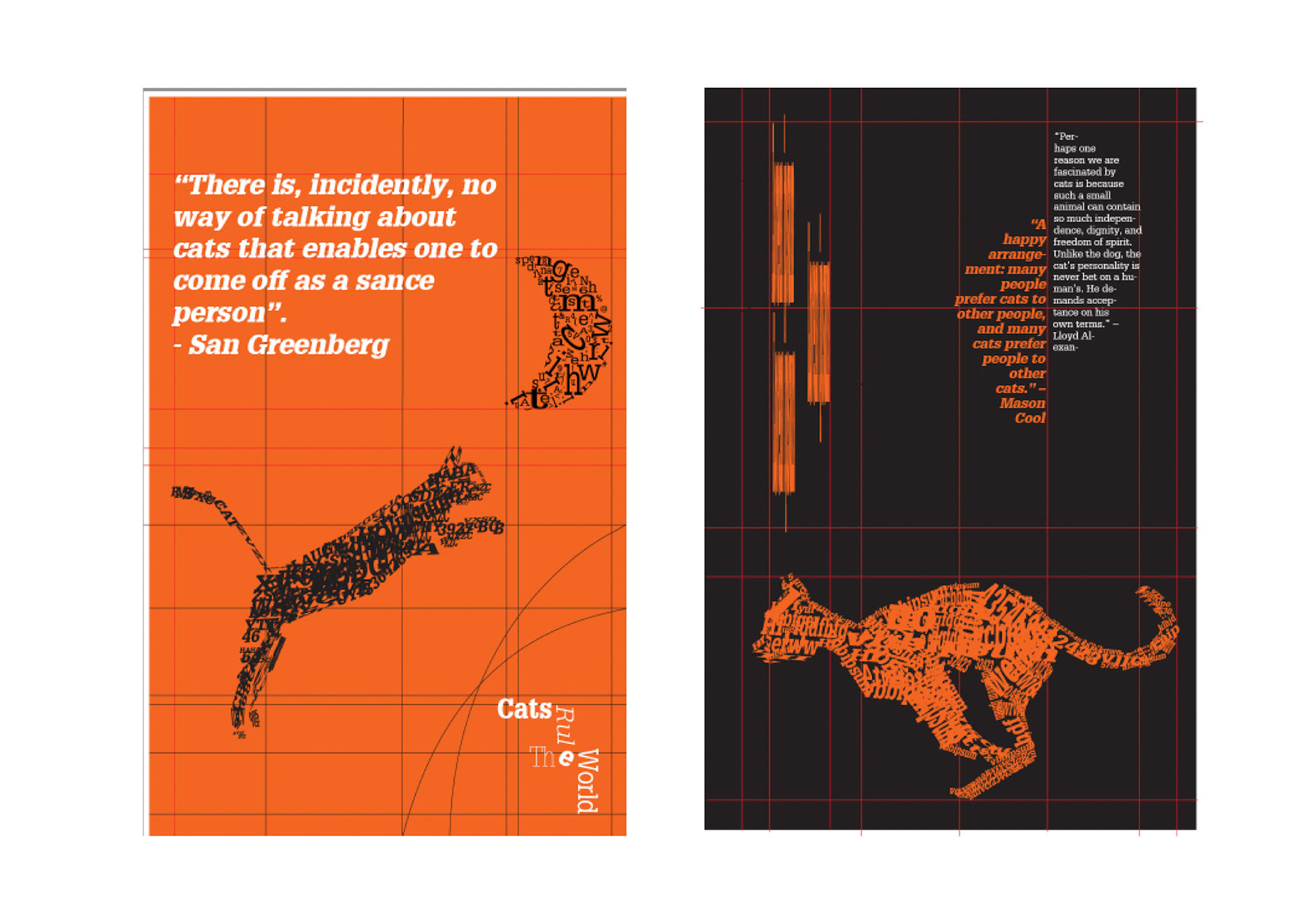
Grid System:
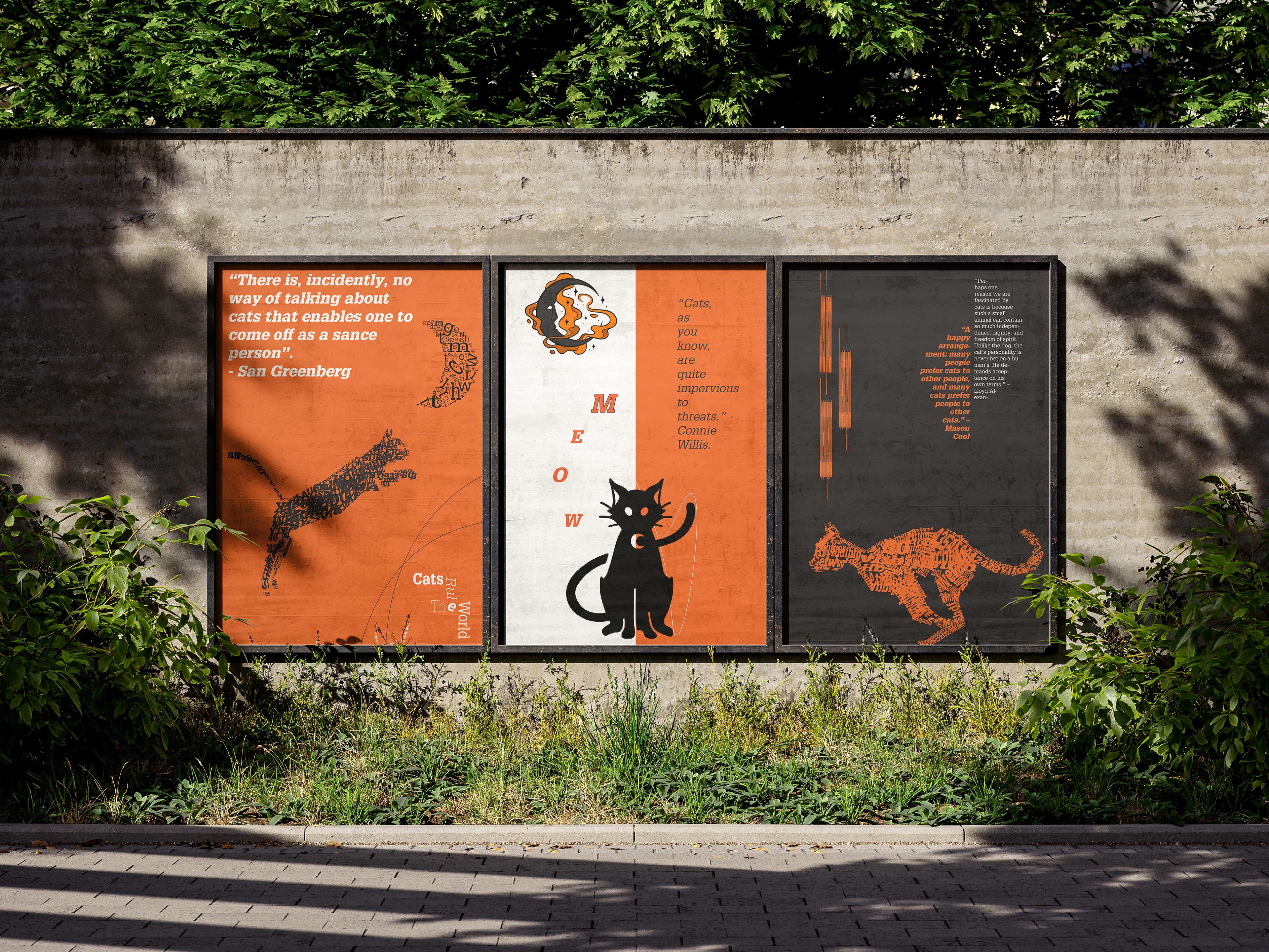
I based my designs on a grid system to establish a clear typography hierarchy and visually organize each element throughout the compositions. The grid structure helped create balance through the use of alignment, spacing, and the relationship between positive and negative space. It also allowed me to separate elements clearly while maintaining consistency across the poster series.
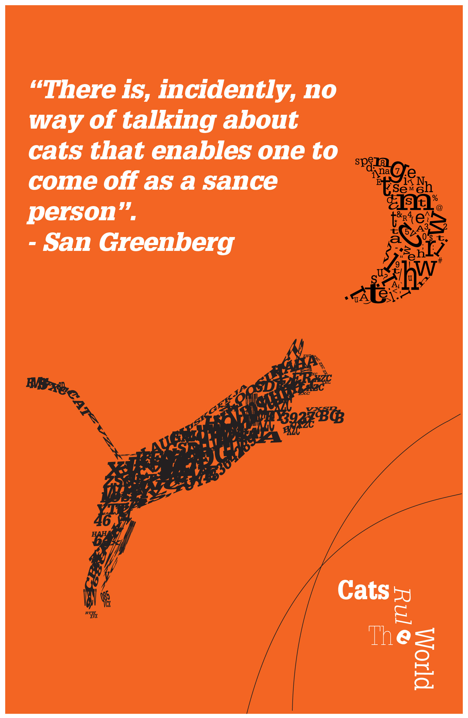
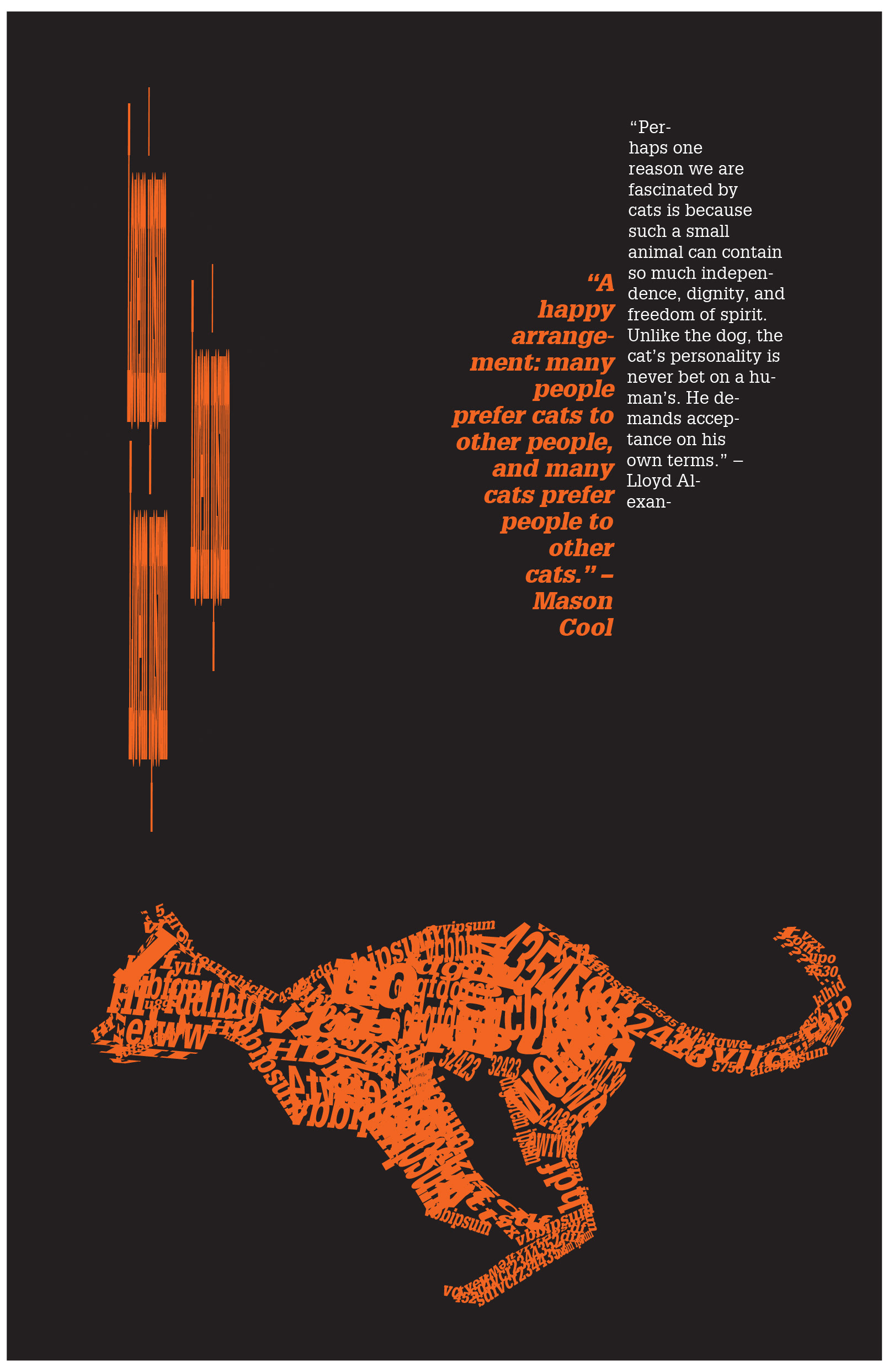
For the first and third posters, I used a hierarchical grid to create more freedom with the typography and cat illustrations while still keeping the layout clean and organized. This approach allowed the elements to vary in scale and placement without losing visual structure.
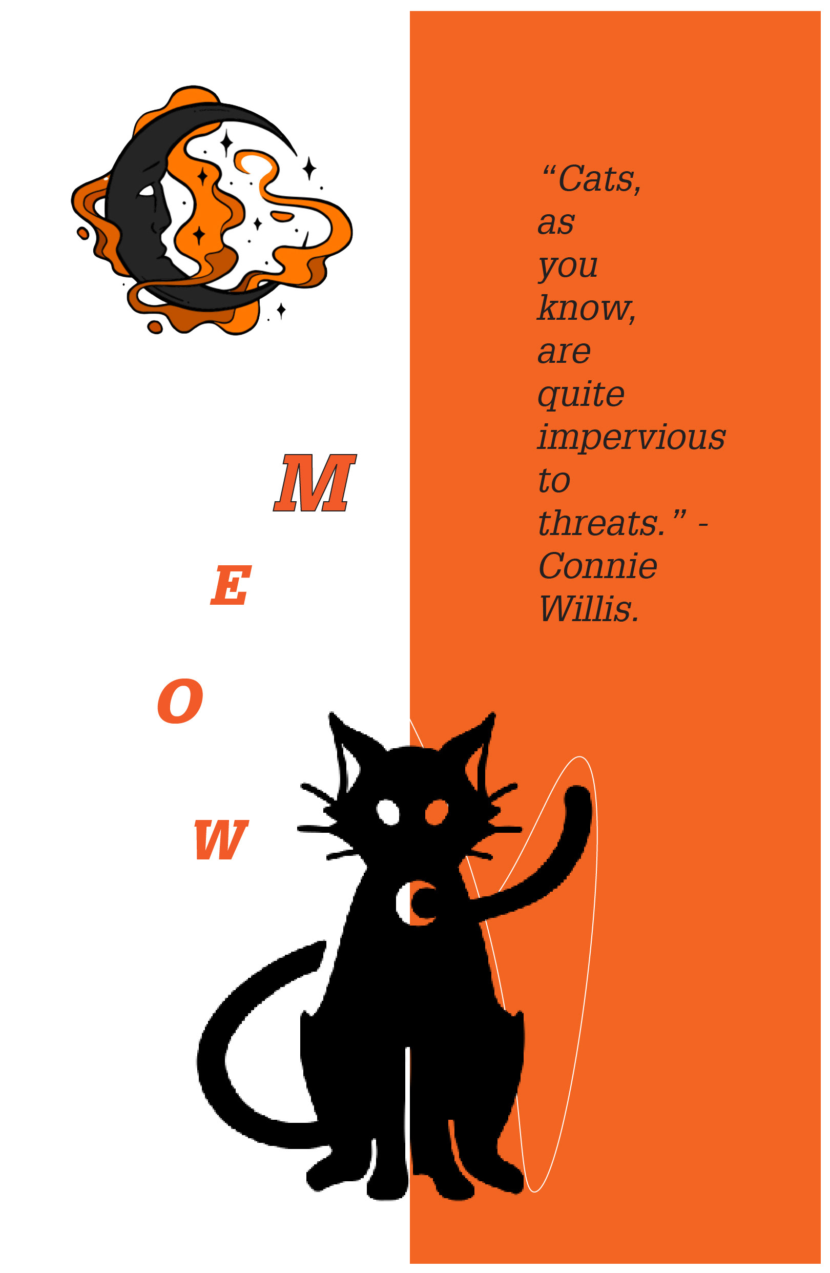
For the second poster, I mainly used a vertical grid system to divide the composition into two sections. Each section uses different colors to create contrast and visual balance while still connecting cohesively with the other two posters in the series.
Final Poster