This project builds on the original logo (on the right), refining it to better connect with the salon's target audience: local women aged 18-60 who value professionalism, respect, and quality service. The owner aims to grow her client base through word-of-mouth and referral programs, focusing on genuine client relationships rather than heavy advertising.
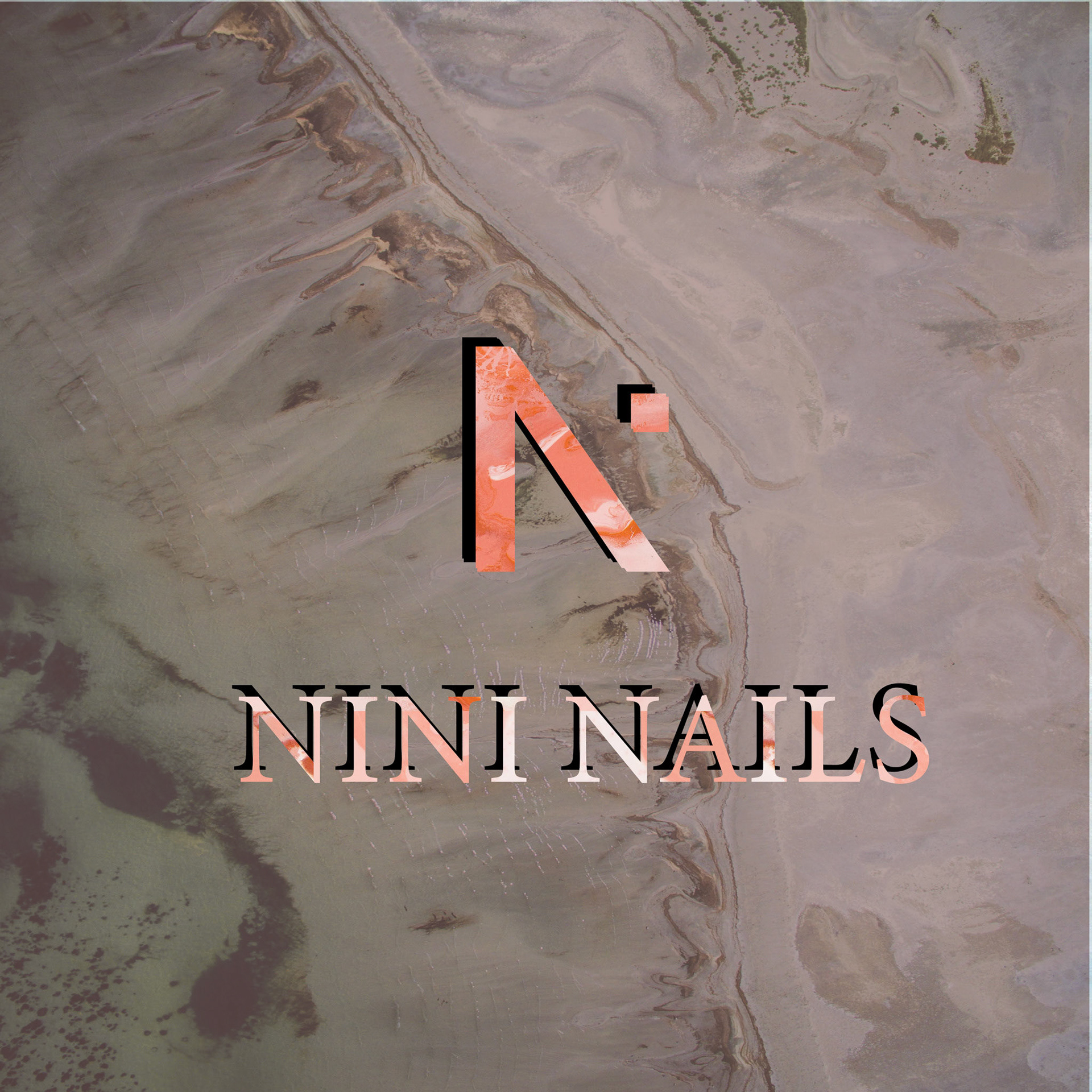
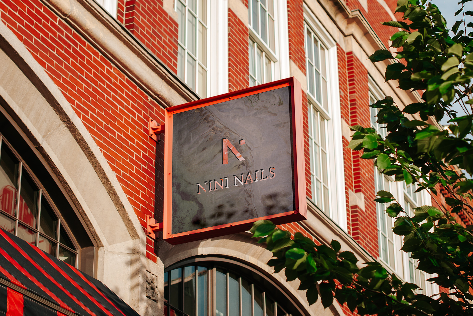
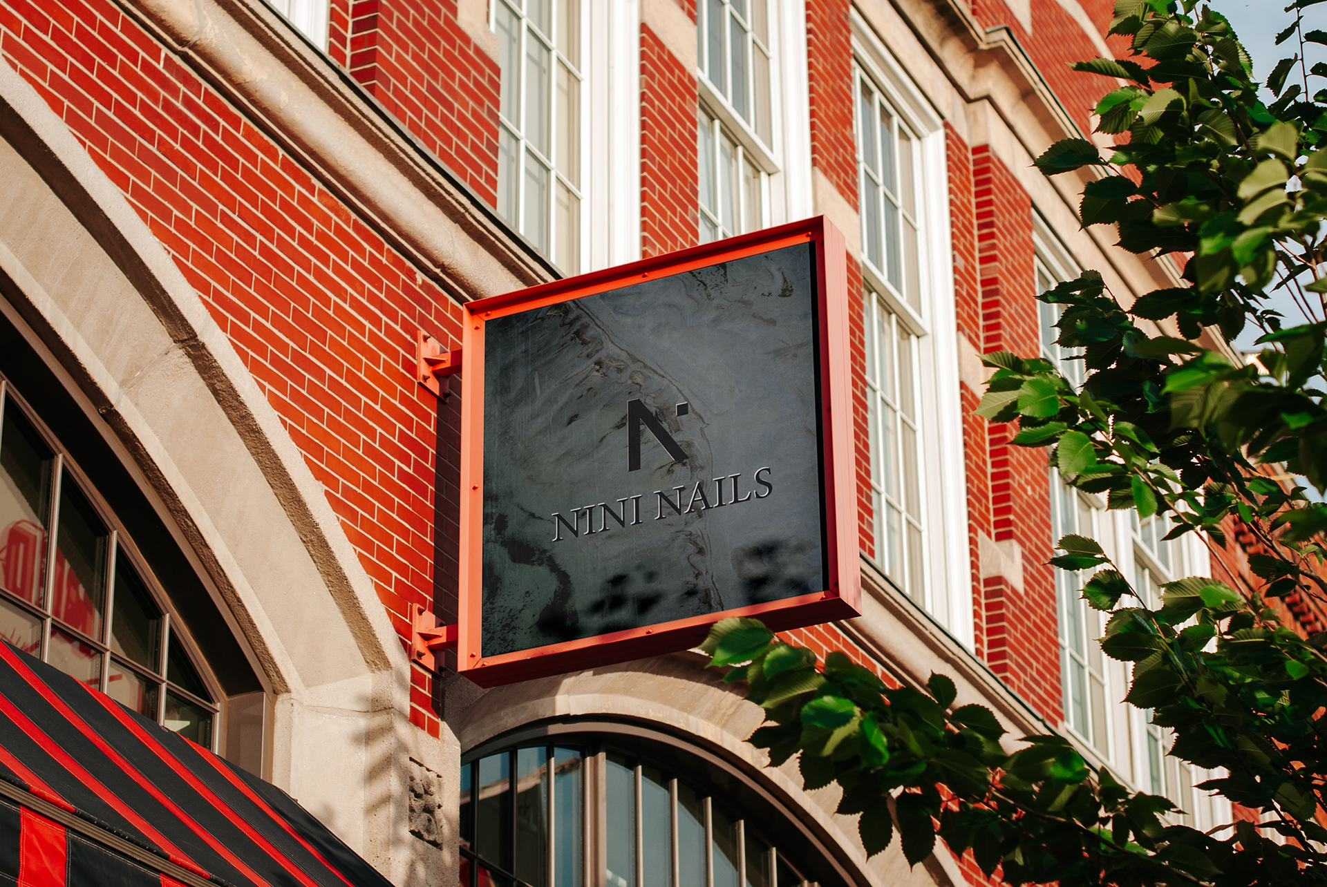
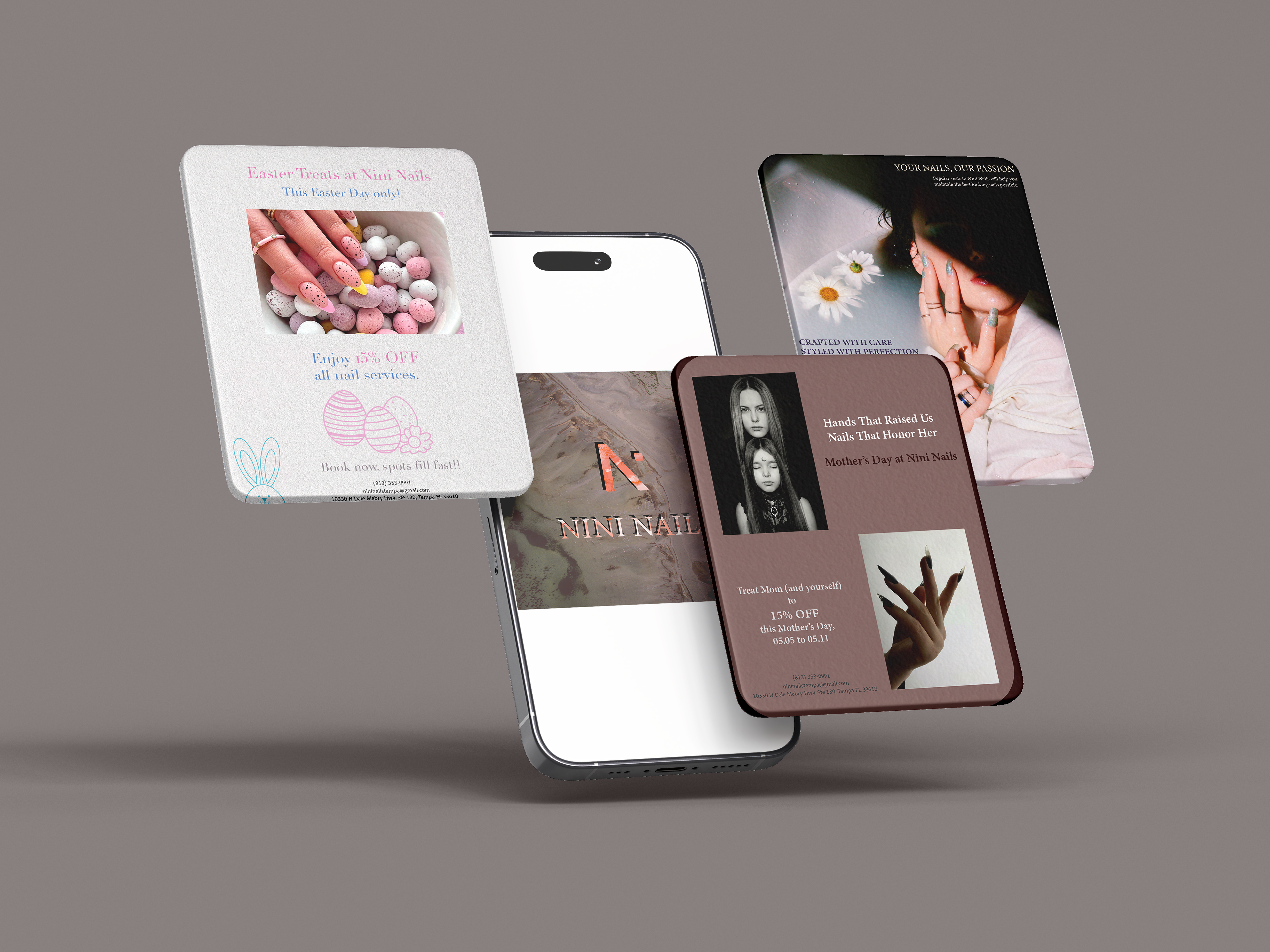
The rebrand takes a modern, minimalist approach, using a balanced, mid-tone visual style that feels both professional and welcoming.
The final rebrand was well received by the owner, who approved the updated color and patterns. She felt it stayed true to the original meaning while giving the brand a fresh update.
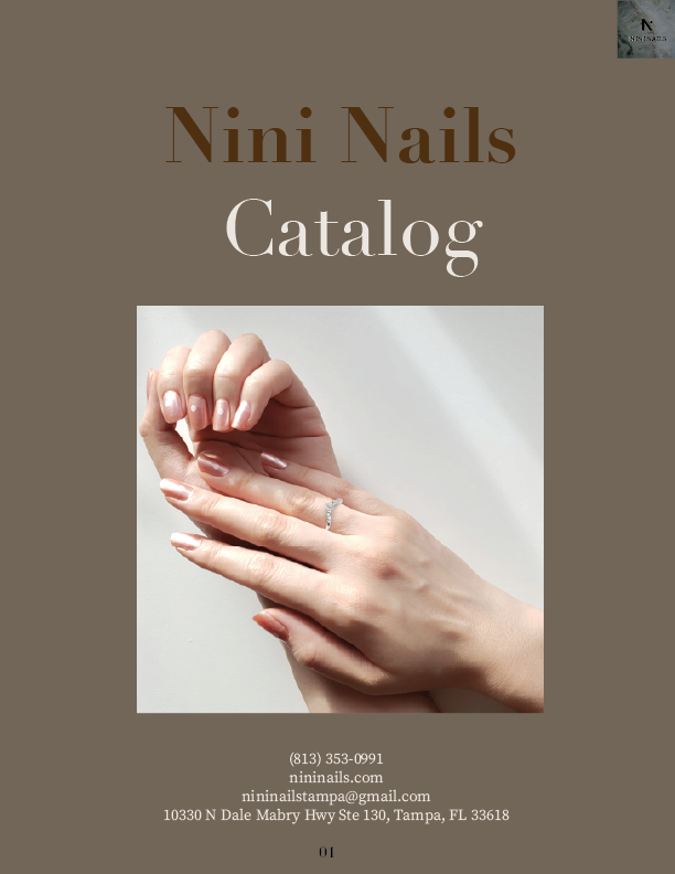
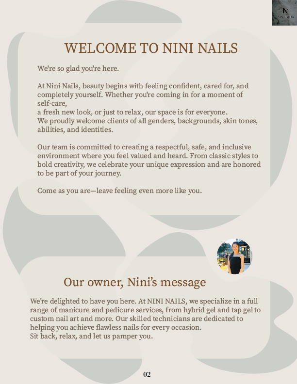
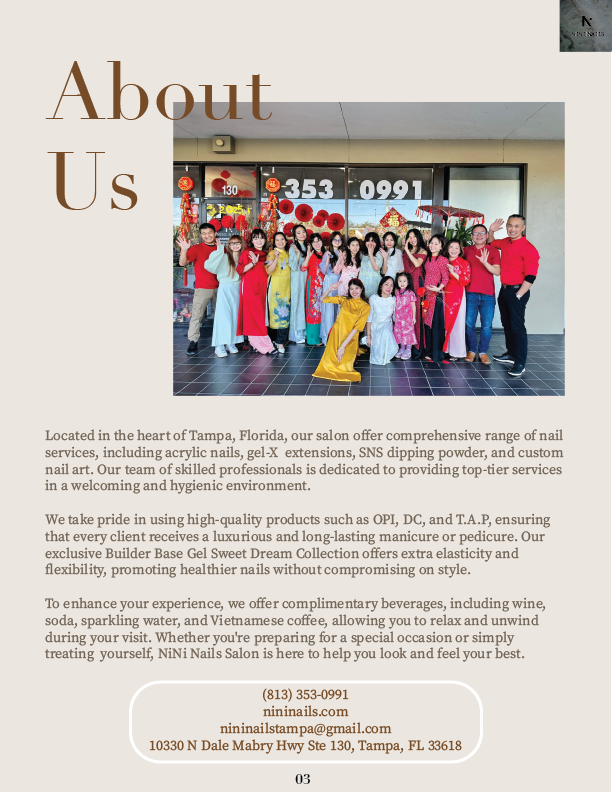
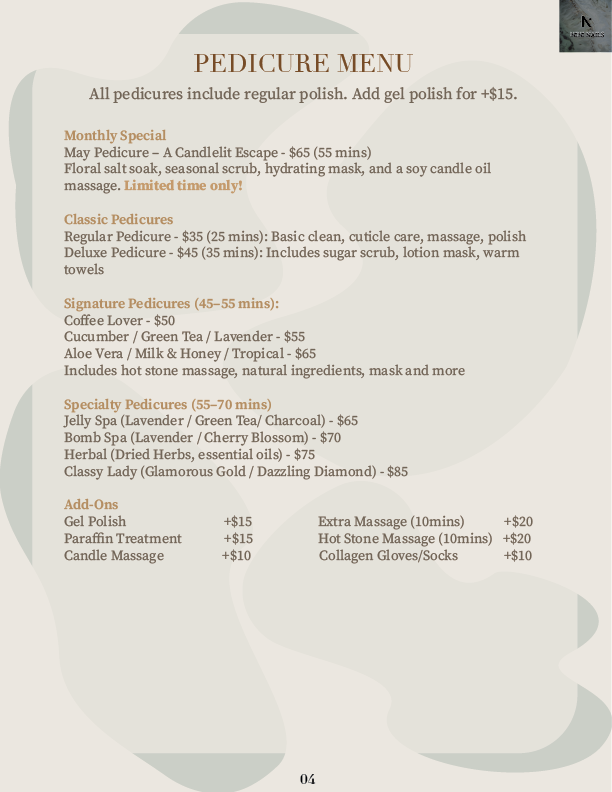
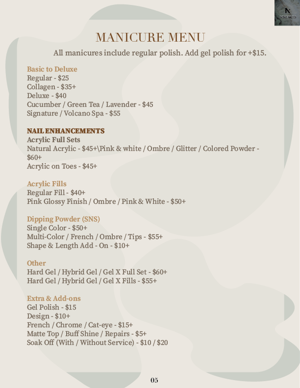
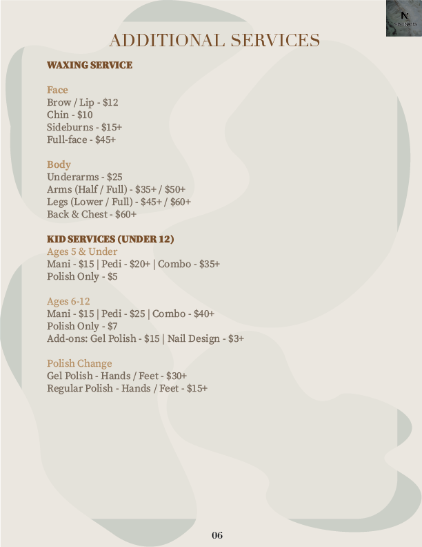
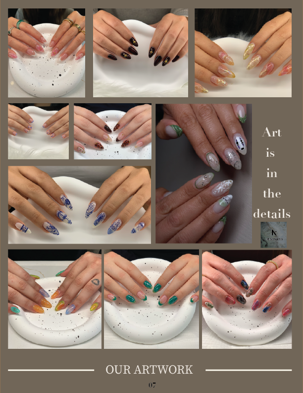
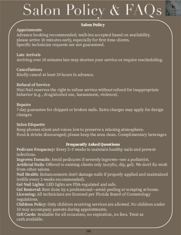
I kept the design intentionally minimal, as adding too much can quickly feel overwhelming. Instead, I focused on telling the brand’s story and creating a clear, thoughtful service menu so clients know what to expect and feel welcomed and connected from the start.
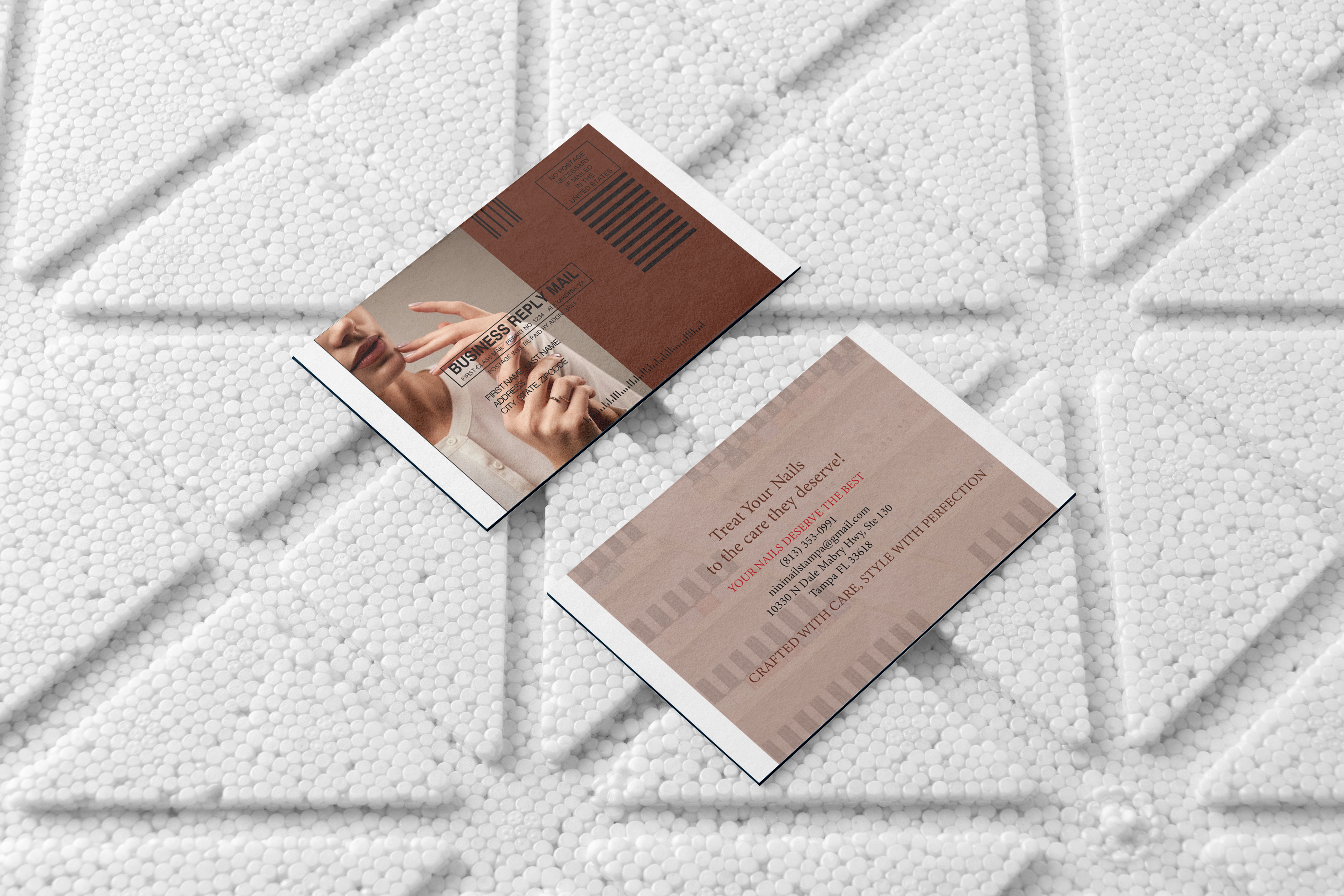
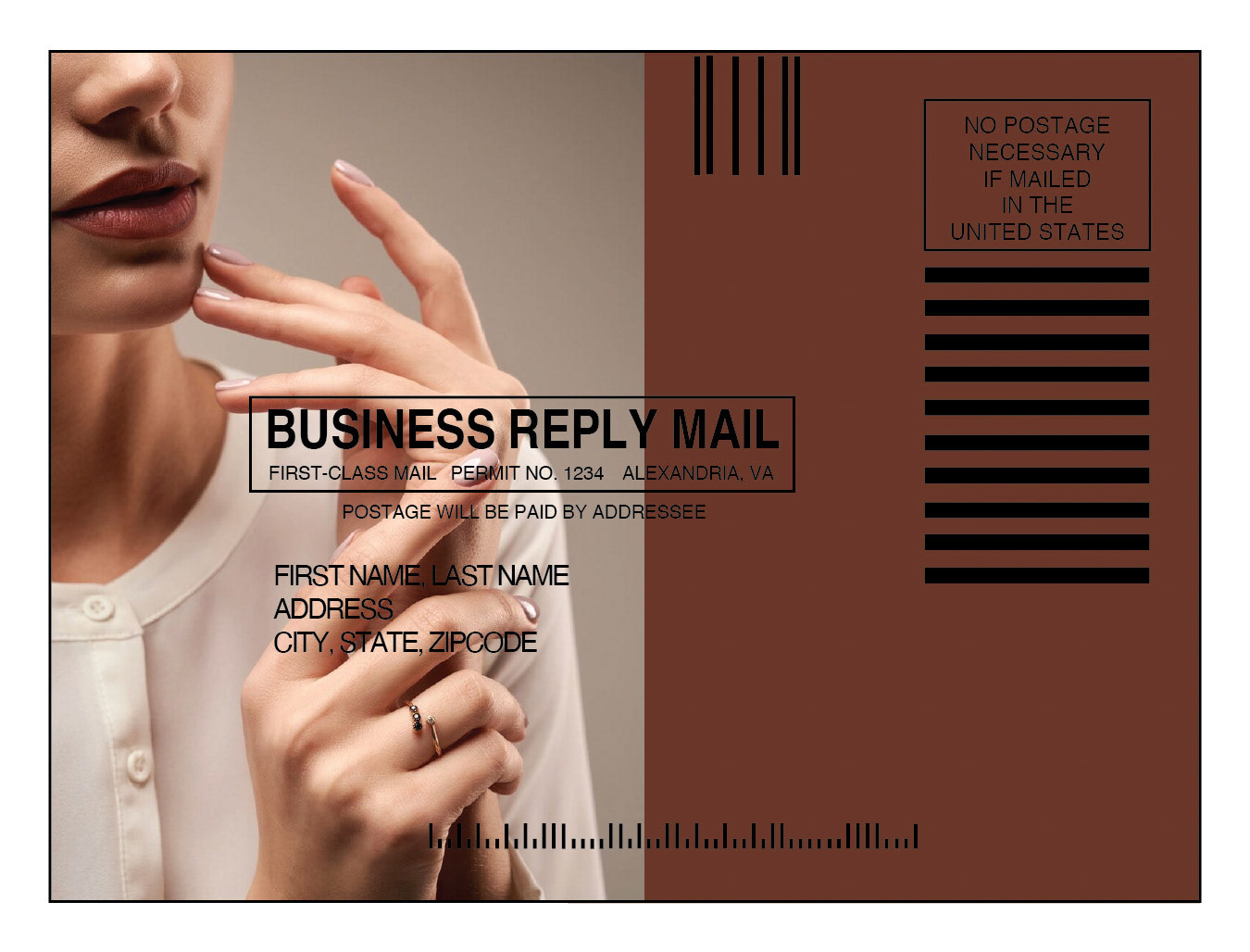
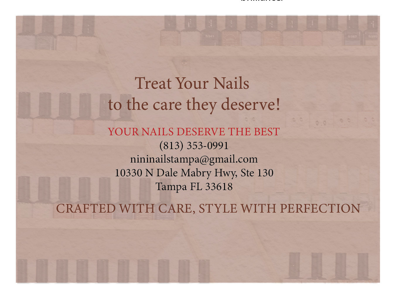
I chose a simple, bold color palette for this postcard to create a professional and inviting feel with a refined look. The design takes on a more business-oriented tone, aligning closely with the brand’s identity. Overall, it’s a smooth and refined approach aimed at appealing to a professional audience.
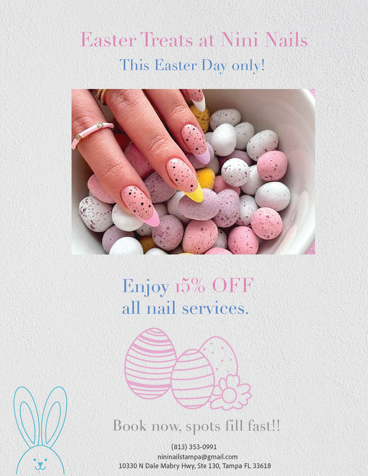
Easter Promotion Poster: I wanted to create something soft, playful, and inviting while keeping the design clean. I used pastel tones and Easter-inspired elements to match the holiday theme and create a cheerful feeling. I focused on highlighting the nail design as the main visual and minimizing the text to keep it easy to read.
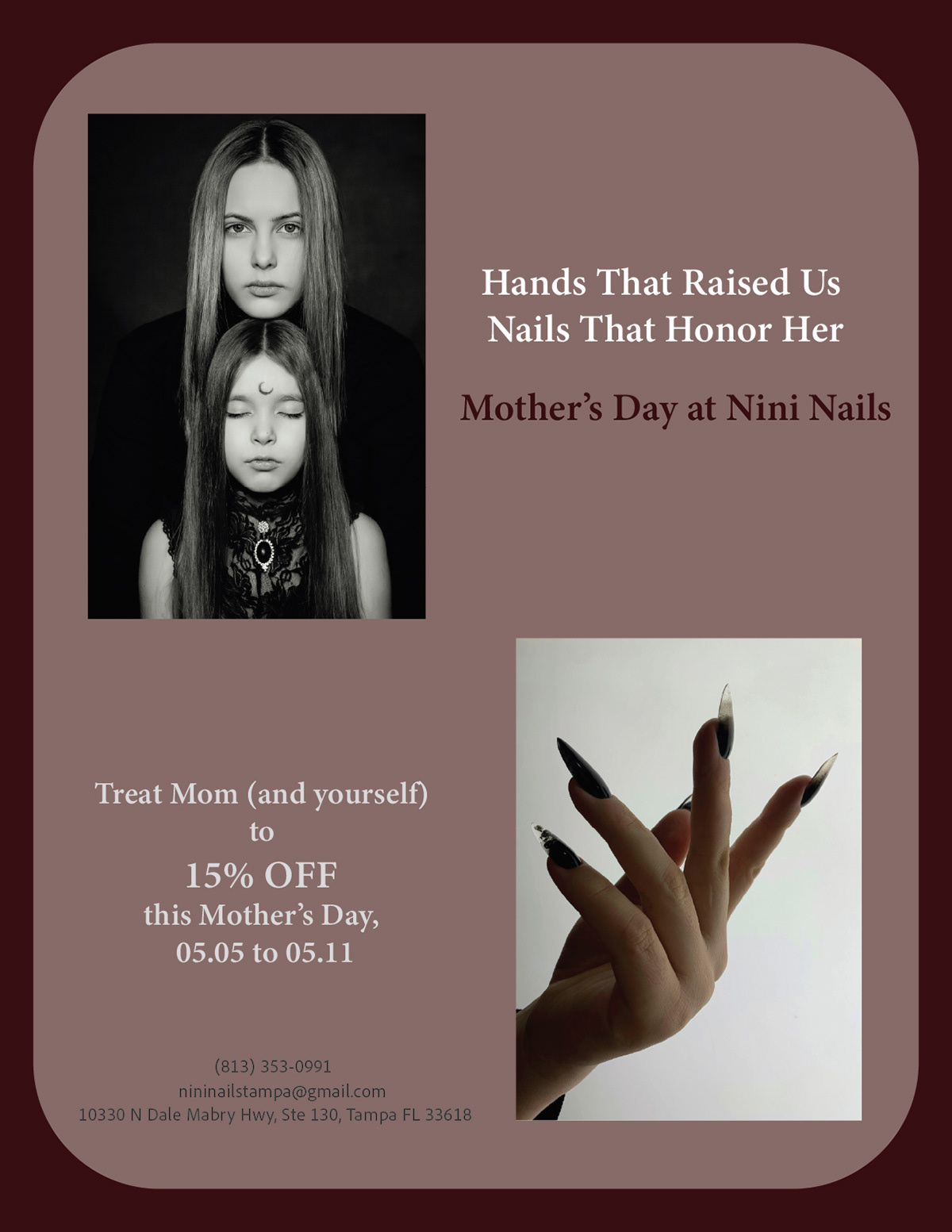
Mother's Day Promotion Poster: I am looking for a more connected and elegant approach. I used muted colors and an editorial-style image to create a warm and refined feeling that reflects appreciation and self-care. I wanted the design to feel personal and meaningful, and make the promotion a special offer in a visually balanced way.
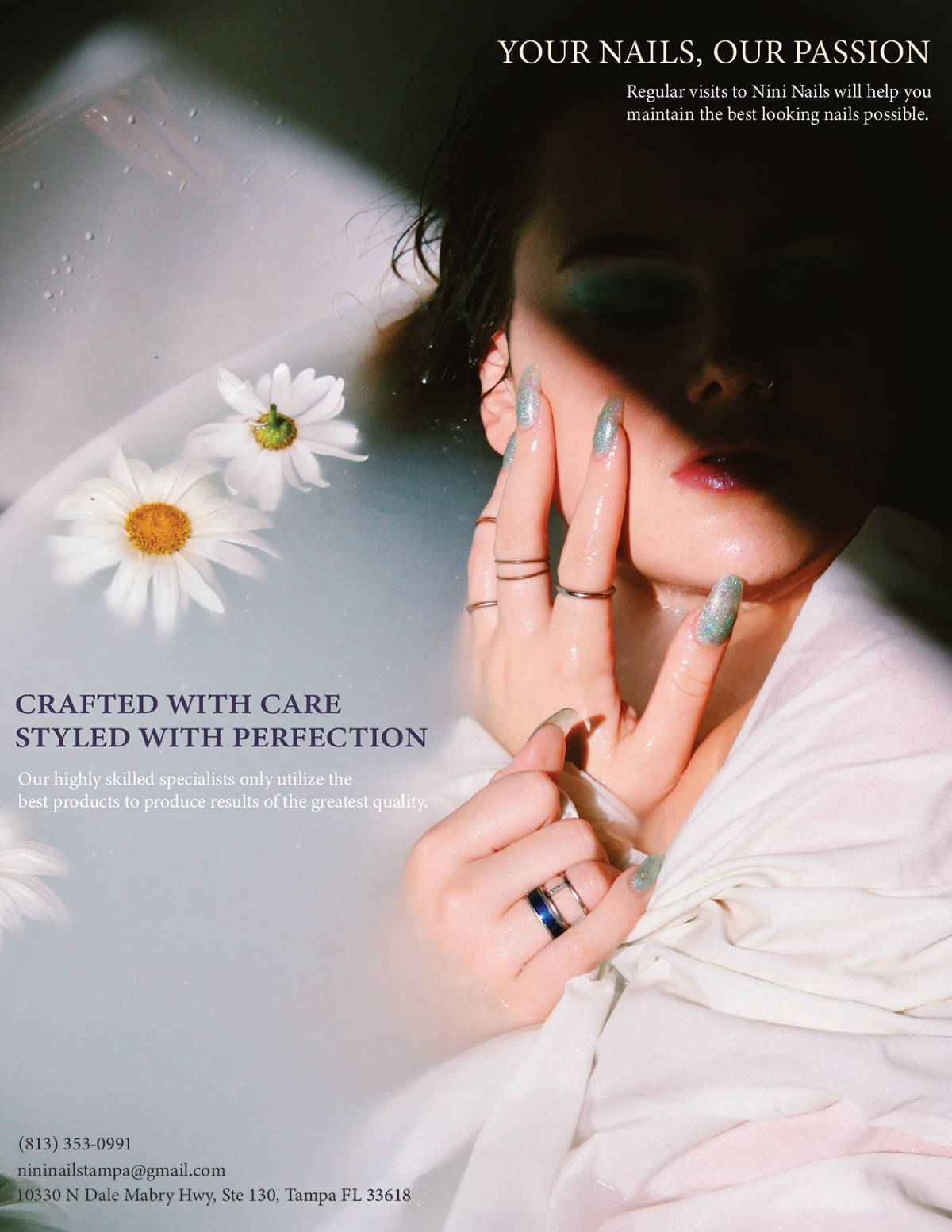
Regular Brand Promotion Poster: I focused on creating an artistic look that reflects the salon's brand identity. I used soft light, floral, and close-up photography to create a calming and polished aesthetic. The overall composition was designed to provide professional, quality service and attention to detail while showcasing the beauty of the nail work.
PSA Promotion Video: I worked with limited original videos since I only had one video of the salon interior. To create a more engaging and complete advertising video, I chose some free clips from the Noun Project and edited them together with the salon footage to produce a short video. I chose the upbeat music to create a charming and welcoming atmosphere through quick pacing and clean transitions based on the owner's request. The final product was designed to feel friendly and approachable while helping promote the salon's services and overall brand image.
After completing this project, I gained more experience in creating promotional materials across different formats, including posters and short-form video content. Working with limited media also helped me improve my problem-solving and editing skills by finding creative ways to build engaging visuals while maintaining a cohesive brand identity.