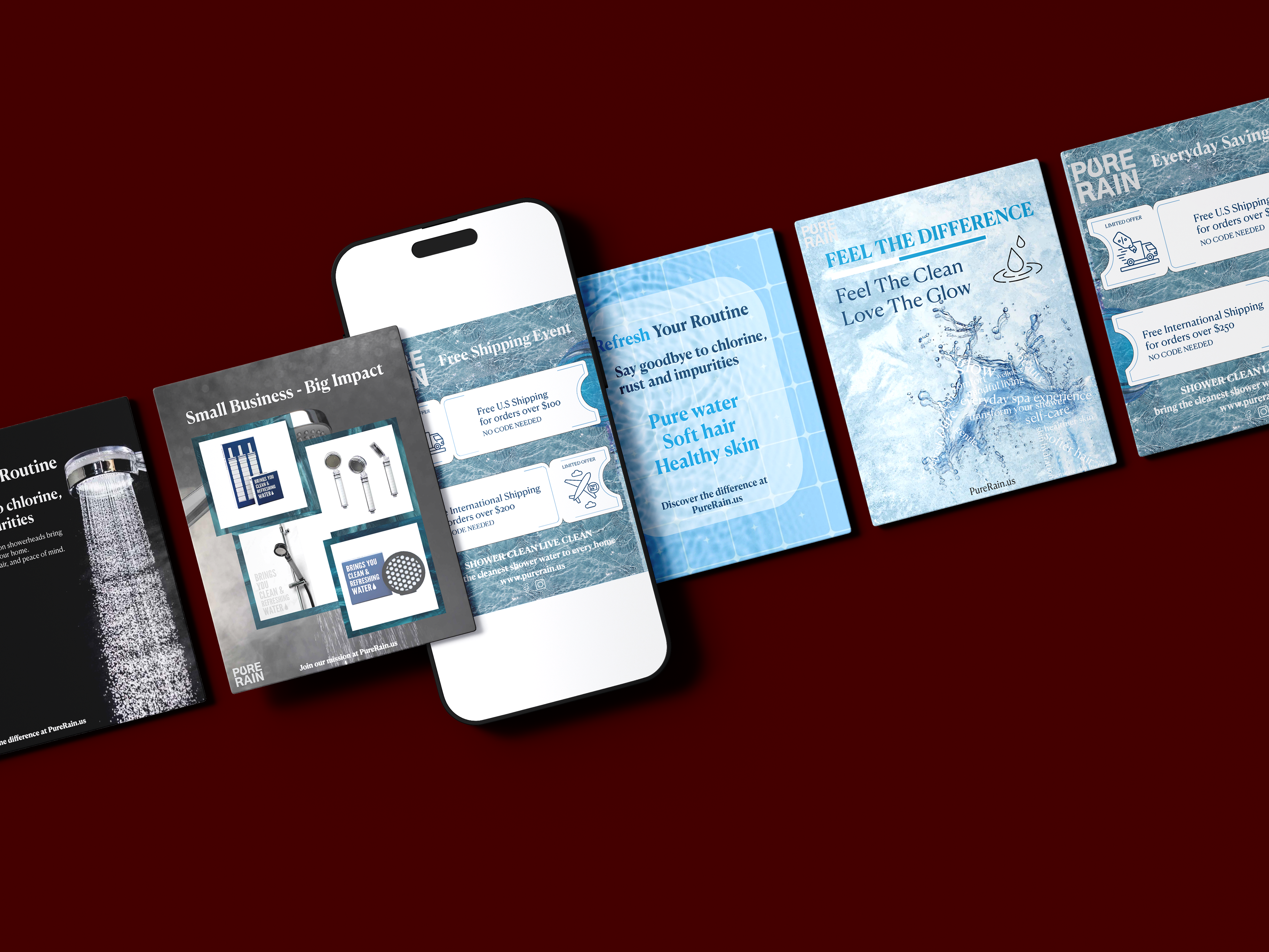
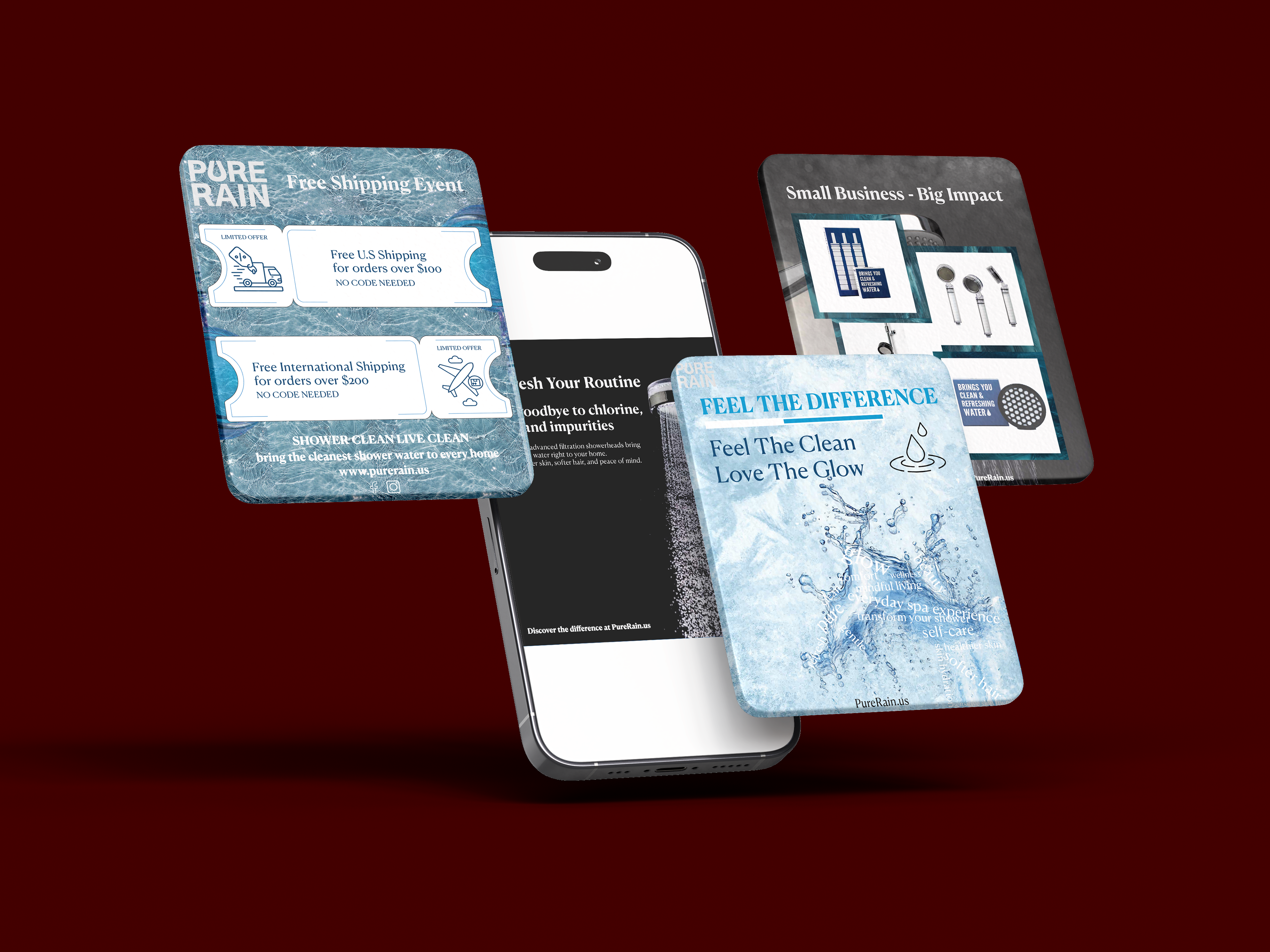
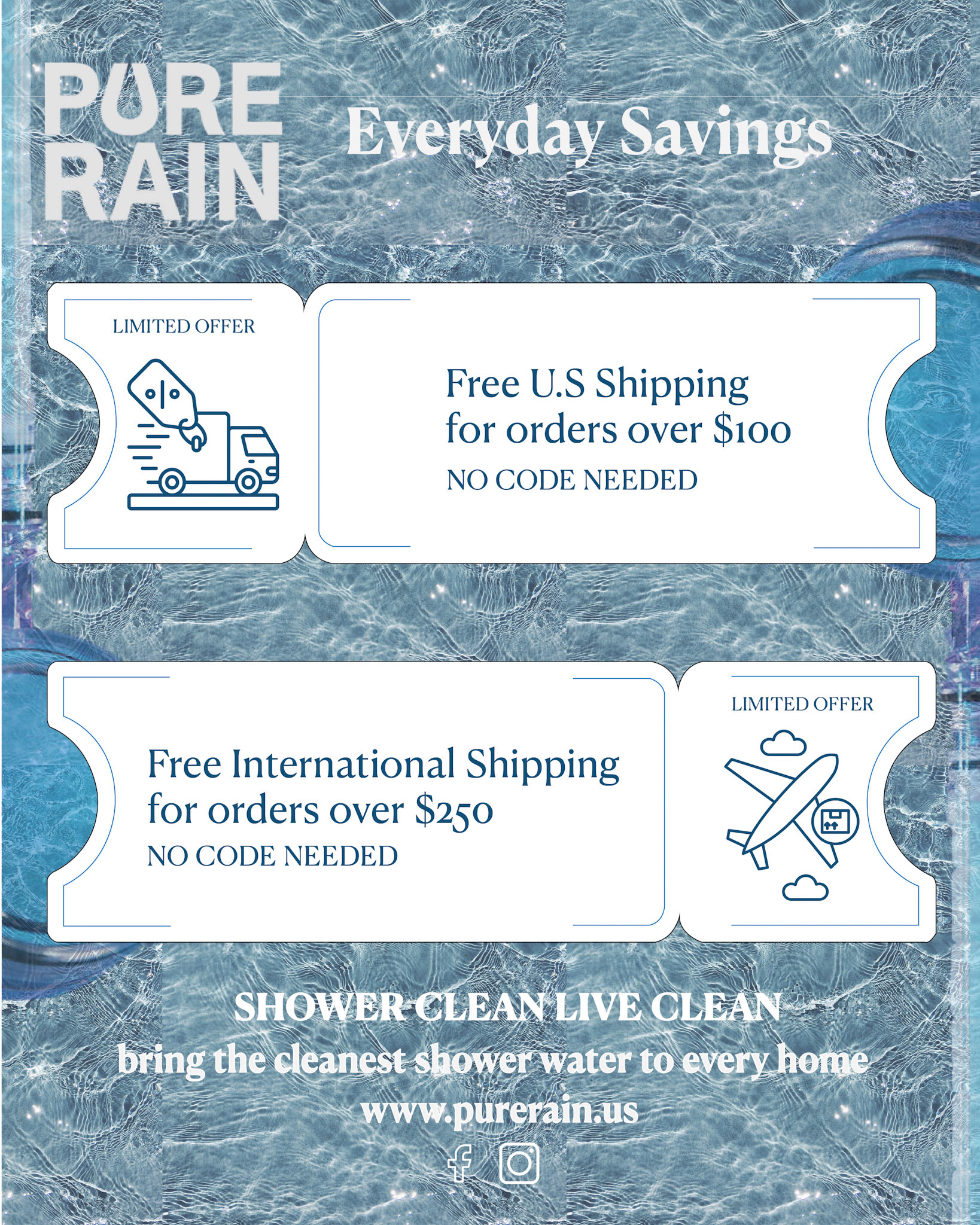
For this flyer, the client wanted to promote their everyday shipping savings. To reflect the brand’s wellness focus, I used a vibrant, refreshing water texture as the background. My main focus was on information hierarchy, so I structured the US and international offers within the distinct, stylized ticket shape with custom iconography. Make sure the “$100” and “$250” thresholds stand out. The result is a clean, cohesive, and highly scannable marketing asset that balances brand messaging with a clear call to action.
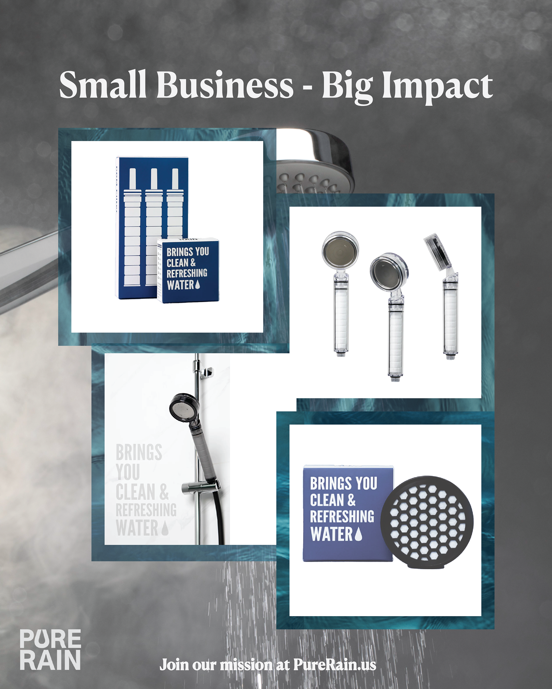
My focus for this flyer is to highlight the brand’s mission and move away from standard, boring product grids. Instead, I chose to design a dynamic, overlapping collage layout. Framing the product’s images in white squares with deep green borders makes each item stand out against the abstract, smoky grey shower in the background. I highlight the design with a headline, “Small Business - Big Impact,” to show the brand’s mission, creating an emotional connection with the audience. The placement of the blocks intentionally leads the audience’s eye in an S-curve down to the call to action at the bottom.
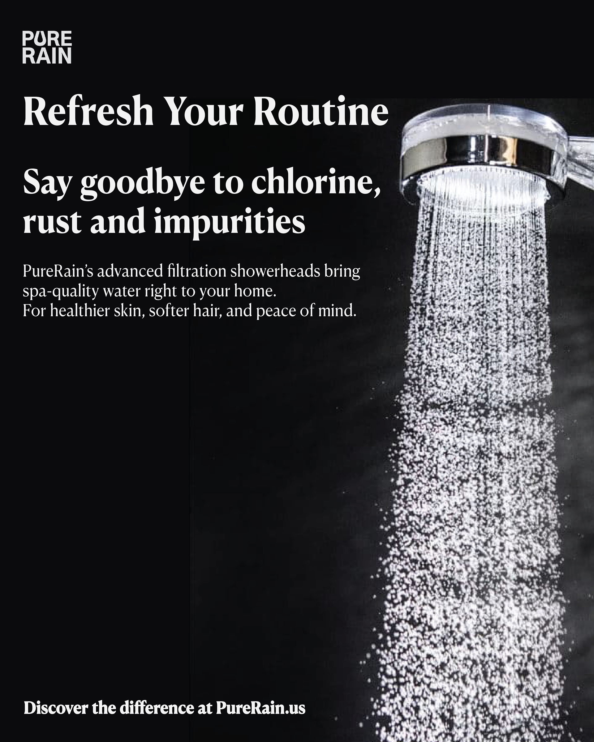
I went with a dramatic black background to create some contrast against the bright, crisp stream of water from the showerhead; it beautifully highlights the filtration power and gives the piece an upscale, premium feel. I used a bold serif headline for the main message, paired with a subhead that speaks directly to the audience’s pain points by calling out “chlorine, rust, and impurities.” I chose a clean, high-contrast white sans-serif for the body text, ensuring the key benefits like “healthier skin” and “softer hair” stand out completely against the dark background.
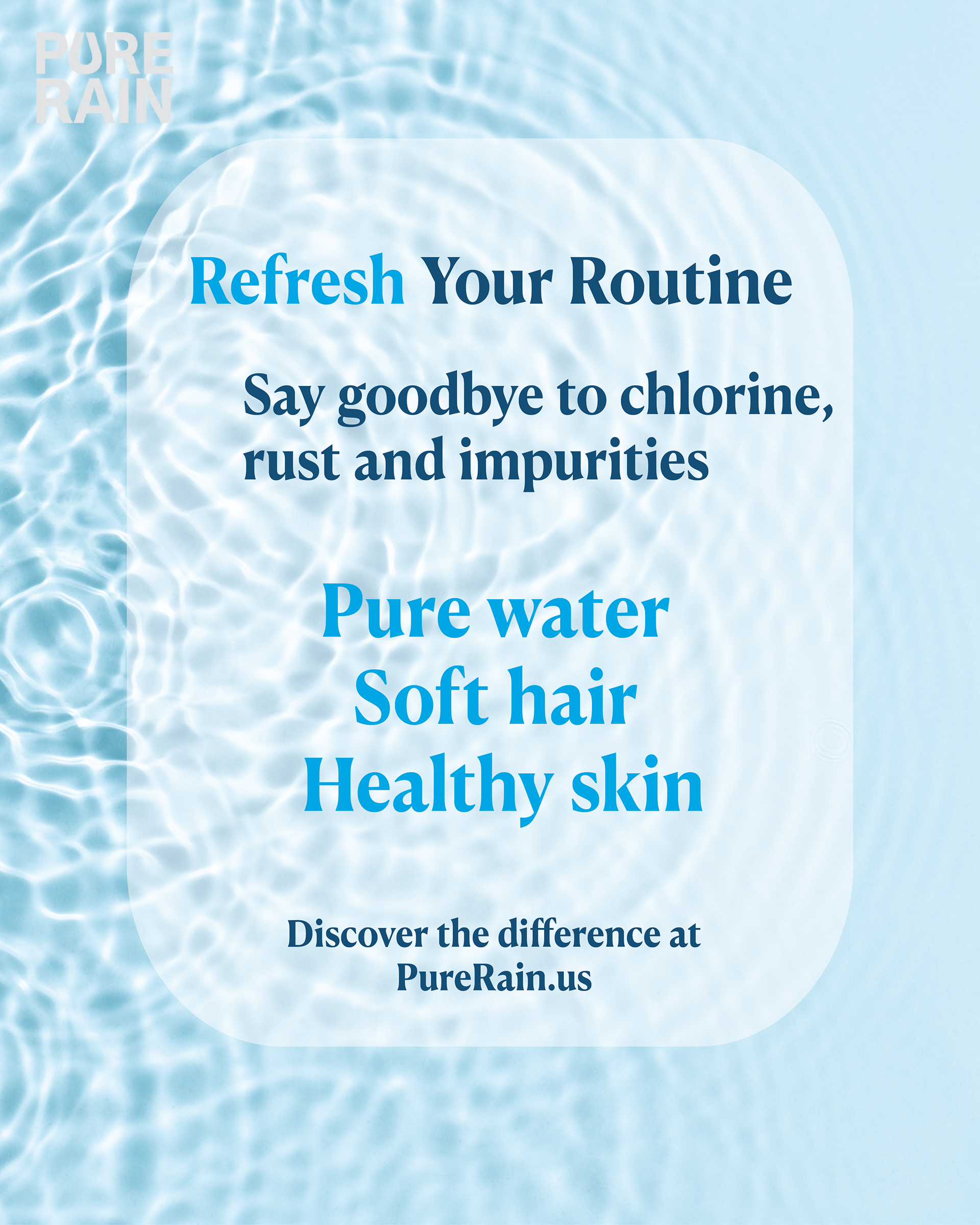
My design focus for this flyer is minimalist, benefit-driven ad variation. To contrast the darker assets in the campaign, I used a soft, textured water background to create a calming, gentle mood aligned with self-care. I also introduced a semi-transparent, rounded content container in the center. This helps separate the text from the background texture, maintaining clear and easy to read. I also highlight the key benefits “pure water, soft hair, healthy skin,” and use the cerulean blue to make the positive outcomes pop.
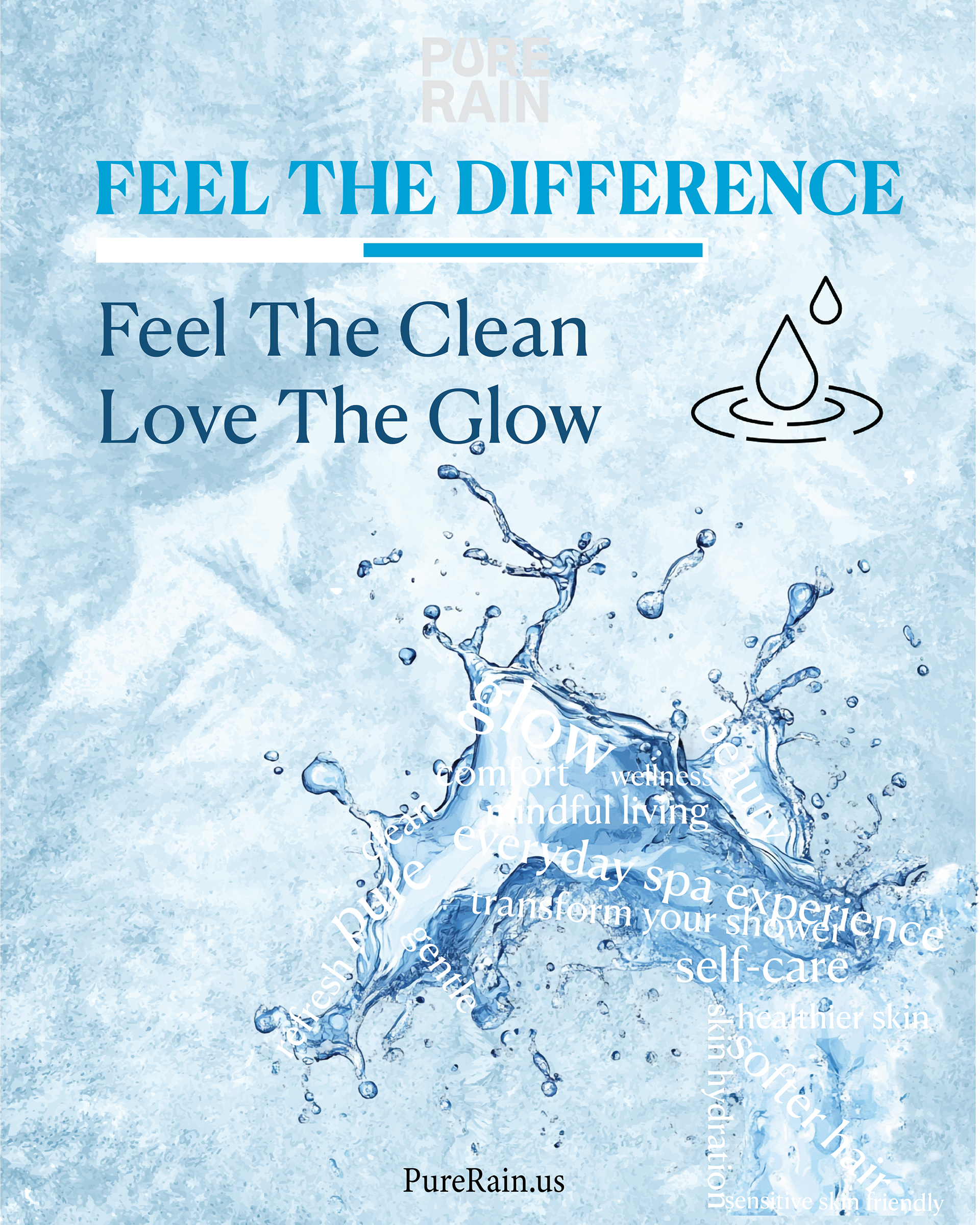
For this design, I wanted to experiment with using typography as texture. I decided to wrap key brand descriptions like "wellness," "self-care," and "everyday spa experience" around the curves of a water splash, blending the message directly into the image. I balanced the complex splash area by using a structured, clean header at the top, complete with a minimalist water droplet icon and an elegant divider line. The blue palette reinforces the feeling of pure, clean hydration.
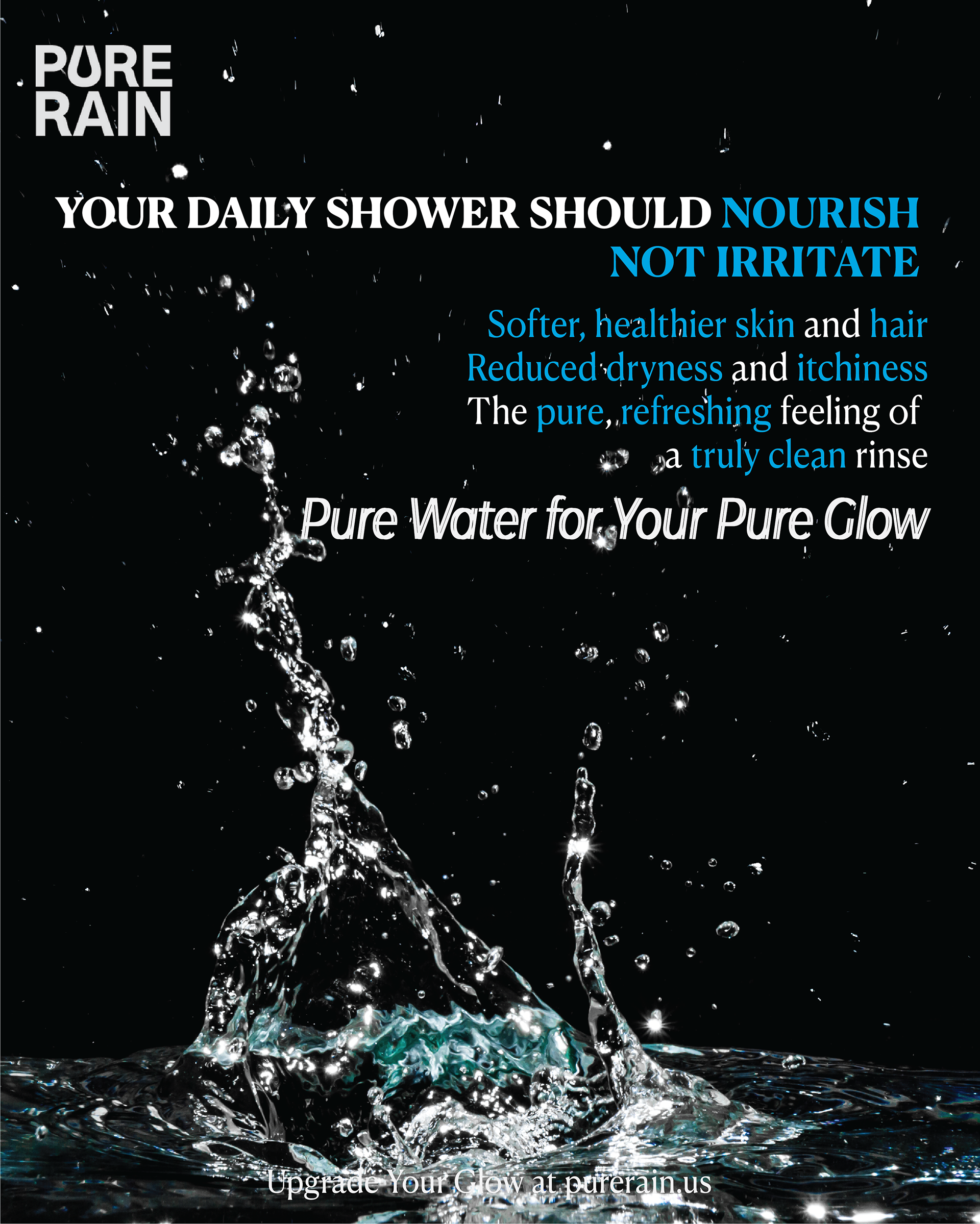
My focus is to highlight the problem and solution message. I used a bold headline and chose the blue color for the positive words to create contrast and highlight the audience's daily frustrations with hard water. The crisp water splash on the black background creates a sense of raw energy and freshness. I aligned the text block to the right to balance the natural upward movement of the water splash on the left, keeping the final composition balanced.